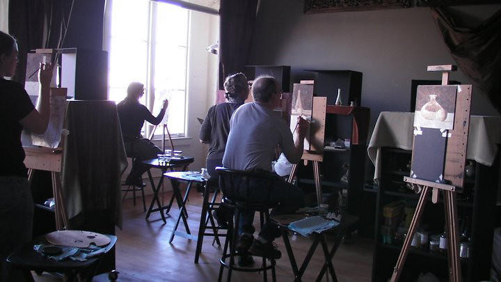
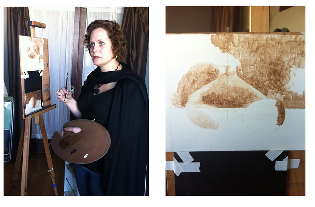
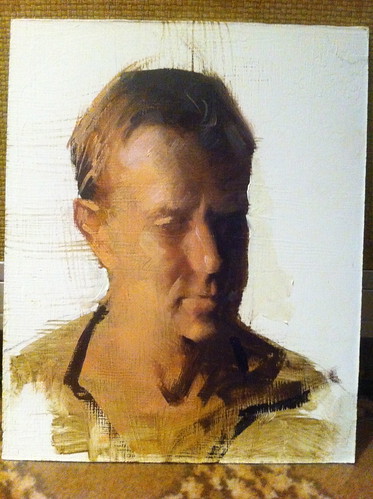
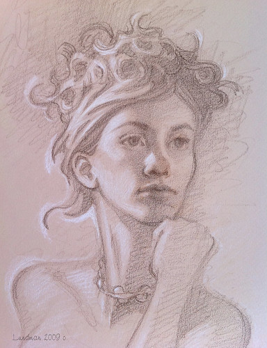
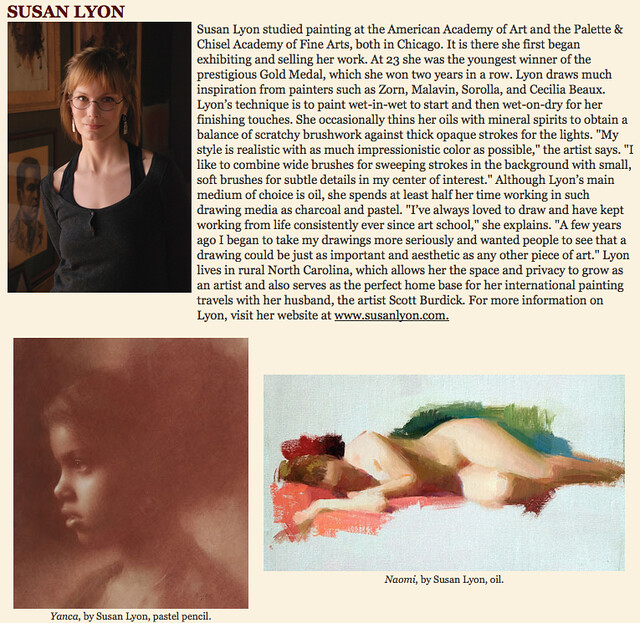
Last January, I took a two week Classical Realism workshop taught by Sadie J. Valeri in her San Francisco studio.
At the time I took the course, my interest in Classical Realism was purely practical. I paint at home nights and weekends, which for me has meant that the Alla Prima (wet into wet paint) method I was trained in at the Palette and Chisel and American Academy of Art, has required immediacy and speed, a process not well suited to my current working full time life style.
I thought perhaps the layered and methodical process of the Dutch/Flemish indirect process might provide me with a better working method, allowing me to work in stages rather than all at once, better suited to coming back over the course of several days and nights. While all of this is true, what I found after taking Sadie Valeri's course was far more enriching and enlightening than I'd expected.
For those unfamiliar with the term, Classical Realism refers
to the contemporary rebuilding of a legacy of art
instruction which developed from the Renaissance ateliers up through the
19th century Academies, which was nearly lost in the anti-figurative
philosophies of the 20th century. Sadie uses a process of indirect painting that was developed by the Dutch and Flemish painters, but many ateliers use a two or sometimes three step process.
For further reading, you can find extensive information HERE at the Art Renewal Center website along with many examples of past and present works. (also a huge array of articles and information on schools)
**********
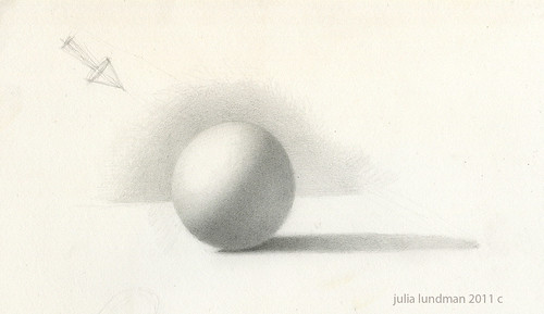
Construction Exercises and Value Control
The first exercise we worked on was a value sphere. I wrote extensively about this exercise, the terms and lighting effects HERE. At first glance this exercise might appear simple. I assure you, it is not! Like practicing scales on the piano, the value sphere is the equivalent for artists.
After we we practiced the value sphere, we studied the principles of organic form in Nature, contour and shape, perspective, and how best to construct objects, including a fantastic lecture on ellipses. **note: for this blog post I will focus primarily on the painting method and will outline in later posts the important information regarding structure that I learned.
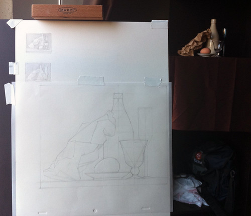
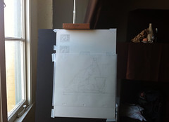
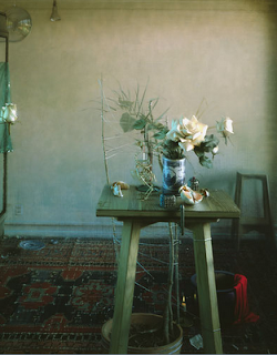
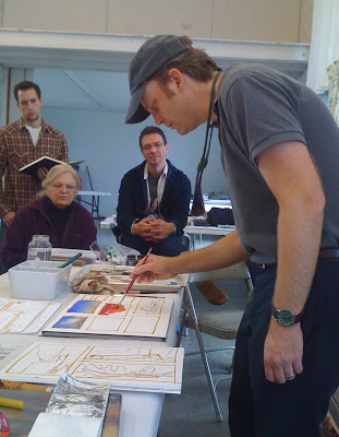
We began our still life painting by taping a sheet of mylar (vellum) paper to a board on our easels which were leveled in direct line with the still life set up. Using a viewfinder, we mapped out our composition by making small thumbnails. We then went over principles in construction of objects, breaking down our subjects into shapes using the straight line block in technique rather than sight size. **note: the two links are 1) example of a figure drawing using straight line block in from Sadie's blog and 2) a discussion on wetcanvas.com about sight size vs. other methods with good comments about non reliance upon sight size.
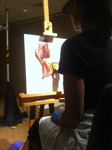
Each student's easel was set up almost at eye level with the still life. Our easels were set far enough away to make the set up just under life size, in this case about 4-5 feet away.The reason for this is practical; comparing side by side makes measuring and comparing easier rather than guessing and translating on to the page the size you would like the objects to be.
Also important to note here is that Sadie's studio is set up for North lighting, the most consistent form of natural light. We did not use any form of artificial lighting whatsoever for this course.
**********
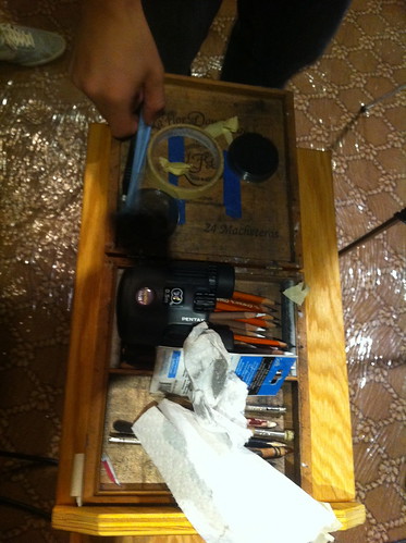
Materials for Painting
After we transferred our completed drawings to the gesso panel, we began painting. Here is a list of materials we used which can also be found on Sadie Valeri's website HERE:
Brushes:
Robert Simmons "White Sable" brushes with the maroon handles and white bristles (very affordable)
Filberts, 2 each of sizes #10, #4, and #1
Rounds, 2 each of size #1 (one brush for the light areas, one brush for the dark areas)
Mediums:
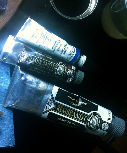
Refined Linseed Oil
Stand Oil
Odorless Mineral Spirits (Turpenoid)
Natural Turpenoid (ONLY for cleaning brushes, never get it into your paint)
"Silicoil" brand brush cleaning jar filled with Natural Turpenoid
Paint Rags:
Shop cloths are used (can be found at Home Depot) for the reason that other paper towels have too much lint - especially the popular Viva brand paper towels that many impressionist painters employ.
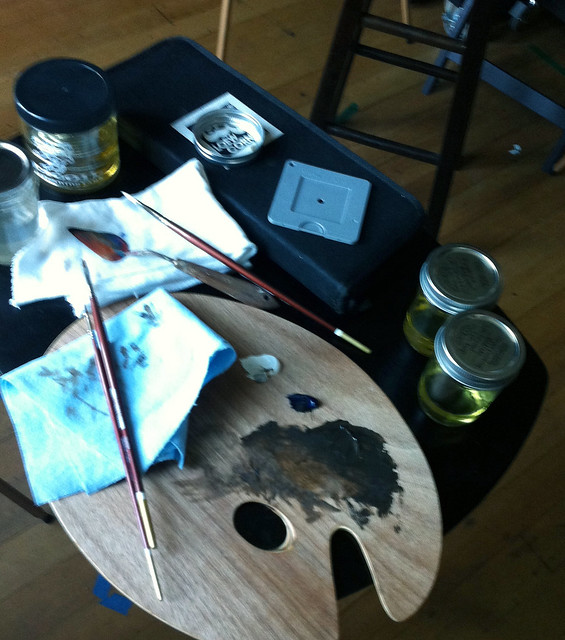
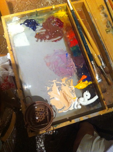
Palette:
classic wooden artist palette with thumb hole so we can pick it up or clip it to our easels.
(If it's brand new, brush on thick coats of linseed oil every night for several days/weeks and rub it into the surface or it will absorb oil paint.)
**note: when I was in art school we used untempered masonite panels cut to size at Home Depot, which we coated with linseed oil in the same way. these have no thumb holes but are great palettes and can also be clipped to an easel if needed.
Panels:
smoothly sanded gesso panel with no texture. Sadie makes her own panels (detailed blog post on her site HERE). You can also use Ampersand smooth panels or make your own.
**note: Daniel Sprick mentioned in his workshop that he coats untempered masonite panels with shellac, then five coats of Golden brand gesso, the last few coats he sands with a belt sander, and then applies Alkyd white to obliterate the texture completely making a smooth surface.
**********
First Stage of Painting
The Open Grisaille Layer
"Open Grisaille" means "dead grey layer" in French. The idea of this is a basic first pass of values that also creates a surface for later layers of paint to adhere to.
We began by mixing a thin layer of burnt umber, a touch of ultramarine blue, and small amount of white, thinned down with *only* turpentine. We used two brushes: one with paint and the other with turpentine on it which functioned as an eraser for mistakes.
We began by washing in the darkest dark in a thin layer. Rather than "swiping" in big strokes, we used small strokes, building our darks. This stage is called "open" grisaille because the white is the white of the panel - not white paint. This stage seems similar to watercolor in respect to how the paint is used, staining the paper in varying degrees of saturation, the white of the paper being the highest value. Here the "stain" is thinned oil paint on a very smooth panel. Thinking of it this way helped me through this layer.
This layer will eventually be completely covered up in the very next layer. However, skipping this step is not advised as it will help the oil paint bind to the surface of the very slick panel. I also found this step a good way to make "pathways" into the brain for understanding the nuances of how the light is working on the set up, kind of like a "warm up" for subsequent layers of paint.
Usually the open grisaille will take about six hours to dry. The panel must be dry before moving on to the next layer of paint.
**********
The "Couch"
After our panels dried over night upon completion of our open grisaille, we came back the next day to apply the couch. In fact, after each step is completed and dried, it is almost always necessary to apply a "couch" layer of underpainting medium on to the panel. A couch layer on a dried panel aids the application of the new paint layer and helps the paint absorb into the panel.
The underpainting medium (linseed oil + turp) should be applied in the thinnest layer possible using a clean large brush. Sadie will also sand between layers after applying the couch, (which is called wet sanding) using the finest possible sand paper tooth - #600 - in order to remove dust and lint that adheres to the panel over night. Many artists have various recipes for the couch - Sadie uses underpainting medium.
Also, we applied the couch only to an area we were working on that day because if we oiled an area we weren't painting, over the course of the day the oil would drip or become gummy.
**note: a good source for information about couching is in the book, Oil Painters Handbook, an encyclopedia that documents time tested techniques for oil painting materials and methods.
**********
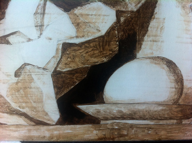
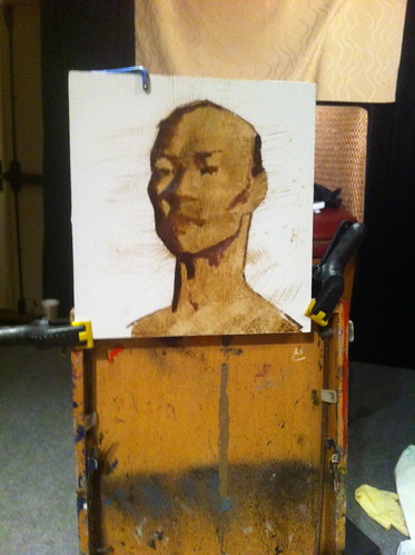
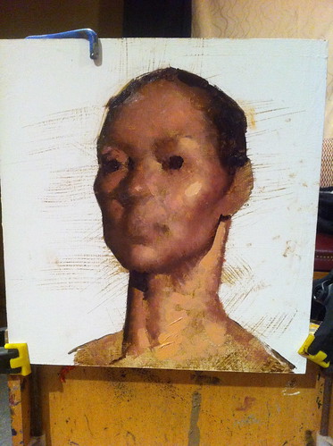
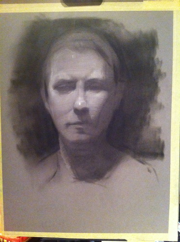
Closed Grisaille - The Black and White Value Layer
After the Open Grisaille step, we moved on to the "Grisaille" layer or Closed Grisaille stage. More information on the history of this method can be found HERE. This layer involves white paint and is completely monochromatic.
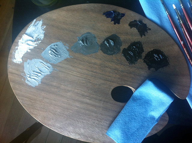
The colors we used to mix this grey are French Ultramarine, Burnt Sienna,
and Titanium White.
We mixed seven values, counting white as value one and near to black as seven. This in itself I thought was an excellent exercise for understanding how best to boil the infinite value scale down to a workable palette.
**Side Note: These black and white values are really warm greys. If you are not familiar with the differences between true cool greys, neutral greys, and warm greys, I highly recommend going to the art supply store nearest you and looking at sets of markers or gouache sets. You will notice the difference between the shifts between them, and it will help you gain an understanding of how how cool, neutral, and warm colors work. You could also buy some sets in three values of each marker and do some exercise sketching. When I worked as a background painter in the 90's, very often I would do value studies using these three greys - it is amazing at how "full" the color can look when really there is no color at all (or very little chroma, which is what is really going on).
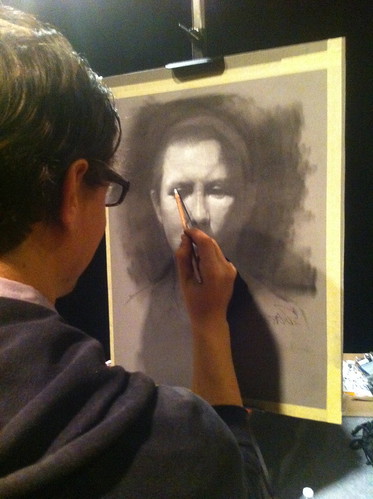
After mixing up our value strings, I was more than eager to cover up the open grisaille layer. Again, I found interesting information regarding how best to apply the paint that was quite different from the Alla Prima technique I was trained in. A lot of artists learn to apply paint in values that "band" together and then blend those value bands. Sadie instructed us that this methodology does not produce a truly accurate and nuanced representation of the values and causes loss of control. It is better to instead think of the paint as small tiles that move across the form, painting each as a very small "dab" - not swiping at all - moving across the form rather than up and down. It is important not to rush or feel like you need to get it all down in one day. The importance here lies in getting as accurate as possible the values of the set up before moving on to the color stage.
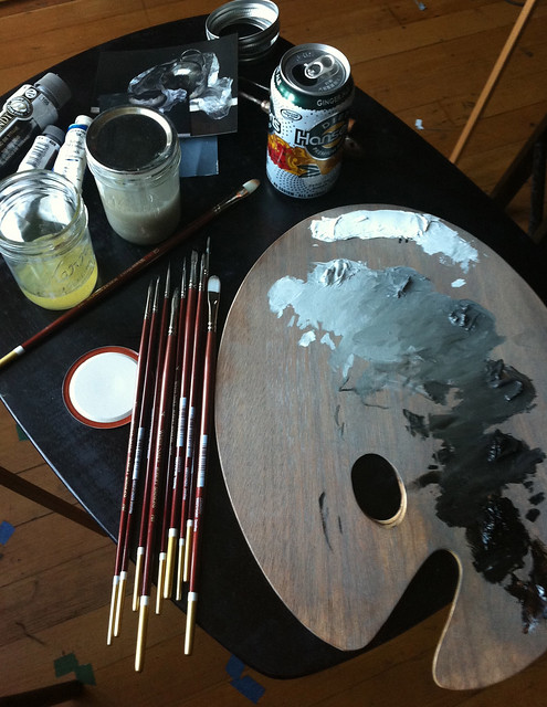
I love the look of a palette at the end of the day, although I don't recommend having your open can of diet hansen's ginger ale next to all those solvents. :) However, Sadie also instructed us to always keep the lids on our solvents and mediums while we painted to reduce the toxic effect in the air as much as possible. I was amazed at how six students were painting and yet the room barely smelled of paint at all! (a nice thing for anyone with asthma like myself)
**********
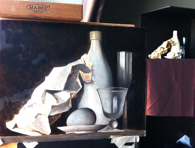
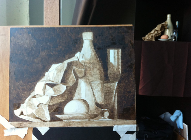
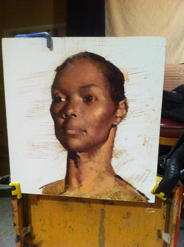
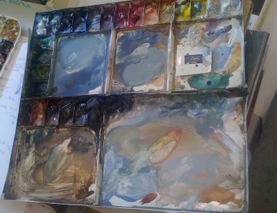
The Color Layer
After working a couple of days on refining the closed grisaille, black and white layer, we moved on to color.
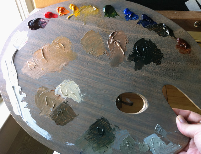
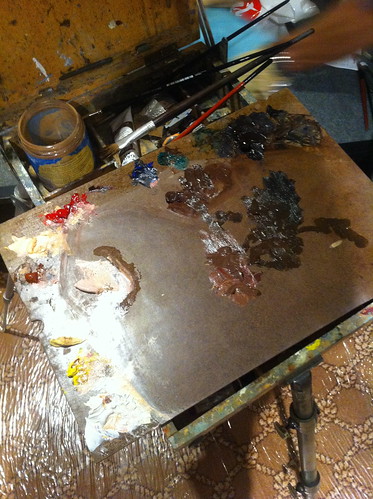
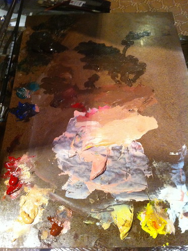
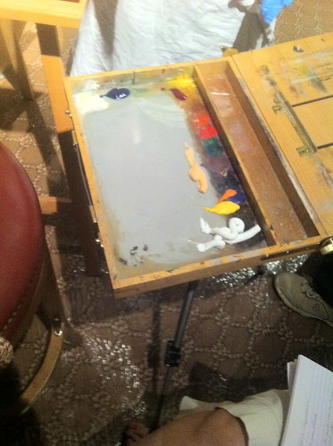
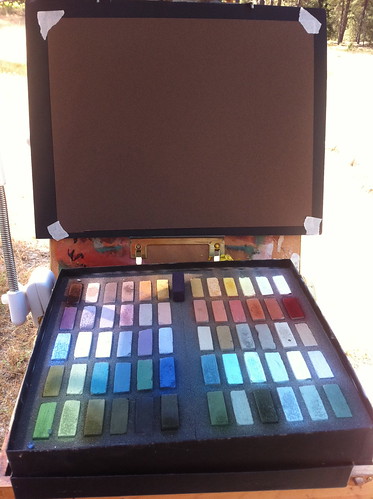
the colors on the palette below, from left to right: Titanium White, Alizarin Crimson Permanent, Cadmium Red, Cadmium Orange, Cadmium Yellow, Yellow Ochre, Sap Green, Cobalt Blue, Ultramarine Blue, Viridian Green, Mars Red, Burnt Umber.
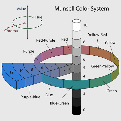
At this stage in the workshop, Sadie lectured about COLOR. Instead of getting into the ins and outs of this chart, I will post the Munsell chart. If you are a digital artist using Photoshop, you will find this easy to understand since Photoshop uses this color wheel system. If you are new to this concept, I suggest reading more about this HERE:
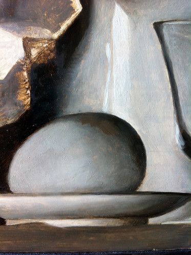
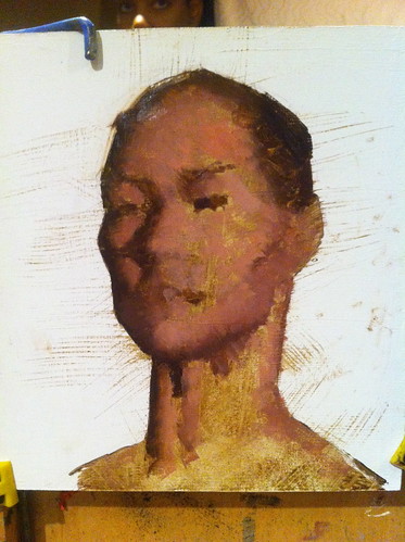
When I began laying in the initial color, I found it difficult to get the paint to adhere to the black and white layer with out picking up some of the black and white paint, which was muddying the color. To make sure this doesn't happen, make sure the closed grisaille layer is completely dry before applying color. I did appreciate the black and white layer, however, because I felt it made the color layer easier to focus on. Because the values were already noted carefully, I did not have to think about the value as much, which left me thinking about chroma and saturation instead. Nice!
Here we started by mixing up the dark color of an object, the light color and a mid tone. We painted thicker in the lights and thinner in the shadows, commonly referred to as "thick over lean", concentrating on the lights rather than the dark colors. We typically mixed a "string" of color before painting an object.
Another important difference I discovered between Alla Prima and Classical Realism was the handling of the highlight. Typically in Alla Prima, I would paint the warm tan-grey of the bottle first and then lay the highlight on top of that layer. When faced with the highlight in this set up, that is exactly how I began to do until Sadie intervened, explaining that in Classical Realism everything is painted right next to each other. In other words, the highlight is painted right next to the bottle color rather than on top of - sometimes referred to as "windowing".
** note: In addition, when I attended a Timothy Jahn demo at Sadie's studio in October of this year, he also mentioned this same thing: that he paints only a small section of a painting at a time, bringing it to full completion and then moves on, moving out and around the painting from there. (Visit his website here)
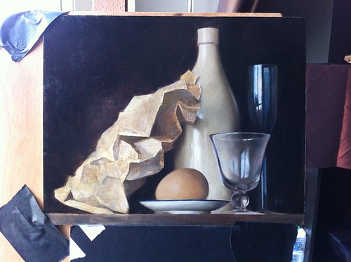
In the above photo you can see the black and white layer was mixing with my color. I found the next day when the layer had completely dried, the color went on cleaner without picking up the layer underneath. Be sure that b&w layer is dry!
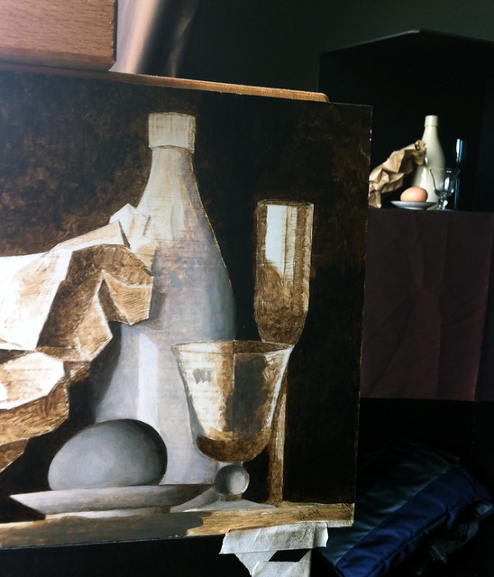
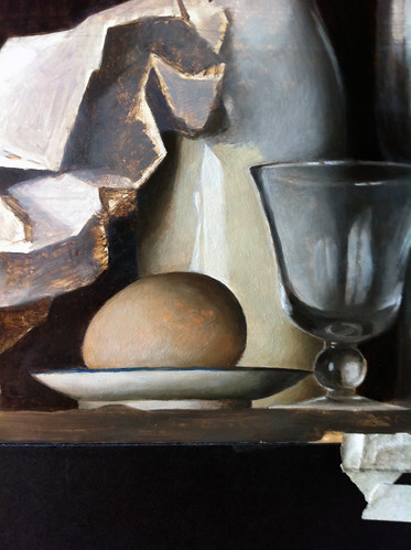
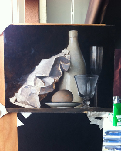
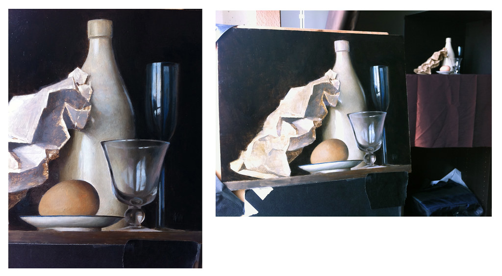
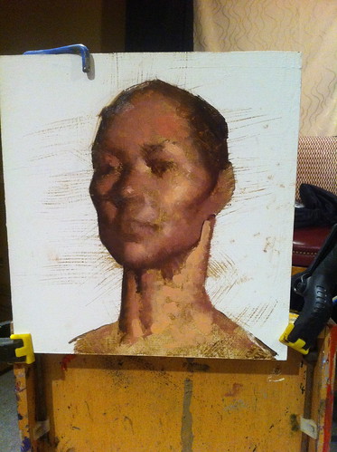
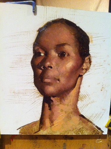
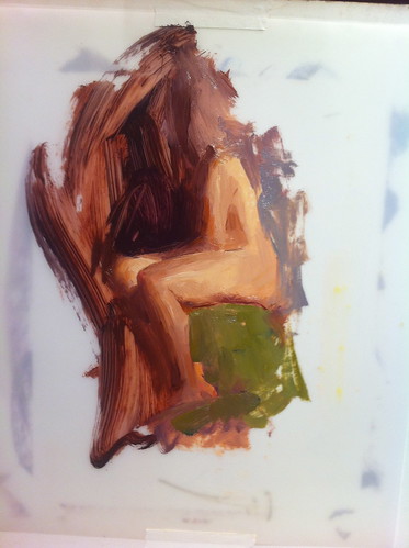
My set up included a crumpled brown paper bag, which I was not able to complete. I mainly focused on the egg and dish, bottles and two glasses. I quite enjoyed this step and could have worked on it for much longer, but at this point the two week course was finished.
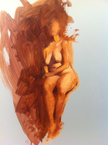
My semi-finished painting, above.
**********
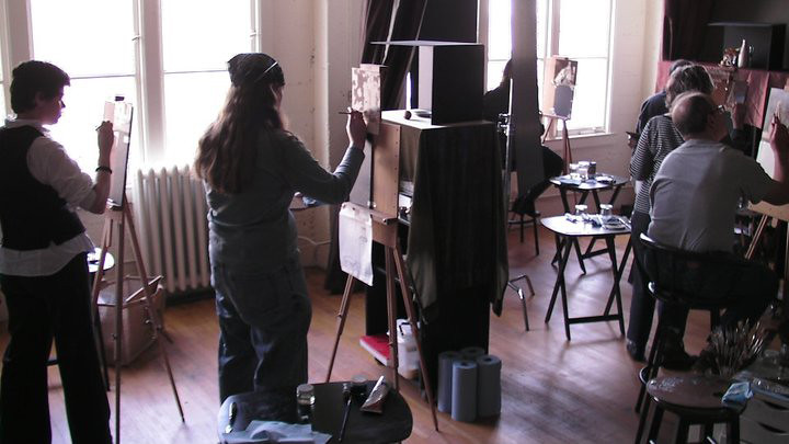
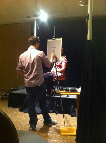
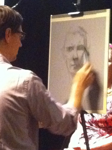
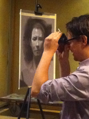
Demonstration and Lecture Photos
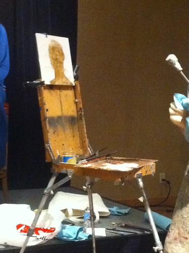
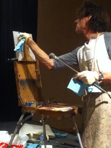
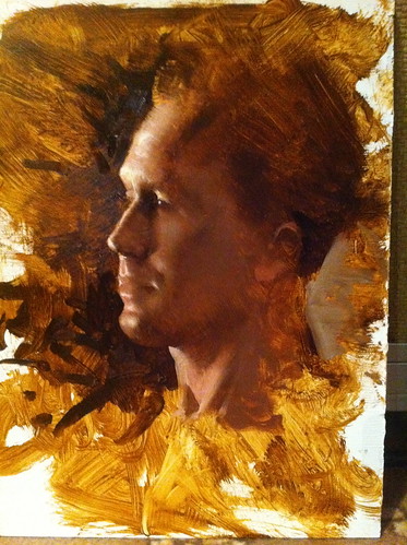
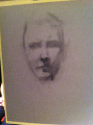
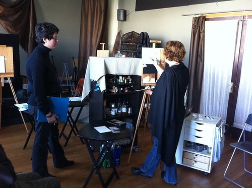
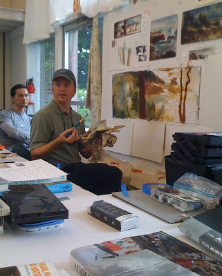
Sadie J. Valeri lecturing while she demo'd the grisaille "dead layer". I noticed how light her open grisaille layer was compared to mine. You can't tell in this photo below, but the paint barely made any texture at all on the surface.
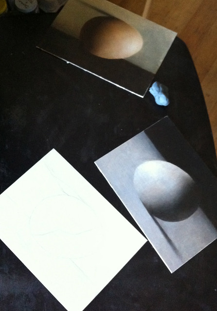
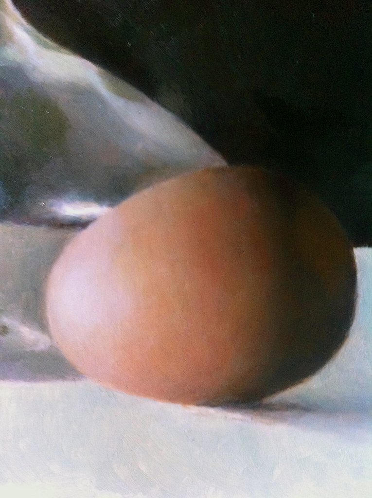
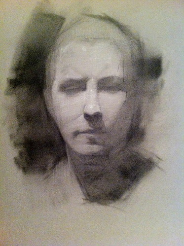
Three eggs in three steps, by Sadie J. Valeri. First, the pencil construction, second, black and white value layer, third, full color (although there is an open grisaille step before the black and white stage):
Here is Sadie's finished egg from the demo she started in the above photos. As you can see, her skill is well honed! It looked even better in person.
**********
Final Thoughts
The methods used in this kind of painting were commonly taught in Ateliers in Europe and America, but diminished during the late 1800's through 1900's during the age of deconstruction in Western Art. (which happened in all the arts, including writing, dance, architecture, sculpture, poetry, etc) A revival has been taking place over the last thirty years for artists who wish to learn Classical painting methods driven by those who have a deep desire to depict Nature in it's true visual state. As a result, Classical Realism has become a richly poetic form of visual art in recent years thanks to the many Ateliers popping up all over the US and Europe and support by collectors world wide.
But what if you don't have a desire to paint in this manner? While I see a lot of painters begin at workshops that are loosely structured and sometimes even stylistic, I highly recommend that students begin with Classical Realism. Additionally, if you have already attended art school, Classical Realism studies will solidify accumulated knowledge and enhance an understanding of visual principles. Every form of painting, Impressionism, Alla Prima, Naturalism, even Abstract Expressionism is an off shoot of this hundreds year old tradition. Modernist avant guard schools function as a reaction to and against Classical Art tradition. Knowing this, why not fully understand the founding principles of technique and explore the truths of Nature? Once an understanding is mastered and practiced, along with the philosophy and historical context, exploring areas of visual expression is borne out of a place of understanding and relevance with a nuanced and intended expression of a visual idea.
As for me, I have spent most of this year using my vacation time and weekends to take workshops of all kinds, and truly enjoyed them all. Because of this, I have intentionally put off my personal work. I still have a great deal of questions and interests to explore, which I hope to address in my own paintings next year. I will definitely be using this technique for many of my studio works and am very eager to start!


