Bee Rider

"Bee Rider", photoshop

A few years ago I had this idea that tiny humans with wings were discovered in various regions of the planet. It's not a new idea at all, but I wanted to mess around with making these fairies a sort of tribal, pagan warrior race that looked more human than the wide-eyed alien version. I am deeply inspired by the art of Mary Cicely Barker (of Flower Fairy fame) and Margaret Tarrant , Edwardian era artists that depicted tiny human-like fairies usually of a friendly beautiful sort. 

Margaret Tarrant watercolor

Cicely Mary Barker watercolor

I wanted to take their ideas about fairies and focus on aspects of character personality and group culture. It's a pretty big project that I am picking away at here and there in between many other projects. 

I did this quick little sketch about five years ago. I like the idea but it's a little too vertical for the kinetics of the scene, and the costume doesn't work for me. I wanted to explore warriors that are more gutsy and brutal instead of sweet. I scanned my sketch and then did a TON of loose drawings on top to work out the idea more to my liking. 

I also did a few studies of bees. Here are a few sketches. I thought about stylizing the shapes and the character far more than this, but in the end decided I'd rather focus on the story of the character, and of course (since I love to paint) the light.

I have a several more warrior fairies in the works in various states of finish. Hopefully I'll post a few more this year in between other posts. :)  Thanks for reading!

Disney's Palace Pets "Whisker Haven Tales"/Environment Designs and Color Keys

I recently had the honor of working with Ghostbot and Disney Publishing on ten 3:30 minute episodes of Disney Junior's "Whisker Haven Tales with the Palace Pets", directed by Alan Lau. Episodes can be seen here: 

www.DisneyPalacePets.com 

My primary role was to develop background "key" environments working from the approved animatics. If you aren't familiar with animation, a color key is an environment design that establishes a location, color palette, and lighting. It is then referred to by other artists on the  the team that need to create various points of view surrounding that piece of the film in the sequence. Elements like water that animate were tricky, especially bubbles. We had to take a close look at how bubbles looked under the water and out of the water. 

Time of day was a major consideration in many episodes. I created guides for blocks of 2-3 hours for each time of day so that the color remained consistent throughout the episodes. 

More episodes will be available soon via the Disney Junior Watch app on iTunes! The show is doing very well. It was a pleasure to work with Ghostbot and Disney on this exciting new show! 

Monterey Bay Aquarium/Color Studies & Sketches

Jamie and I recently went on a trip down the coast to the Monterey Bay Aquarium, one of my very favorite places in the world. We both brought our drawing, sketching, and painting supplies, including my new samsung tablet. Because most of my color sketching was going to be done inside the aquarium, I carried around my tablet in my messenger bag and took it out when I saw something I wanted to study.

As mentioned in my previous post, the primary reason I purchased the tablet was so that I could do a lot more color studies of interior lighting in situations where it would be difficult to take out my usual paints or pastels, places like restaurants, cafes, aquariums, museums, unusual interior lighting situations. Boy am I glad I did. Each time I would sketch from life in the aquarium, I would take a photo before I left. When I would look at the photo later, I noticed a HUGE difference - the camera most of the time did not capture the lighting effects I observed, and if it did, the spirit of that light was completely lost, subdued, or just not there. What an amazing learning experience!

***************************************************

Below are a few of my digital studies. I also did numerous pencil and watercolor studies of the animals in the aquarium, and a few pastels from up the coast. I will post those next week.

 The Kelp Forest. So glad I brought my noise canceling headphones for this one. There were deafening crowds of pre-teens on a field trip with their school. You never know what will confront you when plein air sketching - I highly recommend headphones if you sketch in public places. 

I liked the presentation of this display so much. The blue light spilling from the water and the  yellow-green reflections of the kelp were gorgeous. I felt the design stood well on it's own.

The sketch above is downstairs looking into the Sea Otter display, sea otters mostly spending their time up above water and only occasionally diving below. I noticed this perch watching people as they went by and thought it was funny...

Some sketches went faster than others. This one in the Deep Sea Exhibit was done in about 30 minutes. It was at the end of the day and just seemed to flow. I figured out a composition and story as it evolved in front of me. 

Of all the subjects I studied in the aquarium, this jellyfish display was absolutely the most difficult. I sat across from the display on the floor against a wall in almost total darkness. My eyes had adjusted to the dark, but when I looked down into the bright computer screen of my tablet, my eyes would adjust to that brightness, so that when I looked back up again at the jellies, I had to give my eyes a moment to adjust to the darkness again. VERY tough! I spent a good two hours trying to capture the light of the tank. Wow, what a learning experience this sketch was! 

Composition Breakdowns

In a recent class I took at the Animation Collaborative with the inspiring and seriously talented Armand Baltazar, we had an assignment to break down the compositions of narrative illustrations from visual development artists. We had to

1. write one sentence describing the story of the piece, 

2. describe the point of view (POV) of the piece, and 

3. describe the emotion intended by the piece. 

After that, we drew over the composition breaking down these elements:

 4. the division of the graphic plane (the graphic shapes that make up the composition),

5. Redline the division of depth and mark the foreground, middle ground, and far background,

6. Mark the center of interest,

7. Redline where the eye moves across the piece.

This was an excellent exercise in understanding the architecture of a picture and the thought that goes into guiding the viewers' eye directly to the center of interest. I highly recommend analyzing compositions in this manner for anything from drawings, paintings, and even sculptures to increase your own narrative compositional chops.  

Although the exercise appears simple, I learned a great deal by analyzing each piece. There were some pieces that I haven't posted which failed compositionally; the artist meant the eye to go to one place but unfortunately the eye focused elsewhere. 

Year of the [Electric] Sheep

In 1968, Philip K. Dick wrote a groundbreaking book, “Do Androids Dream of Electric Sheep?”, which was later turned into the film, “Blade Runner”,directed by Ridley Scott. Perhaps the best (at least to me) science fiction film and story of all time. Douglass Trumbull designed all of the practical effects, a profound inspiration on science fiction film and myself all these years. In honor of Year of the Sheep, I did this speed paint.

In 1968, Philip K. Dick wrote a groundbreaking book, "Do Androids Dream of Electric Sheep?", which was later turned into the film, "Blade Runner",directed by Ridley Scott. Perhaps the best (at least to me) science fiction film and story of all time.

Year of the [ Electric ] Sheep. Recorded with Camtasia Studio. Edited in iMovie. Painted in Photoshop CS 6. Initial base layer texture from Cgtextures.com. Custom brushes. Observational study of a sculpture I photographed in the Louvre in 2012, a marble vase originally in Versailles. Music by Vangelis, "Blade Runner". 

THE TIME MACHINE: Visual Development with Armand Baltazar/Animation Collaborative

I recently took a visual development course at the Animation Collaborative taught by senior visual development artist Armand Baltazar, who has worked for many years in animated film, with credits on Dreamworks, "Shark Tale", "Spirit", and "A Bee Movie", as well as Disney's "Princess and the Frog", and more recently Pixar's "Cars 2", among many others. Of all the classes I've taken in recent years, I found this course to be perhaps the most exciting. I've always been deeply interested in visual storytelling, although I've not always had ideal opportunities to practice that very fine art to the fullest I've wanted. So when Armand's course came up on the roster and time in my schedule allowed, I jumped. Aside from my own interests,  I feel a good visual development class is an excellent experience for any artist at any level to go through. So many of us have grand ideas around stories, world building and stylization, but how many of us have really gone deep into our visual storytelling skills? If you've not had the opportunity to take such a class, I encourage you to find one or else pick up a few good "art of" books for film, games, and television.

 Regarding this specific class at the Animation Collaborative, I felt it was absolutely worth it. Armand was a fantastic teacher and really put in a lot of extra work and effort in teaching the class, even staying late to give back really valuable individual feedback, paint overs and advice tailored to each student. Each class was chock full of fantastic information about visual development, portfolio development, and tips and techniques for working quickly, as is required on any project in development.

For the class we each picked a classic book to visualize as an animated film. I picked HG Wells', "The Time Machine", a book that I illustrated years ago, but unfortunately didn't do a very good job of it due to the extremely rushed deadline. For years now I've wanted to revisit the story, and have imagined a reboot tailored toward an animated young adult film. I thought I'd share my character design concepts here, and later will share more development. Over the course of the next year I'll be working up ideas around this story and will share more as I solidify ideas.

***********************************************************

My Time Traveler in my reboot of "The Time Machine" is a young woman in present day. When I draw character sketches, I like to keep a very, very simple line with almost no detail. I like to save any modeling or texturing for painting. I really enjoy the challenge of trying to capture a gesture in as few lines as possible.

I envision the Time Machine device to be wearable tech made up of everyday things like hacked ipads, iphones and a laser tag vest. Like in the original book, the time machine does not move the individual through space, but only through time.

Imagine what happens to those digits after thousands and thousands of years of swiping/touch technology… I enjoyed working on my take on the ELOI quite a lot. I envisioned them growing tall and thin with elaborate hairstyles and lots of adornments. 

 The Morlocks live in underground caves where they have evolved eyes that allow them to see in the complete darkness. They live amongst the ruins, pollution and grim of thousands of years of human corruption.

Below are some quick color comps and sketches of what I have been developing around story moment ideas. Most of these are pretty quick, like 2 hours each or even less in the case of sketches. All of these are meant to be exploratory in nature, and will eventually become more finished paintings. I can't wait to work on these!

 I've long been a fan of Douglass Trumbull, well known in the film industry for his innovative special effects on movies like 2001: A Space Odyssey, Blade Runner, and Star Trek: The Motion Picture. I wanted to emulate his effects in some way, and have envisioned the bottom row of images to be my take on time travel effects.

This is my quickie version of a future city, although I have plans to iterate on this a bit more. Given that our class was only 12 weeks and I only had the weekends to work on it, I felt that I didn't have enough time to really dig through this juicy subject. Looking forward to exploring some more concepts!

Hey, who doesn't need a hot Eloi boyfriend in the future? Actually, this is one aspect of the story that I am quite excited about: the friendship between The Time Traveler and Weena, in my version female (time traveler) and male (eloi). I think this can be resonate with the story themes in some unusual ways - I'm so excited to work some more on these ideas.

I actually have a number of additional sketches and comps, but they are still a little too compy to share. Hopefully soon! 

As I continue to develop my ideas I will post. I hope to put a little book together by sometime next summer, if all goes well. 

Thanks for reading!!!

Learning about Color


My first experience in learning anything at all about color was in making color charts at the American Academy of Art. I was pretty bummed at the time and wanted to just move ahead to painting, but looking back now, it was a perfect introduction. In mixing up charts we learned about how paint handles, what happens when one color interacts with another, and how value is related to chroma. After this, we went on to painting monotone samples for a while, then with limited palettes, and finally full color, usually assignments ranging from still life painting, illustration, and figure painting. We always used gouache to paint, with the exception of specialized classes like oil painting or watercolor where we always painted from the model.

However, the real break through for me came from constant practice during my years as a background painter of environments and color scripts at Calabash Animation in Chicago combined with observational painting in my home studio and the Palette and Chisel Art League where Richard Schmid painted.

For my background painting job, there were usually 7-12 imaginary landscapes and interior paintings per commercial that I had to plan out and paint. Because of the fine art curriculum I took in art school, we rarely worked from imagination. My only guess then as to how to make convincing paintings with no reference was to apply the principles I learned about in Carlson's Guide to Landscape Painting, which I kept at my desk and referred to constantly. This forced upon me a need to truly understand the concepts of atmospheric perspective, the way color behaves while in a landscape, and other principles of lighting that cause changes on local color of objects. By working backwards, studying light and atmospheric perspective, I could then put those principles into practice on an imaginary stylized landscape.

 A Lucky Charms commercial pan background I painted in gouache on illustration board, approximately 3 ft. x 14" wide, around 1994

 However, just working from what I learned in Carlson's Guide to Landscape Painting was not enough. I also pored through books of other artists' work, studying paintings very, very closely. If I had no ideas on color schemes for seemingly mundane things like pavement or boring interior walls, I'd look at how Disney background painters were handling these subjects - usually with interesting lighting, chroma and contrast and learned how lighting and color can be an important compositional element in directing the eye. I combed through book stores and the library to find painters who were working from imagination; I practically memorized every inch of James Gurney's Dinotopia book for examples of great color. 

"Lillies", 11x14, gouache on paper, 1992

But working from imagination alone, I believe, is not effective unless an artist works also from life. One tends to inform the other. During my years in Chicago, I regularly painted the still life, figures and portraits from life over at the Palette and Chisel, which helped me to develop a sense of how to mix paint, see color, simplify it, and apply it on canvas. I learned from Richard Schmid the principle of "cool light warm shadows, warm light cool shadows", something entirely new to me at the time. It was there that I learned how critical value relationships are to color, and how important it is to keep your color clean. Interestingly, I also learned from painting the figure and still life how it seems the majority of colors in any given subject seem to be more greyed down that I usually think at first, and how few really true high chroma colors are usually present.

Later on, when I needed to switch to painting in Photoshop at work, the Munsell Color System in the program gave me a way to visualize how connected the relationships are between hue, chroma, and value. 

After having these experiences, I believe that learning about color is not simply the study of one component like a color wheel or color charts. I believe it has to be a combination of methods plus a relentless pursuit in training your mind to see and translate color accurately. I am still learning and sharpening my color and values sense, and hope that by making another concerted push now in my life I might break through a plateau I've been experiencing the past few years. By documenting my experiences and writing down what I know plus reading new research and methods while also painting from life, I hope to make some improvements.

********************************

Learning to Mix Color


Color mixing is one skill in a set of skills that an artist needs to develop for painting in color.

As stated earlier, the first time I ever mixed color was my first year in art school where we mixed color charts. Later, I made much more extensive charts on a recommendation that Richard Schmid made during a lecture at the Palette and Chisel. When he eventually wrote his book, Alla Prima, he included the exact same advice where you can find it to make your own charts. 

The purpose of making color charts is not so that you have "recipes" for mixing color. These charts are not meant to be short cuts, recipes or formulas for color.  At the time I made these I did not know what each oil color did when combined with another in the palette I was using. When I had problems remembering what, for instance, cadmium yellow deep did when combined with terra rosa, looking at these charts helped guide me. When I needed to figure out what color I was looking at in a still life, if I referred to these charts, it helped my eye understand what it was seeing in terms of chroma and value - usually I would mix that color up and go from there by adding a bit of a third. 

Lundman-colorchart-yellowsreds

Lundman-colorchart-redsblues

Going through the process of mixing colors for charts like this is important in learning many useful things about how to handle paint, how to physically mix it, apply it, manipulate it into values, observe what happens to it's temperature, and notice how important it is to keep it clean. Making charts like this is also useful when you add a new color to your base palette or for experimenting with a set of colors to find how it reacts with other colors in your palette. 

********************************

Learning to Identify Color


Sometimes while I was first learning to paint, I used a small piece of white paper with holes punched in it. I would look through this piece of paper when I was stuck, aligning it with the color I was trying to identify. Very often I was surprised at what I found - a color that was either more grey, less saturated, and not at all what I thought it was. Often, I would mix up what I was seeing through the hole and put a small swatch up on the white piece of paper. I would keep doing this until I got the correct color.

To help visualize what I mean, I made up an example from a recent photograph I took. Although the water is somewhat greenish blue, it can be very difficult to identify specifically. Here, by calling out swatches, you can see just how green the water is and what it's value is. Our minds might tell us that the mountains in the distance covered with pine trees must be green, also, however by calling out the swatch, we can see that the hills are not green, but greyed blues.  


Screen shot 2012-08-14 at 3.36.17 PM
Since I was using Photoshop to make this example, I placed the color wheel there too so you can see where the green of the water is placed within that particular hue.

Isolating colors using a white card punched with a hole puncher can help break down the symbols of what our mind "thinks" it sees into what is actually there. Over time, this simple tool helped me to discover just how saturated or non-saturated a color might be. 

********************************

Tools to Understand Color


After sifting through multiple websites, I finally found two excellent sites that explain color and how an artist uses it. Just about everything an artist needs to know about the physical properties of color and light can be found on these two sites.


Other tools that help visualize and explain how color works are demonstrated in chart form.  It is widely agreed within the realist painting community that the Munsell Color System is perhaps the most accurate way of understanding color and identifying it in context with other colors. The system identifies three terms: hue, chroma and value.

value: the black and white scale, brightness, how dark or light a subject is

hue:
the local color of the subject 

chroma: the degree of saturation or greyness of that local color


Another useful visualization of the Munsell Color System is the way that the program Adobe Photoshop represents it. Photoshop has an excellent color picker that brings up a color wheel. However, I prefer to use an enhanced extension called Magic Picker, an excellent color wheel for Photoshop used by many professional digital artists. If you have a copy of Photoshop, open up the program and experiment with painting swatches using the color wheel. Playing around with the sliders and adjusters really helped me see how color works using this system. This is the same chart depicted above, but represented differently.

Screen shot 2012-08-14 at 3.26.40 PM

Adobe published a technical guide regarding the Munsell Color System. You can find it HERE.

For further reading on the color wheel, read James Gurney's "The Color Wheel" series, Parts 1-7 on his blog, Gurneyjourney.blogspot.com. Gurney has a different but related approach culminating from his years of research on the color wheel. Excellent information, worth the read, including the comments.

Artist Graydon Parrish teaches a three week workshop in using the Munsell Color System at the Grand Central Art Academy in New York City each summer. The usefulness of learning the Munsell Color System is that it can help any artist identify any color, and use that color to depict anything he or she wishes. It is complex to understand at first, which requires some study and practice. I hope Graydon continues to teach - his classes are on the top of my list to attend!

Here is how Parrish describes the way he determines color in his paintings:

"What distinguishes my system is that I make strings of single chromas combined with single hues. I analyze what I am going to paint, find its notation, then mix up strings to cover the range. Reilly's method used cadmiums, way out of flesh range. A string of cad orange brought down with burnt umber/alizarin crimson shifts not only in value, but in hue and chroma as well, making it hard to predict. Reilly too recommended the addition of neutral greys to kill the chroma, but this causes the hues to shift as well. This is something Reilly never mentioned.

The above is just the beginning. One can analyze, then translate so many effects of nature into paint. I have a photo of a Bouguereau drawing where he had written the various colors of his model: green-grey, yellow-grey, rose-grey etc. With Munsell, the notations can be much closer. No more vague terms. (How much grey, for example, is in green-grey?) Its better to say 7.5 YR 6/3 or 7.5 R 5/4, for the average flesh and the ruddies. Then with mixing and planning, one can create an entire palette of Bouguereau flesh, for every change in value, and predict the rise and fall of chroma.

Likewise, Paris Hilton, could be studied and painted as well in all of her sun-tanned splendor. She is likely a chroma 5. When you then know where the chroma rises and where it falls, why some colors pull yellow in the lights and others don't, and how various transparent objects are more chromatic on the edges, then you have the beginning of an entire repertoire of visual phenomena from which to create." - quoted from the wetcanvas.com forums, HERE.

********************************

How Color Behaves in it's Environment


In addition to studying the Munsell system, learning how to mix and identify color, it is critical to also understand the principles of light and how color is affected by it. Matching color in any given subject is an important skill in developing the eye to see color correctly and helps to determine your palette and pigment choices. However, also understanding the reasons that make color appear a certain way in a particular situation is equally as important.


The very best books I can recommend are:

 Carlson's Guide to Landscape Painting

 Andrew Loomis, Creative Illustration

James Gurney, Color and Light

Richard Schmid, Alla Prima

Here is a summary of some important points I learned from these books about how light and color work together:
  • cool light produces warm shadows; warm light produces cool shadows. (Alla Prima)
  • the most saturated color in a particular area is at the transition between the light side and the dark shadow and also at edges of objects. (Color and Light)
  • Values in a landscape are often as depicted below, the source of the light, the sky, most often (even at night) being the lightest value in the landscape, the ground plane the second, slanting planes third, and upright planes usually the darkest. (Carlson's Guide to Landscape Painting)
  • Value is the most important factor in a painting, with hue and chroma coming next. If values are correct, hue and chroma will still be able to read. (Color and Light)
  • a color will alter it's appearance depending upon the context of that color in the light or if other colors around it change. (Alla Prima, Color and Light)
  • the limitations of pigments prevent us from depicting the wide range of luminosity in the world around us, so we must make adjustments in order to get across an approximation of what we see. (Alla Prima, Color and Light)


page 34, Carlson's Guide to Landscape Painting by John F. Carlson

In "Creative Illustration" by Andrew Loomis, he dedicates a chapter entirely to the great Howard Pyle. Loomis included this chapter in order to pass on directly, in print, information that was taken in note form during classes taught by Pyle regarding his general theory regarding light and color.

"All objects of nature are made visible to the sight by the light and of the sun shining upon them. The result is that by means of this we see the colors and textures of the various objects of nature.
From this it may be seen that color and texture are the property of light and that they do not enter the property of the shadow. For shadow is darkness and in the darkness there is neither form nor color.
Hence form and color belong distinctly to light. Shadow - as the object illuminated by the sun is more or less opaque, so when the light of the sun in obscured by that object, the shadow which results is more or less black and opaque, being illuminated only by the light reflected into it by surrounding objects.
By virtue of shadow all objects of nature assume form or shape, for if there were no shadow all would be a flat glare of light, color and texture...But when the shadow appears, the object takes form and shape.
If the edges of an object are rounded, then the edges of the shadow become softened; if the edges of an object are sharp, then the shadows is correspondingly acure. So, by means of the softness or sharpness of the solid object, is made manifest. 
Hence, it would follow that the province of shadow is to produce form and shape, and that in itself it possesses no power of conveying an impression of color or texture."
-Howard Pyle, as quoted by Andrew Loomis, Creative Illustration, pg. 136

September 11th/Ten Years Ago

Ten years ago I was working as a full time freelance illustrator from my home studio here in San Francisco. I had moved here the previous year with my ex husband, Mike. I had been working happily as a background painter at Calabash Animation in Chicago and Mike was a lead animator and Director. In addition to working in animation, I was also painting and selling work in a gallery but the money I earned was not enough to make it a full time venture. As traditional animation turned toward cg animation, we were forced to look elsewhere for jobs. Mike and I both applied for jobs all over, and ended up in San Francisco when Mike landed a great position directing at Mondo Media.

San Francisco was not as giving to me, however. As it turned out, the first year and a half we lived here, 100% of my clients were from New York, Chicago, and Denver. The client I was working with the weeks before the attacks was the Art Director I worked with at Enesco in Illinois, with whom I had a professional relationship for about seven years. When she moved to another giftware company, she contacted me. My first assignment was to paint some beautiful angels, which would first be made into greeting cards and figurines if the paintings were well received. The project held the promise of royalties and long term expansion of my career into a field I always enjoyed - collectible sculpted figurines.

ANGEL1-V1-FINALPENCIL

Although I am not the kind of artist that typically paints angels or spiritual themes, I was excited about this job because it was figurative. Much of the work I painted in commercial animation was background environments, color design of characters and props, and color scripts of story boards. I fell in love with animation during my time at Calabash and was eager to continue working in the field, but found I did not have enough experience when I moved to San Francisco, and also had no digital skills whatsoever. Although I applied to animation studios around town, the answer was always the same. They wanted digital work, not traditional.

So this particular job held much promise for me as a new direction. I threw myself into the project. I spent long hours thumbnailing various poses, made studies of decorative elements from Art Nouveau designs, and researched costuming that I felt would work for this theme. All of my research sketches are lost, unfortunately. In addition to the pencils below, I had also rendered close up details of the edging along the bottom of the gowns, sketched out wings, and had designed specific flowers for the hair.

ANGEL2-V1-FINALPENCIL

 The pencils above are the first versions I sent. She requested that I change the faces to look at the viewer, and have a slightly happy expression. I felt angels would look more heroic, as they are intended to be, if they were not looking at the viewer, instead looking toward the heavens. I tried to convince her but she insisted on a friendly appearance and felt my pencils were too serious.

ANGEL1-V2-FINALPENCIL

I have two versions of this pencil (below). One is flipped. I can't remember which was the final version of the painting. Also, the reason there is tape all over the pencil is because this was the pencil rendering I used to transfer the design to illustration board. I painted all of the paintings in watercolor and gouache, my preferred medium that I had a lot of experience using as a background painter.

ANGEL2-V2-FINALPENCIL

On Monday, September 10th, I had gotten final approval for all of the pencils and the go ahead to start painting. I spent all of Monday transferring the pencils to illustration board. I was set to begin painting the first angel on Tuesday, September 11th.

The morning of Tuesday September 11th unfolded - and like the rest of the nation, I was horrified and consumed. 

My deadline came and went. I found myself unable to paint. Every time I put my brush to the illustration board, a flood of images and thoughts raced into my head - the artists who lived in studios in the towers, the pastry chef from San Francisco, the firemen who rushed in, the people in the Pentagon, the people on the planes. Painting angels felt so terribly ridiculous. I could not - would not - feel a sense of peace and hope while so many were lost in such a horribly violent attack. I explained to my Art Director that I would not be able to deliver the assignment on time. She was very upset with me and told me, "life must go on."

ANGEL2-V2-XEROX

I eventually finished the assignment. However, I lost the client. The original paintings were never returned to me. I never received samples of the finished product. I did get paid, thankfully. I never heard from my client again. I rolled up these drawings and put them away.  

Across the country, work completely dried up for freelance artists, causing great financial hardship for so many artists. The only silver lining for me during this time was that my father bought me a copy of Photoshop and a Wacom tablet for my computer. I spent all of my time learning how to paint digitally and rebuilding my portfolio, which led to a background painting contract at the Learning Company, a contract I was so grateful for.

Although it is natural to look for meaning in events, I still cannot make any sense or connection with these images of angels I was assigned to paint at this particular time. My art director was right in saying that life must go on. However, I feel strongly that we must pause to grieve for the loss the victim's families suffered that day and remember the soldiers who were called to war in Afghanistan and Iraq. 

Angelborder-xerox014

Peace

.

The art of sharpening pencils


Lundman-pencils-sketching

 I went to the American Academy of Art, in Chicago, where I quickly learned the art of sharpening a pencil, charcoal, china marker, and any other writing instrument that can be sharpened to a point. At the time I thought it was over kill to sharpen my pencils to such an extreme as required by my professors. I soon realized the reasons and advantages for doing so.

The methods taught to me at the American Academy of Art were passed down from the previous generation of professors, most notably William H. Mosby, the academy's master artist professor and graduate of the Belgian Royal Academy, and the great Andrew Loomis, who also taught at the school during the 30's and 40's. Some of Mosby's notable students include artists Gil Elvgren, Bill Parks, Ted Smuskiewcz, Howard Terpning, and Richard Schmid, who credits Mosby as his most influential art professor. (I had the good fortune to study under Bill Parks and Ted Smukiewcz while at the Academy, and learned a lot watching Richard Schmid paint and dispense wisdom at the Palette and Chisel in Chicago - an amazing learning experience!)

It is the influence from Mosby and Loomis that no doubt caused my generation's professors to require their students to sharpen their charcoal sticks and pencils in such a particular manner. I am still amazed the information lived on in our era of deconstructivism and forever grateful that it has. As silly as it might seem at first, sharpening drawing instruments is an important feature in mastering dexterity and refining technique, and I encourage everyone to try it at least once or twice regardless of final intention, be it illustration, "fine" art, cartooning, or whatever.

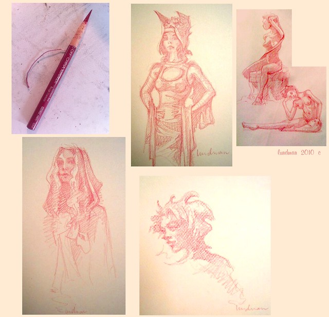
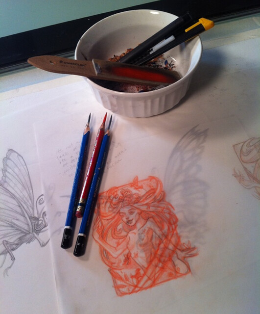
I try all kinds of pencils for sketching, but particularly love col-erase in various colors (mostly brown or red) for preliminary drawings (a habit I picked up while working in animation) and Staedtler Mars Lumograph 100 series in 2H, H and HB for final lines. I don't care for electric pencil sharpeners because they will not go far back enough into the pencil. I like to expose a good portion of the lead, say just under 1/3 of the way from the writing end. Part of the reason for this is because once the lead is exposed, I can also use the side of that exposed lead for blocking in or textures. Pencil sharpeners, electric or otherwise, just don't do the job as nicely as a utility knife or razor blade does. I also find it quite meditative and zen to spend some time getting my drawing instruments ready and have come to love the process.

Lundman_drawing materials

My typical drawing/sketching materials are from left to right:
staedtler sanding pad, col erase pencil, staedtler mars lumograph pencils in 2H and H, papermate tuff stuff eraser stick, olfa brand snap off utility blade, kneaded eraser (top right). 

I have tried many different types of utility knife over years, mainly using raw razor blades. Recently when I took Sadie Valeri's classical realism painting course, she suggested we purchase an Olfa brand snap off utility knife, one that I had not tried before and now quite like. I always carry these materials in a small bag in my purse and a sketchbook and at home I keep them in a bowl on my desk that I can sharpen the shavings into.

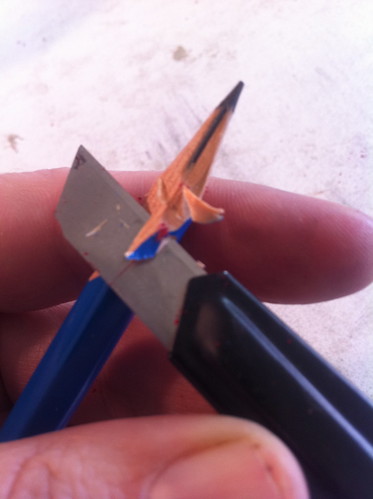
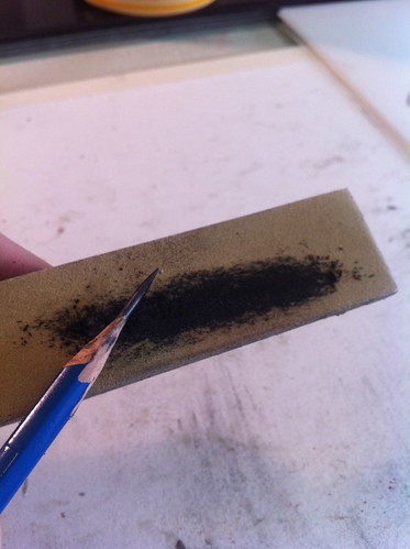
The technique is simple. Shave away the woody part until the lead is exposed.

Utilityblade

Once the lead is exposed, sand the tip of the pencil using a sandpaper pad until sharp. By sharp, I mean really sharp, like a needle. The sharpest you can get it. It takes some time and practice to get it just right and there are bound to be broken points, which is completely frustrating. I always trudge ahead knowing that having those sharpened points will give me one less thing to worry about while i'm drawing.
Sandingpad

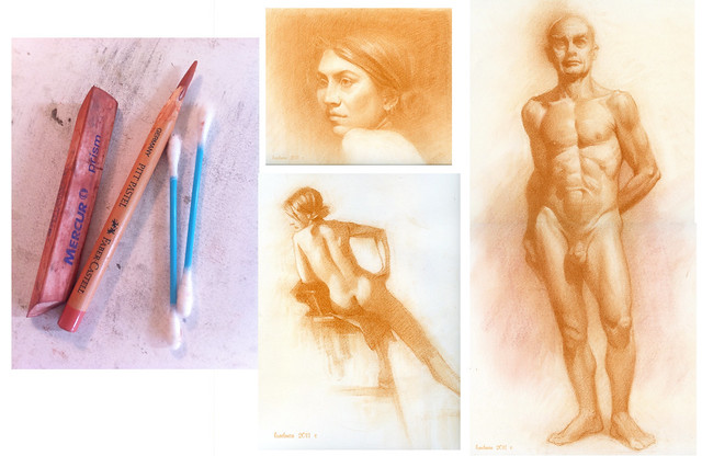
I use the same method for drawing with charcoal. I like to use Nitram Fusains, medium to soft, but mostly medium. When I sharpen this, there is no need for a razor blade or utility knife, just sand paper. I always sharpen at least two pieces to a fine point and keep a raw square piece for textures and block in of large areas.
Charcoal zen
Lundman_Charcoal_Walterportrait


I've also recently started using sharpened pastel pencils, Faber-Castell Pitt brand. Same methods apply. However, this pencil is quite soft, being a pastel, and therefore when sharpened does not keep it's point as well. That's ok however, because usually when I'm working with pastel pencils I like to smudge a bit.

Lundman_PastelPencil_Terry


And when I'm sketching gestures or quick 5-10 minute poses, I like to use a red or brown china marker which I sharpen, unwrapping the paper around the wax lead. It was in art school, again, where we learned to draw with a china marker as the great illustrators did. China Marker (not sure why it's called by this name) is really fun and produces a lovely line. I like to use red and brown tones because those colors are usually the undertone color of organic material.


Lundman-gesturemontage


So many artists are passionate about materials and quite specific about the type and methods used. It makes sense, after all. Pencils, charcoal, pastels, inks, feel like extensions of our hands. We channel all of our energies into whatever tool is being used; I sometimes feel like the pencil is a part of my hand.


Toronto Comic Arts Festival: Pencil it In from Toronto Comic Arts Festival on Vimeo.

Happy drawing! :))

Fairy Castle Freelance Project

Lundman-FC-Final_layout
Lundman-FC-Final_bw
Lundman-FC-Final_color

and here is a version with no characters, background only. I could mess with this forever, tightening up areas, simplifying shadows, etc. I wish I could draw and paint backgrounds again for a living. I love it so...

Lundman_CastleOnly-nomaypole
I recently worked on a freelance project for Michael Borge, who has created a show called, "The Royal Ladybugs". I was part of a small team consisting of a few artists, all female, who contributed really wonderful art for the show. Here is my contribution, the establishing shot of the Morning Castle.
You can see from the progression that I made quite a few changes along the way. The castle is part of an animated sequence as a reel to sell the show, so I needed to make the layout large enough and long enough so the camera can push in while some overlay pieces pull to the sides, an effect we used all the time when I worked at Calabash. I'm still a HUGE fan of multiplane. Anyway, when I am finished with the overlays I'll post those too. I think it will be really neat! This entire project was seriously FUN!

A few backgrounds

I thought I would post a few images from work to show what I've been up to professionally. I work for the online gaming company Zynga, maker of Mafia Wars, Cityville, and Farmville. For a short time I worked on the game Petville. Here are a few images from that game that I am most proud of, especially since I worked so hard on them. All are published last summer in the game Petville. Painted in Photoshop.

I was pretty happy the clouds in this - I worked really hard to make them transparent and luminous. I wanted them to look a bit reminiscent of the San Francisco fog.

Below are some images that I designed and painted for a Fairy Meadows release in the game Petville. The green flowery oval is a magic door. Below that are two more background images. They are populated with items in the shop that users can purchase to decorate their Petville homes.


all images property of Zynga.

Go to http://www.zynga.com/ and have some fun!

Reliquary Class at Ulla Milbrath's Studio!

This past weekend I took a class taught by the talented artist extraordinaire Ulla Milbrath, whom I met taking classes at Castle in the Air. Ulla teaches regularly at the Castle in the Air and also at her incredibly inspiring home studio, filled to the brim with handcrafted projects and antiques of all kinds.

I was inspired a few years ago by the reliquaries I saw on her blog after googling 'reliquaries'. I found these amazing pieces Ulla made, and discovered, even better, that she sells them at the Castle in the Air and other places, AND...she teaches classes in how to MAKE THEM.

She finally offered a class that fit with my too busy schedule, this past weekend. I couldn't wait! What a treat it was! Ulla taught me how to make each one completely from scratch using illustration board, mica, pieces of my own art, hand dyed ribbon, and - a new skill - soldering the pieces together. If you aren't familiar with a soldering iron it's like this: a very hot iron, who's tip is as hot as volcano, which you use to melt pieces of metal wire, which you then manipulate into pools of molten hotness and try not to spill on either your hands, clothing or art piece. How thrillingly DANGEROUS!

Details below each piece:


"Luna, Reliquary portrait"


Luna is a painting I did a few months ago and sold as a print at the APE festival. For this application, I printed her out on heavy stock and cut carefully with an xacto knife around the edges. The original has fairy wings and extends to a partial view of her torso, but since this is a small piece, I sacrificed those areas for the reliquary (Perhaps sometime it would be cool to try making another one with real cicadia wings!). The cut out illustration is sitting on top of a blue fabric I lightly dusted in clear glitter and on top of that a few pieces of luscious moss. Tucked in between the moss and Luna are a few vintage flowers and a few pieces of dried baby's breath. The outside is soldered metal, which attaches the mica covering.

Learning to solder the outside was a bit challenging and intimidating, but also dangerously FUN. I can see how it becomes addicting. Melted metal is so SAUCY! haha

"Daisy, Reliquary Portrait"

This is the very first piece I made, also using a painting I cut out and altered in order to fit the reliquary. It's still not quite working the way I want it to. But learning is all about making mistakes and trying new things. I hope to try alternate versions of this one too!


"Mossy, Reliquary Portrait"

The tiny painting of a woman inside this piece is something I painted a few years ago. Again, I cut her out very carefully, made the box, glued together...AND, for this one, cut some glass for the very first time to make the covering. Honestly, I am in awe of the vast knowledge Ulla has in all manner of techniques! This one is a bit bigger than the others, so I thought I'd show the context by photographing it in a few places. I left the edges un-soldered (is that a word?) because I like the way the copper tape works, but also because I plan to go back and tidy up the fabric edges and trim in the back.

Displayed next to my very small collection of Ephraim Faience hand made pottery and a pretty photo of my sister. :)

I am really excited about making more reliquaries. At the moment I don't own a soldering iron or other materials. The way I'm feeling is that the strongest one is the "Luna" portrait. I would like to try her with some cicadia wings. I also hope to make several more fairy portraits and reliquaries - maybe I'll even be able to finish some by WONDER CON! :)

Thank you so so much to my friend and inspiring artist Ulla Milbrath for spending an entire weekend teaching me the techniques involved. She worked really hard - I imagine it must be difficult to be teaching others while in your own studio, resisting the urge to make your own creations! I am deeply appreciative.

Clover and Luna concepts, close...but not close...

"Luna", 8.5x11, pastel and gouache on paper


"Clover", 8.5x11, pastel and gouache on paper


These are two experimental concepts for characters in a book I am working on. They are fairies, although they don't have wings in these portraits.

I have been obsessed with face painting and floral adornment for some time now, and would like to apply the idea to my story; for me portraits are a good way to figure out mood until I land on something that feels right for my story. I'll also do the usual character proportional line up sheet, etc, but for now I'm feeling out mood and experimenting with technique.

And, these, sadly, are not quite what I'd like. :( They are a bit too cute, a bit too young. Back to the drawing board.

But, having said that, they were totally FUN to draw, and I may even do some more. In fact, next weekened I am taking a reliquary class at Ulla Milbrath's studio, and have thought about making LUNA, into a reliquary.

Purrcasso Charity Benefit


I made my first donation to the Purrcasso Art and Craft Gala benefit for the Berkeley Humane Society. This year is extra special due to the tragic fire that damaged much of the shelter and killed many cats and dogs. Please come by Saturday evening for the auction on ORIGINAL ART by bay area artists!!! ALL proceeds go directly to the shelter.

November 6-7, 2010
Saturday 6:30-8:30 p.m.
Sunday 12-4 p.m.

2865 Seventh Street, Berkeley

Learn more at BerkeleyHumane.org


Here is my contribution to the auction.


"The Good Ship Purrcasso", 8x10", gouache


Booth at APE!

One of the many things I struggled with in getting my booth together for my debut into the convention world was how to present myself at my table. What font to use, what color scheme, is this really 'me'?, how much glitter to use...too many butterflies? Do I like scroll banners and should I add glitter flowers to it? All of these pressing questions led to a lot of panic and stress in the last few days leading up to my first con. Thankfully, well, more than thankfully, Jamie was there to talk me down off the ledge and help me organize what I needed to get done.

Besides the booth prep, there is the art itself, printing... what sizes to print, how to scan, what paper to use...and then: ordering clear bags and backing boards, then bagging all of them, figuring out pricing, signage, attaching the signs, and more. PHEW! It was a lot of work getting set up, but absolutely worth it.


But the VERY BEST part? At the beginning of the show, a little girl was excited about my fairy print, so I gave her one. The next day she came back and gave me her creation. Her gift filled me with JOY and makes me feel really super excited to continue working on my Fairy Conservatory project. What a GIFT!!! :)))


The next convention I am signed up for is the San Francisco WonderCon, in April. From now until April I will be working on my "Seasons" series (new pieces coming before the end of the year) and probably fleshing out some details regarding the Fairy Conservatory by that time, too. I'm also donating a piece of original art to the Purrcasso Art and Craft Gala, which I'll post when I finish (next few weeks). Good times and lots of creating!!!

Alternative Press Expo - Table #102

Hello! I am making my ***DEBUT ** this October 16-17th at the Alternative Press Expo in San Francisco - BOOTH 102! I've been outlining and designing a few long term projects that I plan to work on incrementally over the course of a few years. At this years' APE festival, I will kick off by selling 4 prints (and some original art) that represent a piece from each project that I will be expanding upon:

"Fall"
- the first in a series of art prints entitled "The Seasons". This series will continue with "Winter", "Spring", and "Summer".
"Daisy" - this is an art print from two self published children's books I am working on. The first book centers around a little girl who imagines herself to be a flower. In the second book, she imagines herself in an aquarium. The books will have no words, only illustrations.


"Luna" - this is a preliminary character exploration from a book I have outlined entitled, "The Fairy Conservatory".


"Sephalina" - this print is a pin up of my boyfriend Jamie Baker's character from his comic book, "Sephalina". Jamie self published a full color comic which will also be on sale at APE at his booth 108, a few doors down from mine. His book is hilarious, plus I love the way Jamie draws - I am honored to have a pin up in it! If you enjoy: Sci Fi, comics, humor, hot space girls, and art, you MUST pick this one up. MUST!

Please stop by BOOTH 102 to check out my prints, say hello and sign my guest book! I am so excited and *VERY* nervous! It is so, so ON!

"Fall" work in progress, Part 4


This painting is taking forever. I only have nights and weekends to work on this, so progress is very, very slooooowwww...... so many little details yet to paint, two weeks left to go before I need to scan and make prints for APE.

The birds are cedar waxings, which have a field day in the fall pulling berries off of branches. My next step is to finish all the birds, add blowing leaves, branches and berries, and finish up the background, which I would like to be simply stated and soft. My process is pretty straight forward: block in the big shapes in a thinner mix of oil paint, breaking down light areas and dark areas first. After the basic shapes of light and dark were applied, I built up thicker areas on top, with more value transitions in between. For thicker areas of paint, I use less thinner and more medium, which is 5 parts rectified turpentine, 1 part linseed oil, and 1 part dammar varnish. I like this medium because it allows the oil paint to get a really nice sheen to it as it dries, which is the look I'm going for in this one.
I realize the entire painting looks very orange. It is intentional. Since this is a series of four paintings, each painting will have a dominant color. I felt the Fall painting would be predominantly oranges, yellows, burnt siennas and reds. The birds are a bit more gray, so once they are put in I will add some more gray tones to balance out the color throughout the painting.