"LOSING TIME", Poster Roughs

This year I have been very busy writing and rewriting, and then rewriting again the story for a graphic novel tentatively titled, "LOSING TIME". 

The story takes place in the same universe as HG Wells' 1895 classic, "The Time Machine", but is an expansion of that world and events. 

Since I am also currently enrolled in Pixar Production Designer Steve Pilcher's Production Design course at the Animation Collaborative, I thought I would focus my class efforts on moving forward with this project to see where it would lead with some really great feedback.

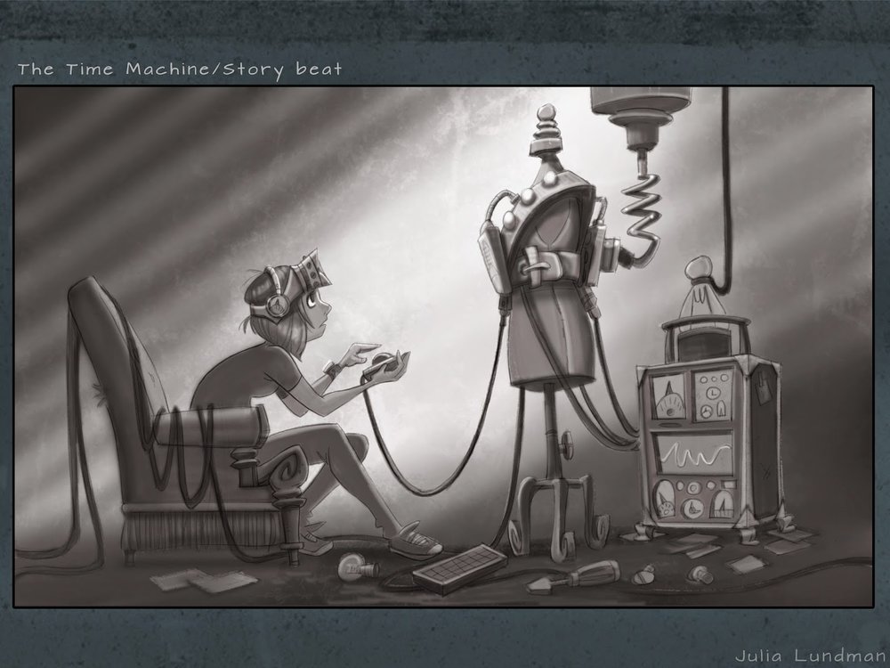
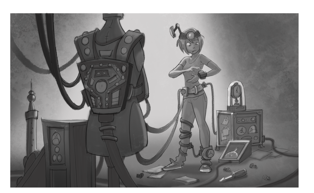
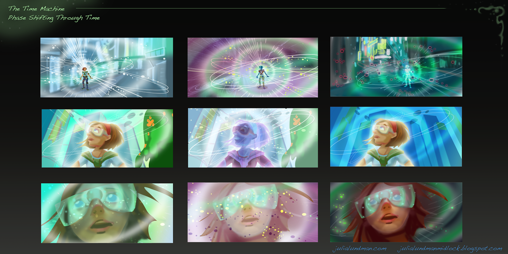
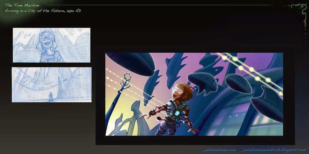
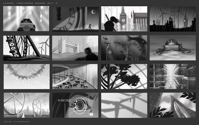
Immediately, Steve assigned "mood boards", story beats and other art that visualizes a general tone of the story, but only in three values. The idea here is to get a strong composition and mood that identifies the feeling of the story. I decided to focus on act 2 of my story, and although these are likely to change dramatically as the script develops, these were an awesome exercise that I will likely take with me on virtually every project I design on.


After the mood boards, we moved on to poster roughs. Creating a poster or cover art go a long way towards representing the overall motifs of the story. Working on this exercise has really helped me to think more deeply about the motivations and core ideas of the story I am developing in a way that I might not have otherwise thought of. 

Here are are my initial roughs. 


I will likely pick one of these from the second page, perhaps incorporating a border as well. I'll post the final after I finish it in a few weeks,  probably a week or two after CTN in Burbank this week! :)

Stay tuned, and thanks for reading!

Composition Breakdowns

In a recent class I took at the Animation Collaborative with the inspiring and seriously talented Armand Baltazar, we had an assignment to break down the compositions of narrative illustrations from visual development artists. We had to

1. write one sentence describing the story of the piece, 

2. describe the point of view (POV) of the piece, and 

3. describe the emotion intended by the piece. 

After that, we drew over the composition breaking down these elements:

 4. the division of the graphic plane (the graphic shapes that make up the composition),

5. Redline the division of depth and mark the foreground, middle ground, and far background,

6. Mark the center of interest,

7. Redline where the eye moves across the piece.

This was an excellent exercise in understanding the architecture of a picture and the thought that goes into guiding the viewers' eye directly to the center of interest. I highly recommend analyzing compositions in this manner for anything from drawings, paintings, and even sculptures to increase your own narrative compositional chops.  

Although the exercise appears simple, I learned a great deal by analyzing each piece. There were some pieces that I haven't posted which failed compositionally; the artist meant the eye to go to one place but unfortunately the eye focused elsewhere. 

THE TIME MACHINE: Visual Development with Armand Baltazar/Animation Collaborative

I recently took a visual development course at the Animation Collaborative taught by senior visual development artist Armand Baltazar, who has worked for many years in animated film, with credits on Dreamworks, "Shark Tale", "Spirit", and "A Bee Movie", as well as Disney's "Princess and the Frog", and more recently Pixar's "Cars 2", among many others. Of all the classes I've taken in recent years, I found this course to be perhaps the most exciting. I've always been deeply interested in visual storytelling, although I've not always had ideal opportunities to practice that very fine art to the fullest I've wanted. So when Armand's course came up on the roster and time in my schedule allowed, I jumped. Aside from my own interests,  I feel a good visual development class is an excellent experience for any artist at any level to go through. So many of us have grand ideas around stories, world building and stylization, but how many of us have really gone deep into our visual storytelling skills? If you've not had the opportunity to take such a class, I encourage you to find one or else pick up a few good "art of" books for film, games, and television.

 Regarding this specific class at the Animation Collaborative, I felt it was absolutely worth it. Armand was a fantastic teacher and really put in a lot of extra work and effort in teaching the class, even staying late to give back really valuable individual feedback, paint overs and advice tailored to each student. Each class was chock full of fantastic information about visual development, portfolio development, and tips and techniques for working quickly, as is required on any project in development.

For the class we each picked a classic book to visualize as an animated film. I picked HG Wells', "The Time Machine", a book that I illustrated years ago, but unfortunately didn't do a very good job of it due to the extremely rushed deadline. For years now I've wanted to revisit the story, and have imagined a reboot tailored toward an animated young adult film. I thought I'd share my character design concepts here, and later will share more development. Over the course of the next year I'll be working up ideas around this story and will share more as I solidify ideas.

***********************************************************

My Time Traveler in my reboot of "The Time Machine" is a young woman in present day. When I draw character sketches, I like to keep a very, very simple line with almost no detail. I like to save any modeling or texturing for painting. I really enjoy the challenge of trying to capture a gesture in as few lines as possible.

I envision the Time Machine device to be wearable tech made up of everyday things like hacked ipads, iphones and a laser tag vest. Like in the original book, the time machine does not move the individual through space, but only through time.

Imagine what happens to those digits after thousands and thousands of years of swiping/touch technology… I enjoyed working on my take on the ELOI quite a lot. I envisioned them growing tall and thin with elaborate hairstyles and lots of adornments. 

 The Morlocks live in underground caves where they have evolved eyes that allow them to see in the complete darkness. They live amongst the ruins, pollution and grim of thousands of years of human corruption.

Below are some quick color comps and sketches of what I have been developing around story moment ideas. Most of these are pretty quick, like 2 hours each or even less in the case of sketches. All of these are meant to be exploratory in nature, and will eventually become more finished paintings. I can't wait to work on these!

 I've long been a fan of Douglass Trumbull, well known in the film industry for his innovative special effects on movies like 2001: A Space Odyssey, Blade Runner, and Star Trek: The Motion Picture. I wanted to emulate his effects in some way, and have envisioned the bottom row of images to be my take on time travel effects.

This is my quickie version of a future city, although I have plans to iterate on this a bit more. Given that our class was only 12 weeks and I only had the weekends to work on it, I felt that I didn't have enough time to really dig through this juicy subject. Looking forward to exploring some more concepts!

Hey, who doesn't need a hot Eloi boyfriend in the future? Actually, this is one aspect of the story that I am quite excited about: the friendship between The Time Traveler and Weena, in my version female (time traveler) and male (eloi). I think this can be resonate with the story themes in some unusual ways - I'm so excited to work some more on these ideas.

I actually have a number of additional sketches and comps, but they are still a little too compy to share. Hopefully soon! 

As I continue to develop my ideas I will post. I hope to put a little book together by sometime next summer, if all goes well. 

Thanks for reading!!!

Character Design Course at Animation Collaborative

I recently took a really great character design course at the Animation Collaborative with Pixar Character Designer Dan Holland. 

During the last several sessions of the class we worked with the Story Class team and their teacher/director Louis Gonzales to develop character designs for their story. I focused on the satan character, "Booker", who is a voodoo supernatural otherworldly creature. 

I first started with a lot of research on voodoo both in the Caribbean and in Africa. I found some amazing reference and riffed on the designs keeping in mind that the creature underneath was supernatural.

These are my first pass very rough 5 minute sketches meant for exploration:

I also explored some ideas with incorporating alligator features in his face, since alligators are a common animal in the New Orleans region. These were super quick, like 5 minutes each - just gut reaction sketches.

After creating lots and lots of quick "gut reaction" sketches like the above, I started seeing if I could combine the two ideas into one. I gravitated toward a black gown, a skull with alligator like teeth embellishments as well as possibly gold filigrees, and necklaces that have lots of jewels and charms. I wanted the hands to suggest that the guy under there was not a human but some other being. I wanted the eyes to look like alligator eyes.

I narrowed in on the historical concept of satan: a former man who then became an angel, who then fell from grace and became the devil. I thought about what he looked like as a man, then an angel, and then the devil. I wanted to incorporate some evidence of that story into his design.

I wondered what he looked like without his mask - a demon with alligator teeth and eyes, alligator skin and maybe even snakes crawling all over him. Perhaps the mask he wears is the skull of his former human being self.

The Booker/devil character in the story presents the main character, Lou, with a magical trumpet that can play anything he wants with the expertise of a seasoned artist.

I thought he might also sit on a throne of sorts made of animal skins, horns and imagery that symbolized fate. I didn't have time to explore the throne more than this - I would like to go back and do a much more thorough exploration.

After presenting these to the director Louis and the story team, Louis felt that the Booker character was even more of a human being than I depicted him rather than a demon like creature. I went back to the drawing board and did some more sketching. The story team really liked the quick sketches I did of the character in a zoot suit with charms and a head dress but wanted a human face.

So I worked up some exploration of variants of the head dress, all based on the alligator motif with feathers, shells and sometimes horns. I also like incorporating charms which seem common in voodoo art. 

The one I liked the best is in the middle. His design is derived from african mask animal designs. I thought his beard might be dread locks with some charms worked in. I looked at patterns of fabrics from African voodoo culture and tried to think about how I might incorporate those designs into the zoot suit. I also tried adding some pins like you would see in a voodoo doll.

I think I could probably come up with many, many more concepts for this character, but I want to make some final decisions now that the class has ended. I'd like to paint these up and also put them into some compositions.