Yosemite & The High Sierras, 2015

This past July, I went with my family to the fabulous Yosemite National Park, Lake Mammoth, and Bodie. It was a family trip that was packed with activities and endless inspiration all around. Yet we were surprised when the hot, dry heat suddenly turned to RAIN, THUNDER, LIGHTING, HAIL, and SNOW! In fact, the Tioga Pass had to be closed one night due to snow and slick conditions along the windy, high elevation road.

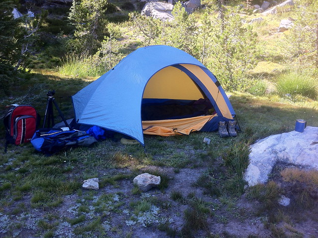
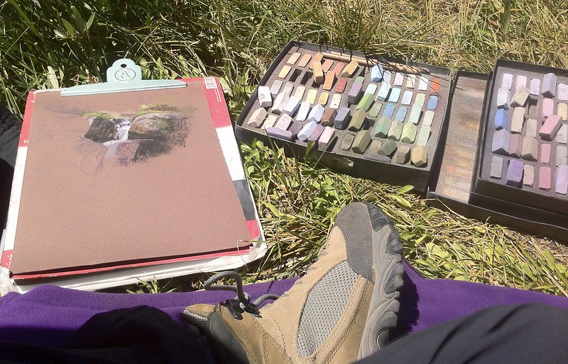
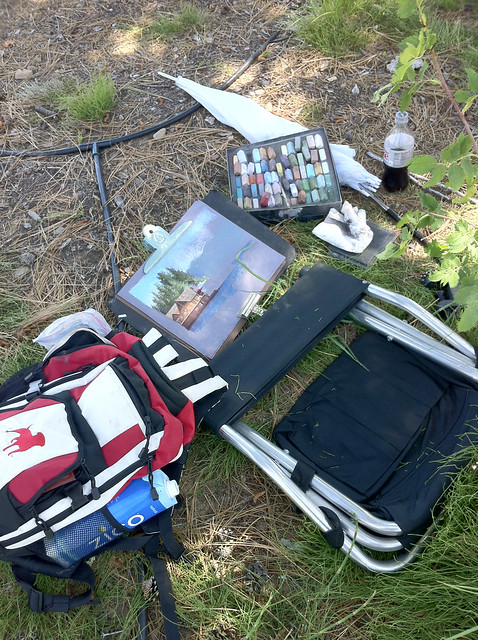
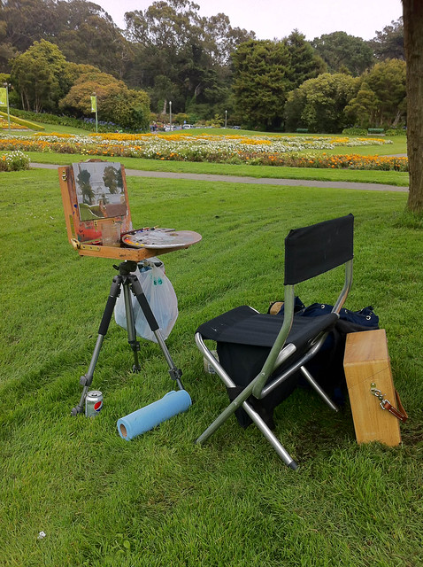
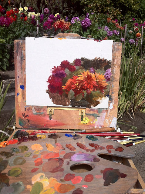
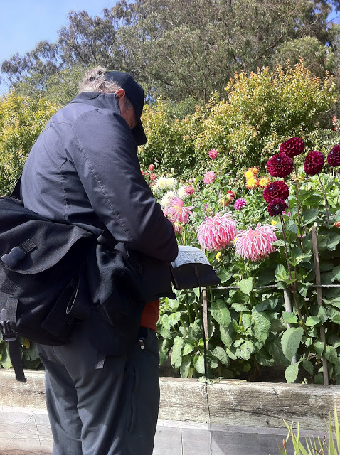
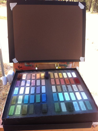
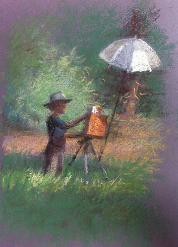
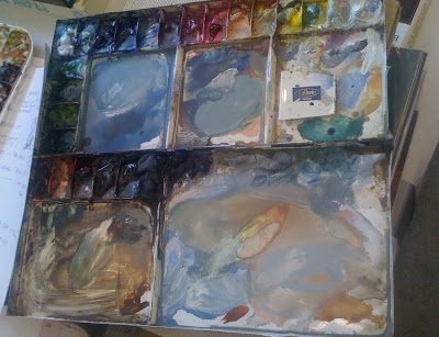
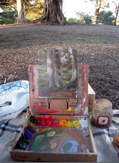
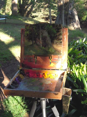
The weather curbed my painting time since my pastel kit would have melted if gotten wet. I regretted not having brought my oil kit, which can work in any weather. Because of the weather, I managed to sneak in just a few studies, mostly under the threat of rain or the watchful eyes of aggressive squirrels and scrub jays looking for a handout.

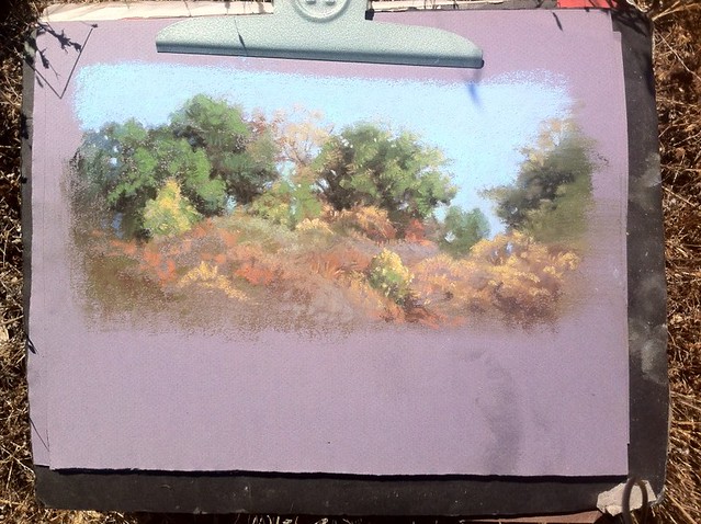
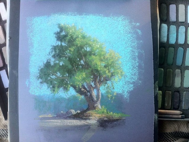
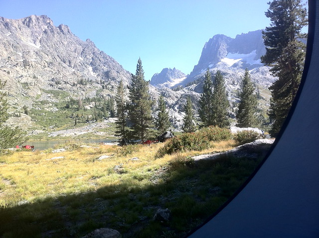
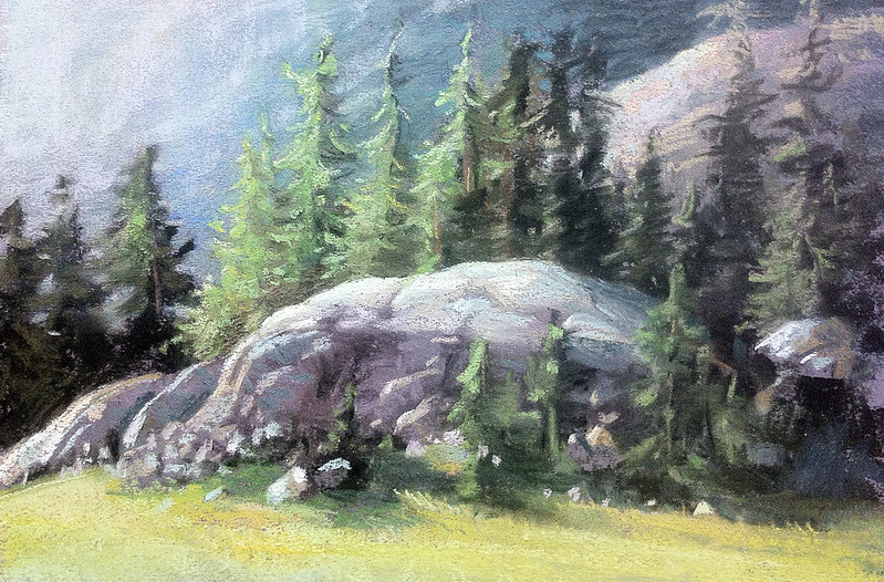
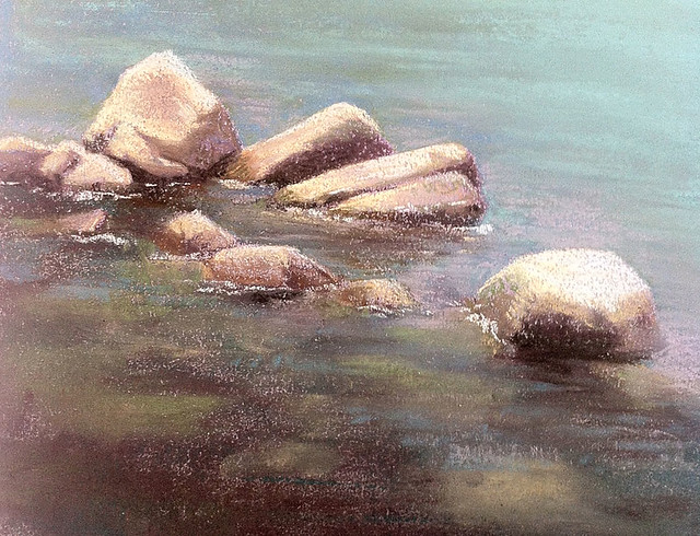
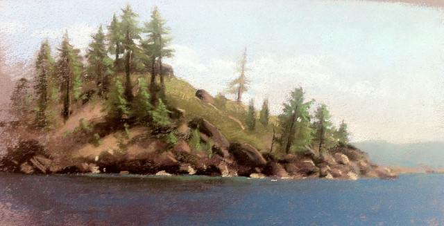
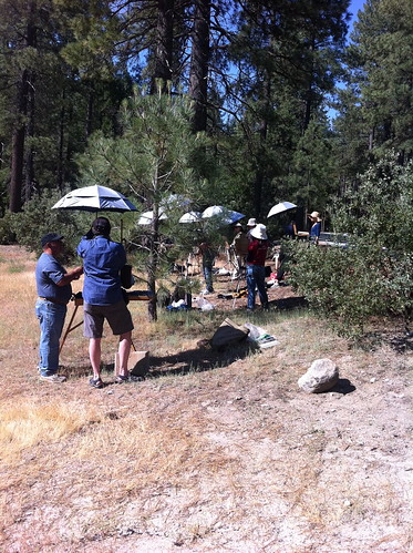
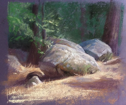
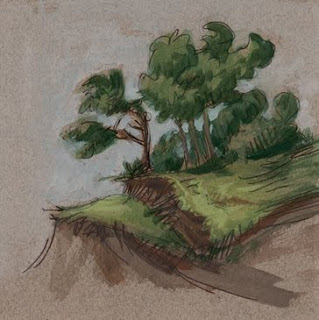
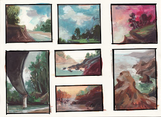
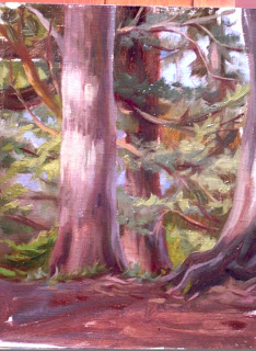
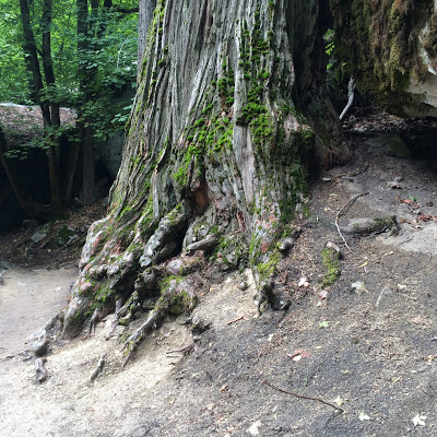
One hot, semi-rainy afternoon in Yosemite I went out a long the Mirror Lake trail. I was completely blown away by the massive moss covered granite boulders and pine trees everywhere. 


The scale alone is impressive! 


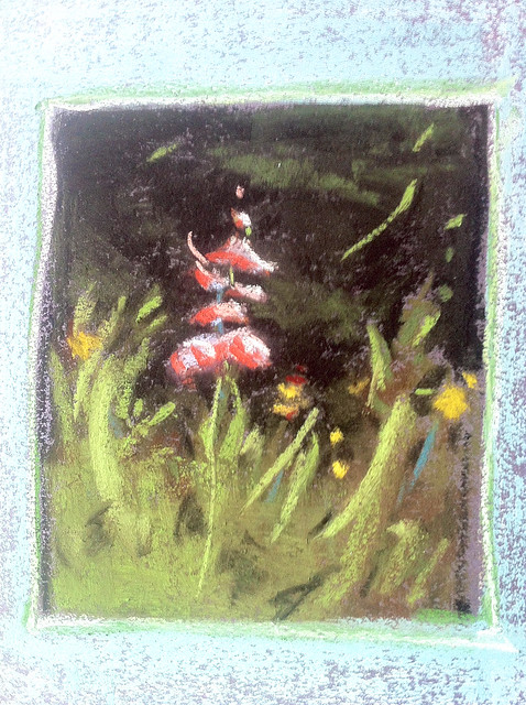
I stopped along the way off the path in a quiet spot from the huge crowds on the trail, spreading out my pastel kit on my oil cloth picnic blanket only to be visited by two squirrels who came right up to my backpack and sniffed around. 


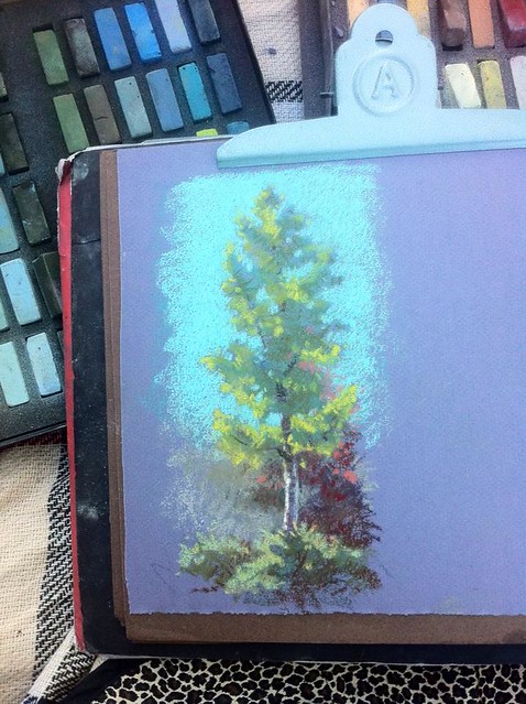
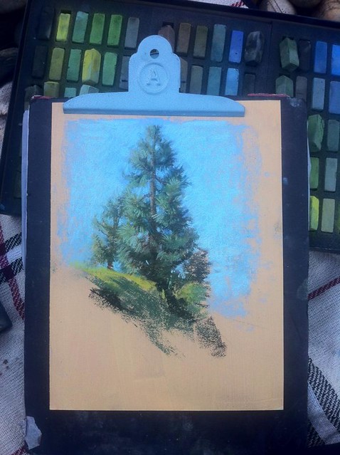
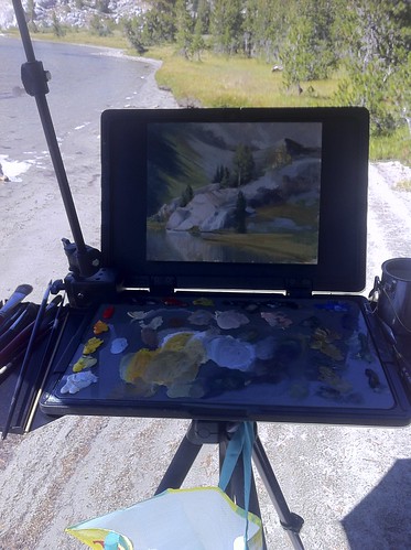
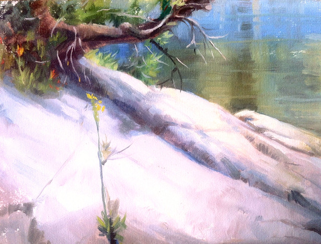
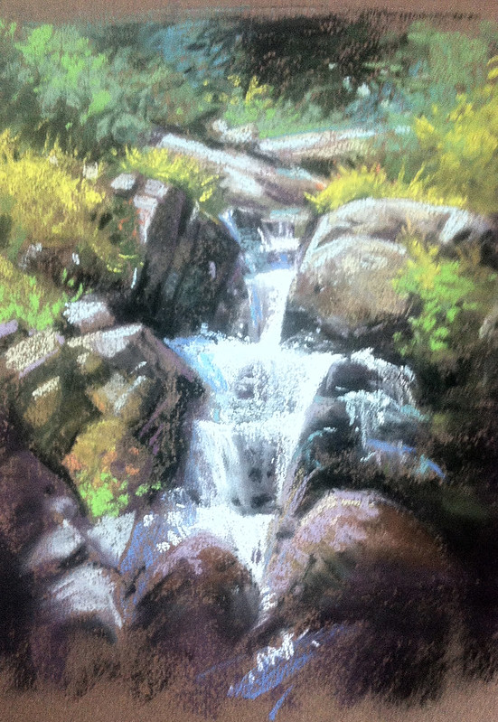
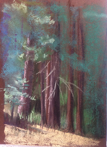
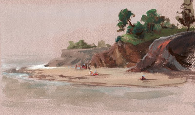
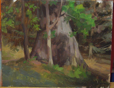
On another day out we all went along the Vernal Falls trail, which is mostly uphill. It was fortunately a bright, hot, sunny day with great light. On the way back down the trail I climbed up some rocks, found a nice spot and painted this quick 45 minute study. 


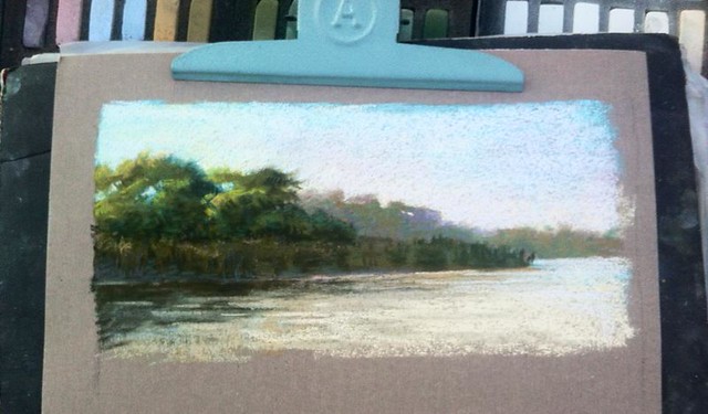
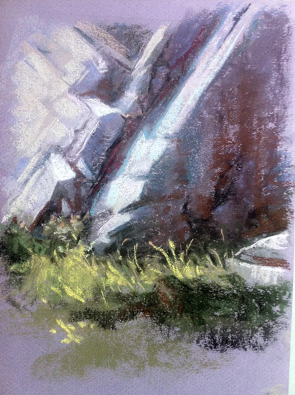
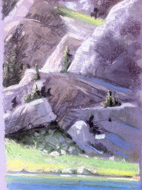
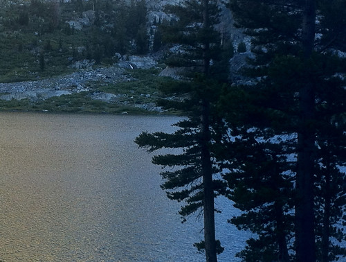
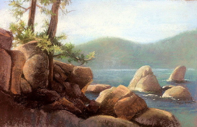
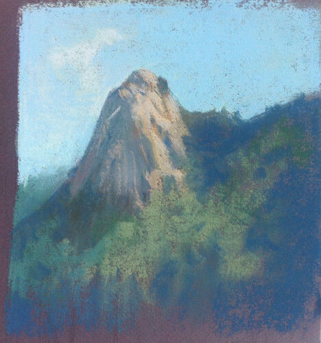
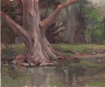
I ended up spending more time along the Mirror Lake trail since it had great views of the North face of Half Dome.


This view (above) is the base of Half Dome, while the painting below is a study of the entire North face of Half Dome, a different view of the usual one we see in photos of the park. 


After a full week bike-riding, playing, hiking, and laughing around Camp Curry, we left to make the long drive up to Mammoth Lake, stopping at the historic gold rush ghost town Bodie. A massive thunderstorm was on it's way, making it impossible to do any sketching.

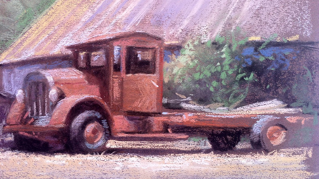
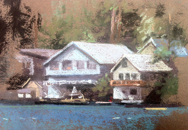
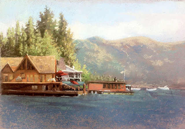
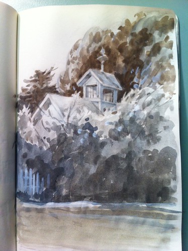
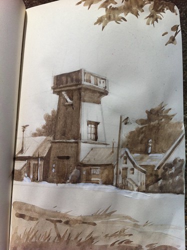
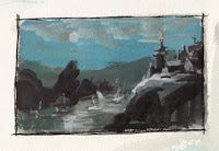
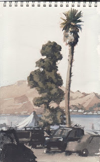
We eventually made our way to a cabin deep in the Mammoth Lakes area near Lake Mamie. We took a shuttle up to the Mammoth Adventure Center, where I found some a-frame chalet style cabins I wanted to paint. 


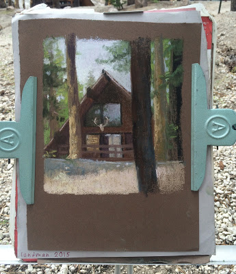
Just as I was finishing rain drops started to hit the paper, and I raced to cover it all up. 


*********************************************************************

What I missed in plein air time I made up for in art viewing.  Hanging on the walls of the famous Ahwahnee hotel is a collection of gorgeous Gunnar Widforss watercolors that are worth checking out, along with the collections of Native American baskets, stained glass windows and hanging textiles. 

The Ansel Adams Gallery on the Yosemite grounds is really more of a store but underneath large prints of his work hanging on the walls, beautiful books, prints and postcards of his work can be bought there. 

I think my favorite art viewing place in all of Yosemite was a small gallery that contained a collection of paintings by 19th and 20th century artists who painted around the valley floor after the landscape was designated as protected by Abraham Lincoln. 

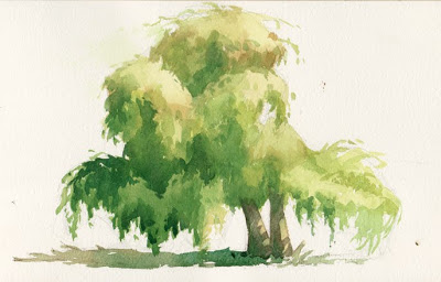
Below is a painting, "Yosemite Valley, Winter" by William Keith (1838-1911) that I looked at for some time. I am always amazed at how little detail an artist can get away with and still create a landscape that says everything it needs to. It also made me really want to visit the valley floor in snowy winter!


The brushy strokes of the trees are so simple. I've painted tons of trees and I have yet to achieve the gesture of one that is as effective as these trees in this snowy landscape.


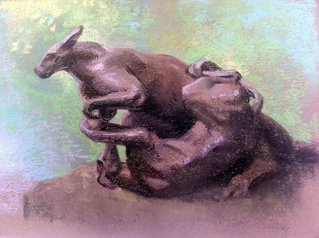
Careful gestures of the figures and horses - not too much over modeling.


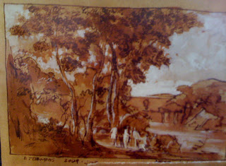
On a plaque next to this Thomas Moran painting (below) was this description:

Thomas Moran joined the Hayden Expedition to Yellowstone and traveled at his own expense to record the landscapes along their route. His paintings and the photographs of William Jackson were used to persuade Congress to protect Yellowstone, much as Carleton Watkins' Yosemite photographs had been used in 1864. He continued to interpret western landscapes - including Yosemite and the Grand Canyon - throughout his life, often on a grand scale. His daughter donated many of his works to the Yosemite Park after his death, and these pieces are now part of the collection of several national parks. 


This Andreas Roth (1872 - 1949) painting impressed me up close when I looked at his brush work. "Inspiration Point, 1933. 


Again, groupings of trees painted with simple masses. I love the negative painting in the shadow areas that create the look of tree trunks too. You see that a lot in watercolor but I've not seen it in oils very often.


I love the washy transparent masses of trees in the distance against the more opaque foreground tree. Works so well.


The watercolors of Gunnar Widforss (1879-1934) are always amazing to me for just the technique alone. The description says they were painted on pebble mat board. It seems the focus of Widforss' work was texture of things like trees, plants, rocks, almost pattern like in their treatment. "Halfdome in Autumn", 1923


Frederick Schafer (1839-1927), "Morning in Yosemite Valley, Cal.", 1887


At first this Albert Bierstadt (1830-1902) painting, below, appeared to both my dad and I a bit overly dramatic, but when I looked at it further I began to appreciate the masterful vignettes within the larger painting.  "Night at the Valley View", 1864


*********************************************************

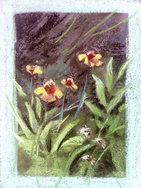
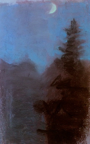
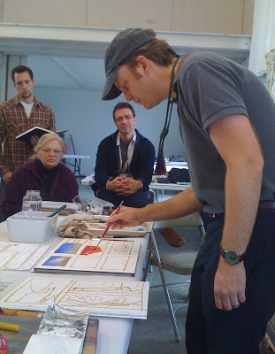
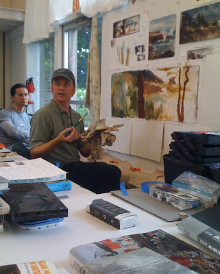
When we went up to Mammoth we stayed at a little cabin that had a nice porch area. On a few showery days my nephews and I sat out on the porch drawing and painting in our sketchbooks. What a cool experience to spend in sketching sessions with your own family. Nothing could be more fun!


Thanks for reading!


Pacific Marine Animal Studies

Some more studies from our recent trip to the Monterey Bay Aquarium. I spent most of my time trying to capture a gesture or general feel for each animal, then tightened up my sketches later using photos I took and in some cases video, the puffins being the most difficult since they were very busy beasts! 

The jellyfish exhibits are like nothing else I've seen at other aquariums. Absolutely stunning.

Moon Jellies (above) are in abundance in the Pacific Ocean, however because they are white they look very similar to white plastic bags. Sea turtles have mistakenly eaten plastic bags and died as a result, one more reason to go from plastic to paper. 

I really loved these gentle sharks. Conservationists are concerned about them becoming overfished due to sport fishing along the Pacific Coast, where they live, mostly along kelp forests and rocky areas. 

Tufted Puffins are in abundance along the Pacific Coast, especially up toward the Aleutian Islands in Alaska. I loved watching them - this guy was very curious about us! 

The light shining through the water in the Kelp Forest exhibit made the anchovy schools look magical. Anchovy schools tend to gravitate toward long columns of kelp in a swirling spiral upward. Sublime! I did these studies from some video footage I shot and then painted various parts of different shots to make it all work together as a portrait of the habitat.

A Couple of Plein Air Digital Paintings

For awhile now, I've been trying to come up with an easier take-with-me-everywhere method of plein air sketching. I have full plein air kits for pastels, oil and watercolor, but often I find that even though I keep one of these kits in the trunk of my car, I usually don't feel inclined to bring it all in to a restaurant, coffee shop or on an afternoon trip downtown. I wanted something MUCH more lightweight and accessible - and the iPad has been it.

Here is a sketch from a recent day trip to the ferry building in San Francisco, a busy tourist-heavy area of the city. 

A lovely day plein air painting at the San Francisco Ferry Building. I used the iPad Air, Procreate app, and Wacom Stylus 1. Music by Karrin Allyson, "From Paris to Rio". A note about the stylus: I recently purchase the Wacom Stylus 2 and discovered it does not work with many apps, including Procreate.

My main objective with iPad sketching is to mimic plein air oil paint using the alla prima technique, direct painting, as opposed to more labor intense methods. The idea is to work quickly on site and get it all down in about an hour or so of working. That means everything from gesture, composition, hue, value relationships and light relationships.

About the hardware: I have yet to find a stylus I am completely comfortable with; I am currently using the Wacom Creative Stylus. I am not keen on recommending it, however, because it feels like painting with a giant crayon. I unfortunately purchased the Wacom Creative Stylus 2 and found afterwards that it is not compatible with many painting apps, including Procreate. A few friends have given good reviews of the Jot Adonit Stylus, which is far cheaper and compatible with a lot of apps. 

In the Procreate app, I created a set of swatches in the color picker that are the standard colors of my basic oil painting palette, plus a few white convenience colors so that I don't have to constantly mix the same color over and over. Using these swatches helped me in getting a similar look to traditional paintings, although I think I could still fine tune the set. 

In addition to that, I am still trying to refine my brushes to find a working method that mimics traditional brushes. Procreate provides a set of brushes that you can then customize, but  I have yet to find some that are to my liking.

Continuing my exploration of digital iPad paintings with the Procreate app, I've tried to mimic my oil painting palette in the color picker to see if I can narrow down my palette choices. I am trying to find a good working flow for alla prima digital studies that actually look like oil painting sketches.

iPad Sketching

I recently got an iPad air over the holidays. In addition to my tree studies, for some time now I've wanted to study the lighting and staging of various live action shows that I admire. So I thought I'd start with a few shows, freeze frame the shot I like and do an observational study. 

I've also played around with various apps. There are so many out there, and I'm pretty sure I've tested them all at this point. The app I like the most is Procreate. It feels like photoshop, but has the basic stripped down interface that I need for painting, and adjusts that interface to work well on a touch screen. Other apps are clunky for various reasons, but Procreate has gotten it right.

Violet Crawley, The Dowager Countess of Grantham in "Downton Abbey". 

My first few attempts were frustrating because it seems that I cannot get the brush size or shape working well enough for me. Also, there is a slight lag between touching the screen and the brush stroke that is a little distracting. Other problems include the color palette; so often the color I thought I chose in the palette is not actually the right value. 

Worf from Star Trek Next Generation.

The above painting of Worf was a little frustrating too because I felt like I was fighting the pen controls the entire time. Also, when I exported it to my photo stream, the painting became darker. 

I then tried a bigger scene to see how it works for capturing an entire shot, not just a portrait. I found the brush controls really difficult in that case. The city in the distance for instance is really rough, not all how I was attempting to paint it, but an ok study of the general set up and lighting. 

Game of Thrones, Season 3, episode 2. Daenerys Stormborn on her newly acquired ship headed to Astapor.

Game of Thrones Season 3, episode 3. Daenerys Stormborn after she unleashes her dragon Drogon on the leaders of Astapor. (that must have been supremely satisfying!)

I love the lighting in this shot. I struggled with the styluses in this painting, trying to use the brushes to obtain a likeness in the eyes, nose and mouth, but finally decided that I need to think of these studies as just that, color studies. 

Latest Tree Studies

These days my life is pretty busy. While I have a few long term projects I'd love to finish (my unfinished/unpainted animation collaborative assignments mostly), they have been put on hold for a few months. At work I am concepting on a new game in development, which is a lot of fun, but also often means a 24 hour turn around on visualizing an idea. I've worked late nights and weekends for about a month now, leaving very little time for any personal projects. So for now its back to my very long term and much more slow paced relaxing art project, tree studies.

All of these I usually create in about 1-2 hours. They are all in places about town, usually areas where my boyfriend Jamie Baker and I can sit comfortably away from too many people. We've been to Golden Gate park, the Presidio, Stern Grove and Lake Merced. We even went on a trip down to Palo Alto where I work and did a tree study in the parking lot one Saturday. Fun times!

Here is my latest batch.


Palm trees in the Presidio. It was a bright sunny day. We set up camp right across from the Disney Family Museum - a great place!


Ok, so this is not exactly a tree study. I painted this in oil, a medium I haven't used outside for awhile. I think the darks in this are too rich. I'm working on keeping them a little more luminous.


pastel study of some redwoods in Stern Grove. 


Another oil study of some buildings in the Presidio. If you aren't familiar, it is a former military base located right next to the Golden Gate bridge. Quite a spectacular base, certainly gives West Point a run for its money!


Little palm right next to the DeYoung museum in Golden Gate park. Pastel study.


A quick oil study of a huge palm on the manicured lawn of the Conservatory of Flowers in Golden Gate Park. 


This is a grouping of trees in the parking lot where I work, Disney Interactive, in Palo Alto. I think the red tree might be a Japanese Maple, but I'm not certain. It was difficult to paint since I only have a couple of red pastels in my kit. Probably will get a few more soon.

I am also working on Sundays on a long term more tightly rendered still life painting, which I posted about below. Hopefully in the next few weeks I'll be far enough along to post some progress shots. 

Thanks for stopping by!

Tree Studies

For the longest time I've wanted to do an entire series of studies focusing on trees - just trees... single trees, groups of trees, macro views of bark, tree trunks, tree roots, various leaves and how the light falls on groups of leaves. Some trees seem to shimmer in the light while others have a distinctly light absorbing quality. I've always loved the various shapes, colors, and sizes but I can't say I understand them very well, at least from the perspective of an artist. Being primarily interested in botanical subjects in general, I've felt for some time that I need to do a serious study of trees and get to know a variety of species.

So I've just started my tree studies. Here are a few. I have been painting in the mornings before work in Palo Alto with a couple of really talented and passionate coworkers - kindred spirits in the brotherhood of paint. I've also been painting on Saturday mornings, early, and usually in the late evening on Saturdays on my nightly walk. 

These days my medium of choice for plein air is pastel, a medium I've fallen in love with over and over again. Painting with pastels feels so natural, like playing with crayons or colored pencils until I get something close to what I want. I can't say I ever feel that way with oil. There is also something really neat about seeing a giant box of pastel colors together that makes me feel good. It feels like harmony.

Lundman_fallcolorPaloAlto

Hilly bank in Palo Alto, pastel on toned paper. I think I spent about 3 hours on this.

Lundman_treestudy1_PaloAlto

A little tree, maybe an aspen, in the parking lot where I work, Disney Interactive. Pastel, about 1.5 hours.

Lundman_treestudy2_LakeMerced

Tree on the bank of Lake Merced in the late afternoon, just off the side of the path near the parking lot on Sloat. Pastel, about 2 hours.

Lundman_treestudy2_PaloAlto

This was a majestic evergreen variety that I was looking up at from the parking lot at work. Not the best perspective to be painting at. I tried to compensate for the foreshortening but I'm not sure it worked. I also painted this on sanded pastel paper. I don't like sanded paper at all. It just grabs up a ton of the pastel pigment and is difficult to blend soft edges. 

Pastel, about 2 hours

Lundman_LakeMercedsunset

Found in the Minarets, Sierra Pack Trip

Earlier this month, I went on a fantastic six day painting adventure with artist friends

Bill Cone,

Paul Kratter,

Ernesto Nemesio,

Michele DeBraganca,

Jeff Horn,

Eric Merrell and

Sergio Lopez

to the Eastern Sierras - John Muir-Edgar Payne country. It was precisely the kind of uninterrupted painting time I so yearn for but don't very often get. 

Lake Ediza was our destination, a steep hike up from about 7,000 feet to around 10,000 at the lake. As we hiked up from the Agnew Meadows pack station where we dropped off our gear for the mules to carry up, I was floored by the incredible views along the rocky trail as I breathlessly made my way up slower than my group, despite the conditioning/training I did a few months before the trip.

Lundman_muletrain

Our mule train arriving after a long hike up to Lake Ediza. Eric Merrell on the far right on top of a boulder.

Lundman_tentatEdizacamp

I set up my tent just under a tree, situated rather close to our cook's food storage/prep area due to the view of the Minarets from my tent. Given that we had a 4:00 am bear visit to the camp site, I think in the future I'd place my tent much farther away from the food source. I'm sure the view was just as magnificent a little further away.

Lundman_Minaretsviewtent

Zipping down the front flap to my tent each morning gave me the most amazing view! I did a few little pencil sketches from my tent in the mornings but mostly sipped coffee while staring at the mountains and feeling like all was right with the world. Probably not the most efficient use of my painting time, but deeply enjoyable nonetheless.

Before I went on the trip I planned out how I would approach the week of painting. I intended to sketch out a couple of long shots, a few medium and a couple of close up intimate scenes so that I could create a portrait of the area from large scale to the very small.

What I hadn't counted on though was how much the altitude seemed to factor into my experience within the first 24-48 hours. After we got up to Lake Ediza from a long and difficult climb up to almost 10,000 feet elevation, I found that even after a long rest and some water that my heart was beating quite fast. I tried my best to ignore it, but my worry distracted me and I didn't paint very well the first day.

Lundman_oilsketchnewkit

After the first 24 or so hours, my heart slowed to it's usual pace and I felt pretty comfortable. Still, I decided to stay close to camp to further acclimate to the elevation. While my camp mates were hiking up steep terrain in pursuit of painting gargantuan landscapes, I crawled along a stream bed close by looking for miniature wildflower compositions.

Lundman_wildflowerstudy1

I attempted several minute scenes, but these two are my favorites of the lot. Most of these tiny compositions were along stream banks underneath tree growth bathed in beautiful cool sunlight with reflected light bouncing in and deep warm shadows. The pastel set I brought did not have a yellow that was as bright and pure as the yellow I saw in the light, so I tried my best to layer a few colors together and tried adding some transition color along the edges in order to brighten the color.

Lundman_wildflowerstudy2

I also had some fun playing with the outside edges of the compositions, layering blue and accenting the edges with an emerald green. These little compositions reminded me a lot of the kind of watercolor paintings I did a lot of in my 20's. I would really like to get some hot press watercolor paper and do some more of these little flower studies. 

In keeping my goals, I decided to venture further away from camp in order to attempt a long shot landscape. I found a bank of trees at the opposite end of Ediza near to where we hiked in and made myself comfortable by the lake shore in a shady spot. I always enjoy large view paintings but do find them daunting at times. Part of the reason for this is probably technical on my part; I feel the need to hang out in one area until I get the entire area correct in terms of value, hue, and saturation before moving on to anything else. This I am sure is due in part to the lessons I learned early on at the Palette and Chisel via Richard Schmid, who often lectured about the importance of getting everything correct within the focal point first. It is entirely possible that I misunderstood his point, but still, there it is, imprinted on my art mind forever and the way I've approached painting since I was 19.

Bill must have wondered what the heck was going on because at one point he came up to me and said, "Commit Julia! Commit!" I had to laugh because I knew exactly what he meant. From that point on I told myself over and over, "stop the bullshit and lay in some more color!!!" I did find it helpful to stop lingering as much as I was in my focal point and get some more color down.

Lundman_sketch1
Lundman_treegroupingLakeEdiza

What attracted to me to this grouping of trees was the deep shadow within the bank of trees at the bottom. I liked the way the shape looked and liked how it was juxtaposed against warm and cool greens in the light. I'm not sure this photograph picked up the variety of color in the shadow very well, unfortunately.

Also, while I painted the mountain in the far distance behind the bank of evergreens, I noticed that the colors were muted variations of reds and greens, a color scheme I saw near the foothills of Zion National Park in Southern Utah. I wondered if these mountains have some of the same elements.

Switching to oil, I wanted to make a few studies of the light on rocks down by the water. I was attracted to the color in the shadows on the rocks - just jam packed with rich color that made it really fun to paint.

Lundman_rockfaceontheshoreofEdiza

However, this simple study was more challenging than it might look. I'd look down to mix up some color, look up, and all of the sudden the temperature in the light was completely different! I decided it was probably due in part to the reflection of the shimmering light coming off of the water from Lake Ediza. This one is also on Arches oil paper. I layered the paint thicker in this study to compensate for the absorbency of the paper which seemed to make my values at least a full value darker about ten minutes after I laid down the paint. 

I did another few studies of the Minarets but became frustrated with the oil paper.

 I think I'll switch back to my usual L219 new traditions panels for oil studies. 

Lundman_rockfaceEdiza

Switching back to pastels, I decided to turn around, move down the beach and paint a close up study of this rock face and shadow. The rock had a blue-grey local color and in the shadow side had some oxidization that made rich brown patterns along the cracks. The entire time I was painting the main deep shadow of the rock I could barely wait to paint in those wisps of grass in the light. When I finally put those little lights in, it was like going to the circus! 

Lundman_LakeEdizaview

I tried a longer view from across the lake. I had to work very quickly on this one since the shadow and reflected light was changing by the minute, it seemed. The triangle of shadow at the bottom was filled with cool deep greens while the shadows above had warm light bouncing into cool shadows.

The amazing thing about the Sierras, at least the Minarets and Lake Ediza, is the reflected light. I found it quite difficult to paint such bright bounce light in the shadows, always thinking to myself that no one would  believe my painting if I painted what I saw in front of me. It was challenging to keep the reflected light within a value range that was in keeping within the shadow while also trying to define form. I've always found rocks and boulders challenging more so than other subjects for this reason.

Lundman_RockSlab

I am so fortunate to have spent time amongst the Minarets with this band of talented mountain loving artists. What made it so deeply enjoyable was the kinship with fellow artists who were all equally enthusiastic about painting. As we sat around the dinner table while Kelly cooked we all talked about what we painted that day, the places we explored and the light we saw.

Lundman_Edizaatdusk

 The light at dusk was just stunning, absolutely my favorite lighting of all, the time of day when all of the color is blanketed in a blue grey bath. Apparently I wasn't the only one interested in this; right after dinner each night, Eric Merrell would begin to set up his pochade box for some nocturne sketching. He had an excellent night time set up with little led lights on his palette that were perfect for illumination and did not blow out the light when you looked up at the dark scene in the distance.

Lundman_EricMerrellnocturne

Eric painting around 9:00. Although you can't see it in this photo, the moon was quite bright, illuminating the landscape and flooding it with warm and cool grey light.

I attempted a nocturne, but quickly learned that in order to do it well I needed a much better lighting set up. Every time I looked down at my palette with my headlamp to locate a color I wanted, I would look up and find my eyes completely unadjusted to the light making everything in sight a giant silhouette. I tried using a dim book light on my palette instead which was an improvement, but then had problems locating the colors I wanted to use. Below is my result, for better or worse. 

However, I did indeed learn A LOT by making the attempt. Not only would I come with tiny LED lights like Eric's, but I'd lay out a limited palette ahead of time full of cool blues, neutral greys, and even warm greys and a few rich violets too. 

The sky was so rich, full of violet and ult blue. I also vividly remember a thin sliver of very warm yellow value 2 light on the outer lighted edge of the moon - very surprising since the rest of the moon looked cooler in the light. 

Lundman_nocturnesketch

Besides developing a nocturnal lighting obsession, I became completely enamored by the lighting around waterfalls that were close to our camp. These areas were typically surrounded by rocks that when wet became a deep brownish color, almost black in some areas. This looked really stunning against the white water washing down around them and the green patches of vegetation nearby.

Lundman_waterfallintoEdiza

I felt like one day's time was not enough to study this waterfall area. I really want to go back and spend a full week exploring the light and color of this incredible dynamic.

Lundman_waterfallsketching

A Plein Air Summer, Going with the Flow

This summer I left my job at games company Zynga so that I could accept a new job as Art Lead at Disney Interactive/Playdom, a position I am very excited about. In between jobs I had a month off, time I sorely needed and, of course, I used that time to paint. 

Jamie

and I had tickets to attend an event called

"Outstanding in the Field"

, a traveling chef tour that was hosting a dinner at

Farm Fresh to You in Capay Valley

. We booked the whole weekend with the idea of wandering around the valley sketching idyllic rolling hills and farm country. 

Tragedy struck on the first morning of the first day when we witnessed a terrible murder of a cute baby faun by a Labrador retriever. After seeing such a beautiful little creature murdered by the neighboring farm's family dog, I really didn't feel inspired to sketch the landscape. Since we still had three days and our fancy chef dinner wasn't until the last night, we wandered around the valley looking around for sketching spots. Somehow, nerves-of-steel-Jamie was able to concentrate, but my mind was completely shattered. Finally on the morning of the third day I asked Jamie to find a spot he liked. I resolved that what ever it was, I would force myself to paint - no matter how I felt. He had been eying some old trucks by the side of the road, so that's where we set up.

IMG_3860

"Old Truck", 8x12, pastel on toned paper

What a challenge...I found the first  hour was the most difficult. Maybe because I'm not an old-rusty-truck artist, I found the subject sort of interesting and different. That was enough to suck me into it, trying to find the correct placement of angles and figuring out the lighting and color shifts. Eventually my mind started to float away from those images of violence and into another world,

flow

Later that night we went to the Capay Farm dinner that was hosted by the "Outstanding In the Field" group. We listened to a great lecture by the owners of the farm and also by the people who run the chef tour about supporting organic farms. It was pretty great and so different from anything we've ever done. 

The entire time we were at this event, I was salivating over the GORGEOUS light all around us - and these photos certainly do not do it justice. I wanted to freeze frame so many moments and paint them! Alas, those images are locked in my private data base for future inspiration.

The very next week Jamie was working in LA. I flew down to Santa Monica the following weekend, where Jamie and I spent our entire Saturday and Sunday exploring the beach and sketching.

and also some time relaxing in the sun!

Although I tried both days to paint the Santa Monica boardwalk, I was not successful in capturing what I saw. The light was shifting so quickly, almost moment by moment! Trying to figure out what to focus on was my biggest concern. I really love touristy sites with all their bits of busy color and activity. I would love to come back and do an entire series of sketches of this subject and other lighting conditions I observed on the beach.

After that experience, I realized what I needed to do mentally and physically during this

rare

month off from work - I needed to focus and get some paintings done. When I think back on it now, I have not had a month off since I was 20 years old in college. Since then, I've worked full time every single day with just a few weeks off for vacations here and there. I've never had time to explore a particular subject or a concept in a series or do very large works - something I am

itching

to do. A month off from work certainly is not a lot in the big scheme of things, and at the same time, incredibly precious to me. 

With that in mind, I decided to rent a hotel room up at Lake Tahoe by myself. All I brought with me were my backpack,

Terry Ludwig pastel box

, paper to draw on, my horrifying paint box and too-heavy tripod, my camp chair, painting umbrella, a book on John Muir meditations, flip flops, bug spray, hygiene necessities, my iphone, and some painting clothes. 

IMG_3859

"Lake Donner Sketch", 8x10, pastel on toned paper

Actually, I forgot to mention my family was visiting too, staying at a rented house in Truckee. I really didn't paint during that time. Instead, we did all sorts of cool things like kayaking, hiking, hanging out, and watched the Olympics. The only sketch I did do during my family's visit was this one, above, about 1 hour.

Ok, so I was a total loner AFTER my family left. I rented a cheap hotel room in Tahoe City, with the goal of completing one painting per day. That's right, only one painted sketch per day. Although I can if I have to, I am not crazy about fast sketching. I like to find a spot I love and spend a full 4-5 hours to record what I see. My goal here was to really get in there and study the light, get everything working together rather than an abbreviated sketch. Too much of my life already consists of half completed thoughts and quick sketching; I simply had the urge to complete full thoughts and go at a slower pace.

IMG_3864

"Tahoe Vista", 10x12, pastel on toned paper

What attracted me visually about the coast of Lake Tahoe was the surprising juxtaposition of the earthy palette of the mountains and lake against the extreme saturation of summer time water sports, outdoor cafes, and boats. Again, I found myself gravitating toward touristy sites full of tiny bits of saturated color.

Lundman_TahoeVista_Inprogress1

After painting a few busy spots, I ended up at the AMAZING Sand Harbor. Everything about the place was so incredibly beautiful that I ended up coming back for several days, completely floored by the color of the water, the rocks, the sand, kayacks, and stand up paddling, while also impressed by the cafeteria, well maintained public bathrooms, food stands that served fish tacos and pomegranate margaritas, AND an outdoor theater that performed Shakespeare plays

nightly

!!!

This beautiful rock formation was littered with kayaks, boats and swimmers when I began the sketch, but after a mid-afternoon nap I woke to find everyone had left. I like the solitude of the rocks and the amazing blue-green hue of the water at this beach just as much with the swimmers as without.

Lundman_SandHarborRocks_Inprogress2
IMG_3868

"Sand Harbor Rocks", 8x10, pastel on toned paper

Lundman_SandHarborRocks_Inprogress3

A little about my plein air set up:

it is ridiculous.

I am never that comfortable standing and painting, and even sitting on a camp chair and painting. After trying lots of variations, I finally found that if I attached my umbrella to my camp chair, placed my purse on it as a weight and then used my backpack as a cushion to sit on and propped my pastels on my paint box, I was magically able to concentrate more deeply. Finicky, I know...

IMG_3870

"Sand Harbor", 8x10, pastel on toned paper

After having such a nice time at Sand Harbor, I searched around for subjects that contained no evidence of human activity, especially given that I had just experienced several days of people peeking over my shoulder and asking me questions about what I was doing and why. I finally found a seemingly perfect spot along the rocky shore line that I had to climb down pretty far with my set up. At 8:00 in the morning I had no way of predicting that by noon a steady stream of people would be climbing down the rocks right in front of me trying to get to the water all day. But as anyone who paints outside knows, there is

always

a surprise or some difficulty and you just have to go with it.

IMG_3858

"Tahoe Shoreline Overlook", 8x12, pastel on toned paper

Fortunately there were moments of uninterrupted solitude at other locations.

IMG_3861

"Lake Tahoe Shore", 8x10, pastel on toned paper

IMG_3863

"Vikingsholm, Lake Tahoe", 8x10, pastel on toned paper

After a week of bliss painting and long walks at night thinking about all of the future paintings I would like to do, I returned to San Francisco and the endless summer fog. Not feeling super inspired to paint city scenes, I spent a little time in the DeYoung looking around, trying to regroup. I found this great little painting tucked away in a quiet corner of the museum by Jefferson David Chalfant (1865-1931), entitled "Bouguereau's Atelier at the Academie Julian, Paris, 1891".

Jefferson David Chalfant (1865-1931), entitled "Bouguereau's Atelier at the Academie Julian, Paris, 1891"

I also went outside the museum and looked at some fantastic sculptures by

Melvin Earl Cummings

, whose sculptures appear all over San Francisco. Oddly, all of these particular sculptures are in cages. I am unsure of what the reason is for putting these in cages. It is unfortunate since the sculptures are well executed, although a bit...odd, children wrestling giant rabbits, lions fighting with goats, and dogs attacking a kangaroo.

Despite the cage, I tried to sketch "Greyhounds and Kangaroo". I am certain I did not capture the gesture well; to me this looks a bit jumbled. My only defense is that the subject matter brought back vivid memories of the violence we saw a few weeks earlier in Capay Valley.

IMG_3871

"Greyhounds and Kangaroo sculpture by E.M. Cummings, Golden Gate Park", 8x10, pastel on toned paper

While I sketched, I thought about this subject Cummings chose to explore - animals fighting, one being at a clear disadvantage. I also thought about a Richard Dawkins essay I read earlier in the year regarding deeper aspects within the theory of evolution and survival of the fittest. 

Apparently, survival of the fittest does not necessarily mean the strongest vs. the weakest, although that dynamic does play a part. Survival of the fittest also means the advantage of being flexible, of being a species that can "go with the flow", absorb and adapt. I think that concept can also apply to painting. Painting is hard. It takes a lot of practice, a lot of time, investment in education, money to buy supplies, and hard work. It is difficult to get all of those things working together and can be frustrating and easy to internalize, creating a mind environment of "I am not talented". I believe the true key to what we regard as "talent" is really quality education. This for many reasons is difficult to access, and when accessed requires a lot of time to practice. However, it is during those moments of doubt that I need to remember:

I am doing as much as I can possibly do! take a deep breath, and go with the flow! 

And go with the flow I did. It's been a few years since I've plein air painted in oils, finding it frustrating and not really getting good results. Even so, I decided, what the heck, I've got some time, why not try again? I headed over to the Conservatory of Flowers on a very cold and foggy day to paint this building I've been intrigued by for a long time.

Lundman_Conservatory1_setup

NOTE: I do not at all recommend using a hand held palette on top of your plein air box, unless you are finicky about your set up like me. I like the hand held palette because I have access to the entire surface as opposed to a palette that is set inside a box. Open Box M has a shallower palette surface, so I plan to purchase one soon. 

It took me an entire day to figure out the color range of the building and contemplate the drawing challenges involved in this building. When I recently took a perspective class taught by Carl Dobsky, he mentioned that he would do a field sketch of a subject and then recreate the perspective in the studio before doing a larger more formal painting. I had that in mind when I was painting this, so I tried my best to get an impression of what I observed, painting only the most important information and not worrying too much about correct perspective - which is difficult to freehand on a subject like this.

Lundman_Conservatory2_inprogress
Lundman_ConservatoryofFlowers_2012

"The Conservatory of Flowers, Golden Gate Park", 8x10, oil on panel

Although this is my first study of this fascinating building and great lighting conditions, I plan to paint some more studies from different vantage points and explore some larger compositions. I hope to take this to the next level by creating a large painting using the method of perspective recreation that Carl Dobsky taught us in class.

"Aboriginal Art is described as a method for gaining knowledge of Nature and it's invisible dreaming".

Painting in Golden Gate Park in the foggy and cold summer is always interesting more for the people within the park than anything else. While I painted the conservatory, a man set up about 50 feet away from me and began playing a didgeridoo, an incredible Aboriginal instrument from Australia. How amazing it was to paint while I listened to this incredible sound!

I also tried at least twice to paint the fantastic Dahlia Garden and failed miserably, I still felt ok. 

I did not group together my lights and darks cohesively and instead created a complicated light pattern that does not read well enough.

Jamie painting along side with me in the Dahlia Garden. :)


Bill Cone Plein Air pastel workshop

-->
For Valentine’s Day this year, Jamie gave me a three day weekend trip to Bill Cone’s pastel plein air workshop in Idyllwild, California. :))

 If you are unfamiliar with Bill Cone, he is a Production Designer at Pixar and has worked on many of their films. His position at Pixar is similar to that of a cinematographer, but since the medium is cg animation, his concepts for lighting and atmosphere are painted and usually include both environments and characters for the film. This process helps not only the director to visualize, but also aids the production down the road when scenes are built and lit. In addition to his stellar filmography and illustration history, Cone is an accomplished landscape painter who passionately studies the behavior of light and color. To see some of Cone’s work, check out his blog HERE. (I highly recommend reading his thoughts and insight on the blog in addition to looking at his beautiful pastel paintings)

Lundman_workshop peeps

I have admired Bill Cone’s work for a long time being familiar with it through the various “Art of” movie books, and became more impressed when I went to his one man show of pastel plein air works at the Studio Gallery in San Francisco. I was delighted to learn that he also teaches workshops, and have since wanted to attend. I was so surprised when Jamie gave me a Valentine's Day gift of signing me up for the workshop, especially since I had tried to sign up myself and found the class full! :)

Bill’s approach to pastel painting reminds me of the impressionist style of thinking capturing the LIGHT and SHADOW, as opposed to the Classical Realist approach regarding documentation of exacting detail. Precise placement of detail is a lower priority in this workshop, the emphasis on capturing the light patterns, color temperature, atmospheric effects, composition and over all impression of the scene. Focusing on placement of each and every branch or leaf might be better suited to studio work afterward if one chooses to create a highly precise work, but while out in the field, prioritizing everything ELSE seems to work best. In fact, the scene really cannot be observed properly unless you squint down, do some interpretation, a few edits, and simplification to a degree.

(In fact, Scott Christensen's blog "Flow" also posted about this kind of editing and interpretation in landscape painting: The Fiction of Art.)
 
In addition to listening to Bill's approach to landscape painting, I learned what a fantastic medium pastels are for painting out doors. One of the best advantages is the physical property of the medium, large square pieces which force you to choose big shapes and commit straight away. The most difficult aspect for me was this very thing because I am so accustomed to fine detail work in figurative drawing and illustration at my job. I also like the idea of laying in color all around the picture for the purpose of being able to judge how correct each area is against another and adjusting as you continue to develop the scene. Much like alla prima painting, the first statements around the picture are increasingly accurate as experience is gained.

Bill recommended that we purchase a set of hand made landscape pastels from Terry Ludwig. After trying them, I see why; the feel of them is so rich and buttery, and make beautiful opaque marks in addition to softer more subtle ones. I bought the basic landscape set which seemed to have each and every color I need. A great buy!

Lundman_newpastelsunused

Bill also required us to work on Canson Mi Tientes toned paper, Twilight and Tabacco (shown above). Some students mentioned that they like to work on sanded and toned pastel paper called Waichilus because it is more forgiving. I might try it in the future, although I rather like the Cansons (I also use it for life drawing). It took a few tries to get used to working on toned paper outdoors, as I was unaccustomed to using a dark surface. The best way to regard the brown surface is the think of it as your mid range value and work either up or down from there. Same with the blue paper, if the scene in front of you is higher key then it most likely requires the lighter blue toned paper. 

I must add here the rich brown tone might also work well for portraiture, as often times the shadows are a nice Transparent Oxide Red or Burnt Sienna-ish color. Most organic form has an undertone of warm, which is a good starting point for laying color on top.

Here are some of my plein air sketches from the workshop.
 
Lundman-pleinairrocks

Lundman-pleinairtrees

This painting was the very first I tried with pastels. I was uneasy and nervous considering that I had not ever used them before (except for ONE homework assignment way back in art school) and was used to working on white canvas rather than a deep brown color. Bill helped me punch up the contrast and showed me some ideas regarding technique with pastels.

Lundman-pleinairlake

I really struggled with this painting of the water and shore of the lake we visited on the second day. Bill does a lot of beautiful paintings of water and it's lighting effects (in fact, I'd say he's an expert on this). He helped me in a few spots, like the ground and gave me some tips in trying to get everything in all over the picture rather than in just ONE spot so that I can judge colors against each other and correct as needed.

Lundman-pleinairmountain

Regarding composition, I learned that a distant view is more interesting when a sense of scale is achieved. In order to accomplish this, many landscape painters add a few foreground objects that we know are smaller than the thing in the distance. In this case there were a line of evergreen trees at the bottom of this scene. The scene might be more dramatic had I included them, giving the viewer a sense of how large and how distant the mountain top is.

Lundman-pleinairpainter

This was one that I had to paint! I can't resist a figure in a landscape. Not sure I captured the scene, but it was certainly a joy to paint. 

I've thought since coming home from the workshop that I might expand my set of landscape pastels and add more colors. I am currently working on my "Spring" studio painting and would like to try a color study of it after I am finished with the pencil design. 

Bill's animation experience and pastel work got me thinking about the concept art for Disney animated movie, Fantasia. When I got home, I went through some photos I took (secretly) from a recent visit to the Disney Family Museum in the Presidio. I have seen these very paintings in books over the years many times, but was quite moved when I saw them in person. The technique is the same, focus on the LIGHT and shadow, done in pastels on toned paper. Inspiring, beautiful, and most importantly, connected to naturalist ideas. In fact, the reason I think these work is exactly that, because they are not only caricatures, but also based on light and natural form. (and isn't a caricature also based on natural form?)

IMG_4168

IMG_4171

IMG_4166

IMG_4165

IMG_4164

If anyone noticed that my last post on my studio spaces has gone missing, there is a reason for that. I found more photos and decided to write a longer post. Will post again sometime this summer. Next posts will regard further process on my painting, "Spring" and also notes on "Structure/Form," which will include how I am trying to learn/think/approach the human form in sculpture and also some notes on flower painting and organic subjects.

Thank you for visiting!
A couple of quick sketches I did in my moleskine this weekend while visiting Mendocino. I used three watercolors: Vandyke Brown, Anthraquinone Blue, and Titanium White gouache.

My approach for these sketches was based on the previous post; I drew out the line work in light pencil, found the shadow areas (terminator lines), and painted only shadows.

My only regret in this exercise is that the moleskine sketchbook version I bought was not made for watercolor. The paper rippled a lot with the amount of water on the page, causing me to be annoyed and distracted from the details. Oh well...next time! All in all, Mendocino is an incredible place to spend time, especially when you are there with someone you love.


zhpxkl
dknhz

Peace Pagoda, 30th World Wide Sketch Crawl

Peace Pagoda-SketchCrawl-2-1-22-11


This weekend, about 100 local San Francisco artists met at a cafe near Japantown for the 30th session of the World Wide Sketch Crawl, led by and organized by Enrico Casarosa of Pixar. Although the idea is to sketch around the chosen neighborhood, I thought I would spend my day studying the beautiful monument at the Japantown mall plaza, the Peace Pagoda.

It was a challenge, to be sure. I have always admired the structure; now that I've attempted to construct it, my appreciation of the architecture has deepened. All of those ellipses stacking up toward the heavens...each entity existing in it's own harmonious and continuous form. I wonder if the artist meant to suggest that all of them together, stacking up in diminishing degrees, points toward a greater peace.

This plaza was filled with the hectic noise and bustle of the city. I edited out bus stops, street lamps, ugly steel fences and even edited out the large crowd. I felt this structure, the Peace Pagoda, deserved to be honored as it's own statement as a focal point. Although, I couldn't help myself - I took a few irresistible artistic liberties with the top, simplifying and exaggerating the shapes. They reminded me so much of the kind of thing the great Mary Blair would have designed. Fitting, I thought, as it really is a small world, after all.

Erik Tiemens Watercolor & Gouache Painting Workshop

Over the past weekend, I attended the Erik Tiemens' Watercolor & Gouache painting workshop in Mendocino, California. Erik Tiemans, for those who are unfamiliar, is a concept artist in the film industry. A few times a year he teaches a workshop at the Mendocino Art Center. Overall, as a working illustrator, I found this workshop technically useful; as a painter I found this workshop inspiring.

Tiemens' palette is largely composed of the familiar colors many painters use, but with a slightly blue and gray emphasis with brown undertones. The influence of the Dutch Masters' painting is evident in his work, which he talked about to some degree on the first day.


Tiemens' approach to painting outdoors is similar to pre-impressionist painters, who would spend time in the countryside sketching from life (usually with sepia ink or watercolor), bringing the sketches back to the studio for further development. Here is a sketch he had hanging on the wall in class (a better photo can be found on his blog):


And here is a beautiful finished painting he brought to class:

Although Erik Tiemens works in the film industry as a well established concept artist with a great deal of respect, apart from that field he is just a really damn good painter with a lot of interesting work. It is difficult not to be inspired by his enthusiasm for the craft and history of painting.


But since this was a workshop, what did I take away from it?

Here are some of the field sketches I did during the workshop:


and small studies, experiments worked up from memory:


I love the idea of sketching out in the field, 'gathering data' as he referred to it, taking those sketches and experiences back into the studio to come up with something entirely new: a composed impression based on what was learned from life. To pull this off well, a certain amount of craft and skill is involved that one must, in the end, feel as though the landscape has not been slavishly copied, but rather pulled from a well of knowledge and creativity. In the end, the artist must arrive feeling completely personally immersed in self expression. Isn't that what it's all about? I left the workshop and the beautiful town of Mendocino completely inspired and looking in a more complete direction for my own work. I highly recommend this workshop for any working illustrator or fine artist who simply loves to paint.

21st sketchcrawl Event

I had always heard about this world wide event that happens every three months called sketch crawl, but hadn't tried it. So, when my friend Jackson mentioned that he was going, I thought I'd check it out.

We tried to meet up in Golden Gate Park initially, but the parking was just too difficult. We ended up by the Palace of Fine Arts and then Chrissy Field. Earlier in the day, Jackson mentioned that Eric Tiemens uses a limited palette for his outdoor sketches, so I thought I'd give that a try. This was ultramarine blue, yellow ochre, paynes gray and white (pro white).


At the end, everyone sketching around the city met up at the DeYoung Museum Cafe and swapped sketchbooks. I met this really great artist who just started in vis dev at PDI four months ago, moving from Hamburg, Germany. Goro Fujita - check out his site! Nice work and nice guy!

Happy New Year!


I raced through this one because the light was changing very fast.

and here are some resolutions, at least the ones I'm willing to make public!

1. plein air painting every other weekend, more if possible
2. at least two "studio" paintings (still life) a month, more if possible
3. continue sculpting, just because :)))
4. continue sketchbook project with Cherylyn
5. take some classes at the Castle in the Air in Berkeley
6. jog lake merced at least four times a week
7. more yoga, meditation
8. more volunteer work

That schedule doesn't leave much time for a social life. But I feel happier now than I have in years because I am doing what I love. There is the buddhist saying "be what you practice". Maybe someone will love me for it someday, who knows. At the moment I am truly happy, and that's the best I can ask of the universe. It's a pretty fabulous way to start out the new year.

Painting in Zion


Here are three of the one hour studies i did on the trails. My dad carried my 30 pound backpack that had my paint box and supplies. He was my sherpa basically. What a great thing to have a dad like that, huh? Anyway, we'd stop after a few hours of hiking, I'd set up my stuff, paint for an hour, clean up, and then we'd hike back. At night we'd sit around the campfire at my dad's campsite and chat about the day. The desert is a very healing place. It's amazing. I can honestly say I feel like a chapter in my life has been closed and I'm about to write a new one. Hopefully the new chapter will involve me being who I am and not just dreaming of who I could be.