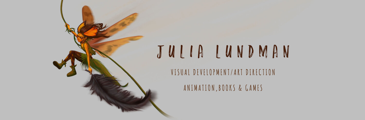
Bee Rider

"Bee Rider", photoshop

A few years ago I had this idea that tiny humans with wings were discovered in various regions of the planet. It's not a new idea at all, but I wanted to mess around with making these fairies a sort of tribal, pagan warrior race that looked more human than the wide-eyed alien version. I am deeply inspired by the art of Mary Cicely Barker (of Flower Fairy fame) and Margaret Tarrant , Edwardian era artists that depicted tiny human-like fairies usually of a friendly beautiful sort. 

Margaret Tarrant watercolor

Cicely Mary Barker watercolor

I wanted to take their ideas about fairies and focus on aspects of character personality and group culture. It's a pretty big project that I am picking away at here and there in between many other projects. 

I did this quick little sketch about five years ago. I like the idea but it's a little too vertical for the kinetics of the scene, and the costume doesn't work for me. I wanted to explore warriors that are more gutsy and brutal instead of sweet. I scanned my sketch and then did a TON of loose drawings on top to work out the idea more to my liking. 

I also did a few studies of bees. Here are a few sketches. I thought about stylizing the shapes and the character far more than this, but in the end decided I'd rather focus on the story of the character, and of course (since I love to paint) the light.

I have a several more warrior fairies in the works in various states of finish. Hopefully I'll post a few more this year in between other posts. :)  Thanks for reading!

Disney's "Whisker Haven Tales with the Palace Pets", Season 2!


For the past year or so I've been working on a new web and tv series called, Disney's "Whisker Haven Tales with the Palace Pets", published on the Disney Junior website and network. The latest episode, "Chowing Down" (Season 2), can be seen here:


All of these shows are developed, directed and produced at the awesome Ghostbot animation studio, where I have been working as Art Director with the Director-bots, Alan, Roque and Brad.

I am SO, SO proud of the really hard work that we all have done on this series. The best part has been meeting kids that tell me all about the shows and the characters. There is nothing better than that!


Here are a few production stills from this episode (I think this one is my favorite!), directed by Alan Lau. The color script on this episode was really key in getting the lighting, mood and tone just right, and also making sure transitions worked from the first sequence which was the set up to the indoor Kibble shop and dream sequences. 


Below is some of the design work I did for the spring episode, "Hearts, Hooves, Eggs!", directed by Roque Ballesteros. The biggest thing I learned in this episode was scaling of details in the distance vs. the scale of details in the foreground. I spent a lot of time looking at mountainscapes studying how to make them work atmospherically.


The color script for the "Masquerade Ball", directed by Roque Ballesteros, was one of my favorites. The episode practically designed itself! A dark room with a party atmosphere was pretty interesting to explore in the color script and in the background design. I was surprised at how dark it could go, actually, and still read as long as the main characters had a good amount of light on them. 


"Buddies Day", directed by Brad Rau, was really fun to design since the fall season was a character in the episode. I thought about things like how the color of the grass and the position of the sun in the sky would be different and distinct from episodes that take place in the summer or spring months. The most difficult part was the lighting in the maze from shot to shot, which required a color script - absolutely. In addition to that, getting a hay texture and shape in flash without it becoming too distracting or vector-y looking against the action of the characters was a real challenge. In the end, I think we found a good balance after a lot of trial and error. 


I just wrapped on Season 2, 13 episodes, which will be released throughout the year including a Christmas episode I'm really excited about. I'm really hoping that we get a 3rd season. After 23 3 minute episodes I feel like I've really gotten to know the world pretty well. I enjoy every single part of the storytelling process in animation and film making and especially working with the Bots. I hope to visit the world of Whisker Haven again sometime soon! 

Star Wars Comps for Concept

Earlier this year for a class assignment with Armand Baltazar at the Animation Collaborative, we had an assignment to come up with a scene or concept that currently does not exist in a movie. One of my all time favorite movies is, of course, Star Wars, the original trilogy, but most especially "The Empire Strikes Back", where we meet Darth Sidious, "The Emperor", for the first time. 

Up until that point, we feel that Darth Vader is the most powerful guy in the universe, even though we are conscious that he is definitely working for someone. When we meet The Emperor, he seems to be parallel to Master Yoda in power but belongs to the Sith and rules the Empire. However, I had always thought that since Darth Vader has unusual power, the Emperor, being a completely corrupt man, would perhaps have some other way of gaining force power than just by being himself. In addition to that, he must have been extremely peeved when Vader let Luke get away. 

I imagined that in between "The Empire Strikes Back" and "Return of the Jedi", Darth Sidious brings Vader into his private chambers where he keeps a gigantic symbiotic parasite that he uses to not only control Vader, but also torture him and secretly extract force energy from him.

Here are a few concepts. I will bring one of these to full color soon, hopefully in the new year!


Additionally, I sculpted a bust and draped some cloth over him to create a nice working model of the Emperor's face. I've wanted to do a portrait painting of the man, and this will be very helpful for lighting. 


Disney's Palace Pets "Whisker Haven Tales"/Environment Designs and Color Keys

I recently had the honor of working with Ghostbot and Disney Publishing on ten 3:30 minute episodes of Disney Junior's "Whisker Haven Tales with the Palace Pets", directed by Alan Lau. Episodes can be seen here: 

www.DisneyPalacePets.com 

My primary role was to develop background "key" environments working from the approved animatics. If you aren't familiar with animation, a color key is an environment design that establishes a location, color palette, and lighting. It is then referred to by other artists on the  the team that need to create various points of view surrounding that piece of the film in the sequence. Elements like water that animate were tricky, especially bubbles. We had to take a close look at how bubbles looked under the water and out of the water. 

Time of day was a major consideration in many episodes. I created guides for blocks of 2-3 hours for each time of day so that the color remained consistent throughout the episodes. 

More episodes will be available soon via the Disney Junior Watch app on iTunes! The show is doing very well. It was a pleasure to work with Ghostbot and Disney on this exciting new show! 

Disney's Palace Pets, "Tales From Whisker Haven"/Color Scripts!

I recently worked on ten 3:30 animated episodes for

Disney's Palace Pets

, a new show on

Disney Junior

. There is also a new Palace Pets Website (!!!) which can be found at

www.DisneyPalacePets.com

The show was developed and produced at

Ghostbot

, directed by the talented

Alan Lau

. It was such a fun project for me personally as I served as Art Director on environments, props and color design. The show was definitely challenging as the Palace Pets have been a successful toy line for Disney for a while now and have a multicolored pastel palette. For this reason, color scripting was necessary on several of the episodes for either a full episode or portions of sequences that were particularly tricky to work out.

Below is my color script for my favorite episode, "The Knight Night Guard". (available to watch on the Disney Junior app now!) Color scripts, if you aren't familiar with them, are a way to get a big picture take on the color design for an entire episode or sequence. It is important to focus on the storytelling as scenes move from shot to shot and sequence to sequence, and make sure the planning for the lighting and effects is consistent logistically from one scene to another. They also are very helpful for animators so they can get a big picture idea of what it is we are shooting for, and also are very helpful for the compositor when piecing together all of the various elements into one shot. Additionally, I enjoy designing color scripts since they give me a chance to think globally about how I want to approach the design of specific environments and how much work I will need to do for specific areas of a sequence, and the work load we are facing in terms of environments and props for a particular episode or sequence.

Below are some stills from Episode 3. They translated pretty closely to the color script - good planning is worth it!

Below is a partial color script for Episode 4, "Throwing a Ball". I didn't have time to do a color script for the entire episode so I focused instead on a tricky sequence that takes place with a time of day change.

Below are a few shots for the final. (Additional characters were added after I did this initial color script.)

I actually did a few more of these but those episodes are not yet released. 

Please check back for updates and be sure to watch Palace Pets "Tales of Whisker Haven" on Disney Junior! Next week I will post about some of the environments and props I designed. Thanks for reading!

Pacific Marine Animal Studies

Some more studies from our recent trip to the Monterey Bay Aquarium. I spent most of my time trying to capture a gesture or general feel for each animal, then tightened up my sketches later using photos I took and in some cases video, the puffins being the most difficult since they were very busy beasts! 

The jellyfish exhibits are like nothing else I've seen at other aquariums. Absolutely stunning.

Moon Jellies (above) are in abundance in the Pacific Ocean, however because they are white they look very similar to white plastic bags. Sea turtles have mistakenly eaten plastic bags and died as a result, one more reason to go from plastic to paper. 

I really loved these gentle sharks. Conservationists are concerned about them becoming overfished due to sport fishing along the Pacific Coast, where they live, mostly along kelp forests and rocky areas. 

Tufted Puffins are in abundance along the Pacific Coast, especially up toward the Aleutian Islands in Alaska. I loved watching them - this guy was very curious about us! 

The light shining through the water in the Kelp Forest exhibit made the anchovy schools look magical. Anchovy schools tend to gravitate toward long columns of kelp in a swirling spiral upward. Sublime! I did these studies from some video footage I shot and then painted various parts of different shots to make it all work together as a portrait of the habitat.

Monterey Bay Aquarium/Color Studies & Sketches

Jamie and I recently went on a trip down the coast to the Monterey Bay Aquarium, one of my very favorite places in the world. We both brought our drawing, sketching, and painting supplies, including my new samsung tablet. Because most of my color sketching was going to be done inside the aquarium, I carried around my tablet in my messenger bag and took it out when I saw something I wanted to study.

As mentioned in my previous post, the primary reason I purchased the tablet was so that I could do a lot more color studies of interior lighting in situations where it would be difficult to take out my usual paints or pastels, places like restaurants, cafes, aquariums, museums, unusual interior lighting situations. Boy am I glad I did. Each time I would sketch from life in the aquarium, I would take a photo before I left. When I would look at the photo later, I noticed a HUGE difference - the camera most of the time did not capture the lighting effects I observed, and if it did, the spirit of that light was completely lost, subdued, or just not there. What an amazing learning experience!

***************************************************

Below are a few of my digital studies. I also did numerous pencil and watercolor studies of the animals in the aquarium, and a few pastels from up the coast. I will post those next week.

 The Kelp Forest. So glad I brought my noise canceling headphones for this one. There were deafening crowds of pre-teens on a field trip with their school. You never know what will confront you when plein air sketching - I highly recommend headphones if you sketch in public places. 

I liked the presentation of this display so much. The blue light spilling from the water and the  yellow-green reflections of the kelp were gorgeous. I felt the design stood well on it's own.

The sketch above is downstairs looking into the Sea Otter display, sea otters mostly spending their time up above water and only occasionally diving below. I noticed this perch watching people as they went by and thought it was funny...

Some sketches went faster than others. This one in the Deep Sea Exhibit was done in about 30 minutes. It was at the end of the day and just seemed to flow. I figured out a composition and story as it evolved in front of me. 

Of all the subjects I studied in the aquarium, this jellyfish display was absolutely the most difficult. I sat across from the display on the floor against a wall in almost total darkness. My eyes had adjusted to the dark, but when I looked down into the bright computer screen of my tablet, my eyes would adjust to that brightness, so that when I looked back up again at the jellies, I had to give my eyes a moment to adjust to the darkness again. VERY tough! I spent a good two hours trying to capture the light of the tank. Wow, what a learning experience this sketch was! 

A Goblin Shark for Adelle

A few years ago my good friend Adelle Caunce, artist of Biguglyfishies.com, sculpted a paper mache goblin shark and photographed it for her website. Soon after it was picked up all over the internet by sites like reddit, i09, I F******ng Love Science, with articles assuming that this was a real photo of a real goblin shark and not a caricatured sculpture. At first it was funny because although it is a sculpture, no one seemed to be able to tell. However, after a while, Adelle and friends had a horrible realization, Adelle's photo of her sculpture was widely distributed all over the internet, memes were made, pins were pinned on pinterest, and yet there were no link backs or photo/artist credits made. Even today, when you google "goblin shark" you will find her photo along with real photographs of real goblin sharks with no link backs or credits. 

The internet is a wild, crazy place, and for artists out there, we need to be careful about making sure our work is not distributed uncredited. There have been many horror stories all over the world of artists' work being made into all kinds of retail items from jewelry to pillows and ornaments by big name retailers who should know better. In this image hungry culture we live in, artists are easily taken advantage of, apparently. By the same token, as media users we should be very wary of news stories and images. Adelle's goblin shark was sited by scientists (!!!) in articles about the wonders of the deep.


I've added some credits hoping that google picks up the credited photo in searches for Goblin Shark.

In honor of Adelle's birthday, I painted an illustration and drink recipe of her goblin shark for a recipe book that her lovely husband Steve put together. 


Painted in Photoshop using Adelle's Goblin Shark design.

Be sure to visit her site! She has a huge array of beautiful paper mache sculptures and has even been featured on tv! Biguglyfishies.com and biguglyfishies.blogspot.com

Cheers! 


THE TIME MACHINE: Visual Development with Armand Baltazar/Animation Collaborative

I recently took a visual development course at the Animation Collaborative taught by senior visual development artist Armand Baltazar, who has worked for many years in animated film, with credits on Dreamworks, "Shark Tale", "Spirit", and "A Bee Movie", as well as Disney's "Princess and the Frog", and more recently Pixar's "Cars 2", among many others. Of all the classes I've taken in recent years, I found this course to be perhaps the most exciting. I've always been deeply interested in visual storytelling, although I've not always had ideal opportunities to practice that very fine art to the fullest I've wanted. So when Armand's course came up on the roster and time in my schedule allowed, I jumped. Aside from my own interests,  I feel a good visual development class is an excellent experience for any artist at any level to go through. So many of us have grand ideas around stories, world building and stylization, but how many of us have really gone deep into our visual storytelling skills? If you've not had the opportunity to take such a class, I encourage you to find one or else pick up a few good "art of" books for film, games, and television.

 Regarding this specific class at the Animation Collaborative, I felt it was absolutely worth it. Armand was a fantastic teacher and really put in a lot of extra work and effort in teaching the class, even staying late to give back really valuable individual feedback, paint overs and advice tailored to each student. Each class was chock full of fantastic information about visual development, portfolio development, and tips and techniques for working quickly, as is required on any project in development.

For the class we each picked a classic book to visualize as an animated film. I picked HG Wells', "The Time Machine", a book that I illustrated years ago, but unfortunately didn't do a very good job of it due to the extremely rushed deadline. For years now I've wanted to revisit the story, and have imagined a reboot tailored toward an animated young adult film. I thought I'd share my character design concepts here, and later will share more development. Over the course of the next year I'll be working up ideas around this story and will share more as I solidify ideas.

***********************************************************

My Time Traveler in my reboot of "The Time Machine" is a young woman in present day. When I draw character sketches, I like to keep a very, very simple line with almost no detail. I like to save any modeling or texturing for painting. I really enjoy the challenge of trying to capture a gesture in as few lines as possible.

I envision the Time Machine device to be wearable tech made up of everyday things like hacked ipads, iphones and a laser tag vest. Like in the original book, the time machine does not move the individual through space, but only through time.

Imagine what happens to those digits after thousands and thousands of years of swiping/touch technology… I enjoyed working on my take on the ELOI quite a lot. I envisioned them growing tall and thin with elaborate hairstyles and lots of adornments. 

 The Morlocks live in underground caves where they have evolved eyes that allow them to see in the complete darkness. They live amongst the ruins, pollution and grim of thousands of years of human corruption.

Below are some quick color comps and sketches of what I have been developing around story moment ideas. Most of these are pretty quick, like 2 hours each or even less in the case of sketches. All of these are meant to be exploratory in nature, and will eventually become more finished paintings. I can't wait to work on these!

 I've long been a fan of Douglass Trumbull, well known in the film industry for his innovative special effects on movies like 2001: A Space Odyssey, Blade Runner, and Star Trek: The Motion Picture. I wanted to emulate his effects in some way, and have envisioned the bottom row of images to be my take on time travel effects.

This is my quickie version of a future city, although I have plans to iterate on this a bit more. Given that our class was only 12 weeks and I only had the weekends to work on it, I felt that I didn't have enough time to really dig through this juicy subject. Looking forward to exploring some more concepts!

Hey, who doesn't need a hot Eloi boyfriend in the future? Actually, this is one aspect of the story that I am quite excited about: the friendship between The Time Traveler and Weena, in my version female (time traveler) and male (eloi). I think this can be resonate with the story themes in some unusual ways - I'm so excited to work some more on these ideas.

I actually have a number of additional sketches and comps, but they are still a little too compy to share. Hopefully soon! 

As I continue to develop my ideas I will post. I hope to put a little book together by sometime next summer, if all goes well. 

Thanks for reading!!!

iPad Sketching

I recently got an iPad air over the holidays. In addition to my tree studies, for some time now I've wanted to study the lighting and staging of various live action shows that I admire. So I thought I'd start with a few shows, freeze frame the shot I like and do an observational study. 

I've also played around with various apps. There are so many out there, and I'm pretty sure I've tested them all at this point. The app I like the most is Procreate. It feels like photoshop, but has the basic stripped down interface that I need for painting, and adjusts that interface to work well on a touch screen. Other apps are clunky for various reasons, but Procreate has gotten it right.

Violet Crawley, The Dowager Countess of Grantham in "Downton Abbey". 

My first few attempts were frustrating because it seems that I cannot get the brush size or shape working well enough for me. Also, there is a slight lag between touching the screen and the brush stroke that is a little distracting. Other problems include the color palette; so often the color I thought I chose in the palette is not actually the right value. 

Worf from Star Trek Next Generation.

The above painting of Worf was a little frustrating too because I felt like I was fighting the pen controls the entire time. Also, when I exported it to my photo stream, the painting became darker. 

I then tried a bigger scene to see how it works for capturing an entire shot, not just a portrait. I found the brush controls really difficult in that case. The city in the distance for instance is really rough, not all how I was attempting to paint it, but an ok study of the general set up and lighting. 

Game of Thrones, Season 3, episode 2. Daenerys Stormborn on her newly acquired ship headed to Astapor.

Game of Thrones Season 3, episode 3. Daenerys Stormborn after she unleashes her dragon Drogon on the leaders of Astapor. (that must have been supremely satisfying!)

I love the lighting in this shot. I struggled with the styluses in this painting, trying to use the brushes to obtain a likeness in the eyes, nose and mouth, but finally decided that I need to think of these studies as just that, color studies. 

Bowie the Greyhound

 On Thursday evenings, I attend a sculpture workshop with some friends. Usually we hire a model for figurative work. This time, however, we thought we'd tackle something different,  the greyhound of one of our favorite models.

Greyhound - model Bowie

 We set Bowie up on a sleeping mat while we sculpted. Occasionally she would get up and walk around the room or go outside for a quick run. 

While I was making the armature, I observed the incredibly graceful movements of our model. I noticed the long flowing s curves repeated throughout her form and her incredibly "springy" stride. I wanted to somehow capture that kinetic grace in the pose.

Greyhound - armature

I didn't make any gesture drawings, but instead decided to just mess with the armature until I found a pose that worked. I put a base layer of clay on the armature, adjusted it several times, and after about two sessions found a pose that had movement. I had trouble with the armature because I used aluminum wire where I should have used steel; the clay is heavy and can bend the aluminum wire. To compensate I decided to make a sturdy base at the bottom and balled up aluminum foil for the rib cage.

Greyhound - first pass gesture

Greyhound - first pass other side gesture

Eventually, our Thursday night sessions ended and our model was no longer available. I decided to take the sculpture home to work on it little by little after work.

The truth is, I am not really a sculptor. I am a two dimensional artist studying the 3rd dimension, sculpture. In the 3 years since I have been learning about sculpting with my friends each Thursday, I have found that the practice aids my understanding of depicting nature in two dimensions greatly. My mind is better able to process how form turns and how light falls on those forms far better than if I hadn't.

Greyhound-3


Greyhound-5


Greyhound - tail anatomy


Greyhound - Scurve2

My underlying interest in visual language is the idea of making something, anything feel alive to the viewer, whether it is realistic or fantasy; I want to be able create an illusion and spirit of life, the sublime. I strive to transcend technique in order to create something beautiful that reflects Nature in a visually poetic manner. It is this idea that keeps me pushing forward, wanting to learn more, improve my abilities and become increasingly skilled at how I might do this. Sculpture has helped me understand in a different way how to think about how to capturing "aliveness" of a creation. While I am certainly a lesser sculptor than others, I feel exploring this medium has helped me solidify ideas about visual illusions.

At this point, I decided to place a black board behind Bowie so that I could see more clearly the lines of her form. I started to soften the muscles and add some areas of compression along with skin folds. I came to the conclusion that although some of the sculpture might not be entirely "correct", it was my choice in serving the design at this point; I enjoyed rounding out forms and accenting areas I found the most beautiful.

Lundman-1

Lundman-2

*********
My "finished" sculpture, at least as finished as I want it to be:

"Bowie", oil based clay on wood base.

Lundman_Bowie_frontview1

Lundman_Bowie_frontview2

Lundman_Bowie_side2

Lundman_Bowie_back1

Lundman_Bowie_back3

Lundman_Bowie_side3

Lundman_Bowie_topview1

Lundman_Bowie_topview2

s curves in motion:


While I worked on this sculpture throughout the summer, I took breaks to attend the Weekend with the Masters painting conference, which you can find in some of my previous posts, but, perhaps more interestingly, during this time I immersed myself in the work of string theorist Brian Greene, author of "The Hidden Reality". *

Aside from ideas about the shape of our questionably infinite universe, one fact about Greene's work stands out as entirely relevant to every day considerations: 

"Nothing in the laws of physics points to free will. Therefore, like time, it is a useful illusion. We are a bag of particles governed by the laws of physics.  And that’s it.”
 (from an interview with screen writer Charlie Kaufman)

 Really? Assuming Nature created these complex particles, it also created the desire for some of us to want to recreate it in art. Why? To understand it? For what purpose? Maybe meditating on Nature's beauty is somehow important in the grander scheme. It certainly is for me at least.

*You can also watch a fantastic PBS dvd series based on his book by the same name, "The Elegant Universe", which explains quantum mechanics in layman terms and is pretty enjoyable regardless (among numerous articles and speeches published all over the web).