The Little Mermaid, A different take

I recently saw some online images of the Finnish ballet of Hans Christian Andersen's, "The Little Mermaid" and was totally floored. Everything from the costume design to the lighting and dance have a slightly dark and mysterious tone that feel just right for the classic tale, departing completely from the Disney version. It made me wonder what other cultures and takes on the tale might be interesting to see. I was inspired by the architecture of Okinawa and thought perhaps the Little Mermaid might fall in love with a Samurai. I'm not sure I really got it but it was seriously a blast to dream about.

Some initial thumbnails, dreaming about what kind of island The Little Mermaid first encounters the Samurai.

This is an establishing shot of the island I chose from the thumbnails, just before The Little Mermaid meets the Samurai she falls in love with.

I was thinking of some foreshadowing in the architectural motifs. These are a few ideas. The possibilities are endless, really. Below are a few variations on The Little Mermaid. I still feel like I want to do a few more pages of these and then move on to the Samurai, Triton and the Sea Witch.

Many more updates coming in a few weeks! Thanks for visiting.

Bee Rider

"Bee Rider", photoshop

A few years ago I had this idea that tiny humans with wings were discovered in various regions of the planet. It's not a new idea at all, but I wanted to mess around with making these fairies a sort of tribal, pagan warrior race that looked more human than the wide-eyed alien version. I am deeply inspired by the art of Mary Cicely Barker (of Flower Fairy fame) and Margaret Tarrant , Edwardian era artists that depicted tiny human-like fairies usually of a friendly beautiful sort. 

Margaret Tarrant watercolor

Cicely Mary Barker watercolor

I wanted to take their ideas about fairies and focus on aspects of character personality and group culture. It's a pretty big project that I am picking away at here and there in between many other projects. 

I did this quick little sketch about five years ago. I like the idea but it's a little too vertical for the kinetics of the scene, and the costume doesn't work for me. I wanted to explore warriors that are more gutsy and brutal instead of sweet. I scanned my sketch and then did a TON of loose drawings on top to work out the idea more to my liking. 

I also did a few studies of bees. Here are a few sketches. I thought about stylizing the shapes and the character far more than this, but in the end decided I'd rather focus on the story of the character, and of course (since I love to paint) the light.

I have a several more warrior fairies in the works in various states of finish. Hopefully I'll post a few more this year in between other posts. :)  Thanks for reading!

Disney's "Whisker Haven Tales with the Palace Pets", Season 2!


For the past year or so I've been working on a new web and tv series called, Disney's "Whisker Haven Tales with the Palace Pets", published on the Disney Junior website and network. The latest episode, "Chowing Down" (Season 2), can be seen here:


All of these shows are developed, directed and produced at the awesome Ghostbot animation studio, where I have been working as Art Director with the Director-bots, Alan, Roque and Brad.

I am SO, SO proud of the really hard work that we all have done on this series. The best part has been meeting kids that tell me all about the shows and the characters. There is nothing better than that!


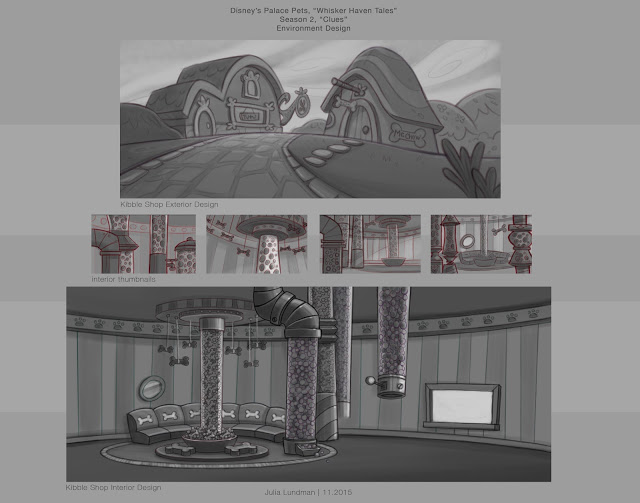
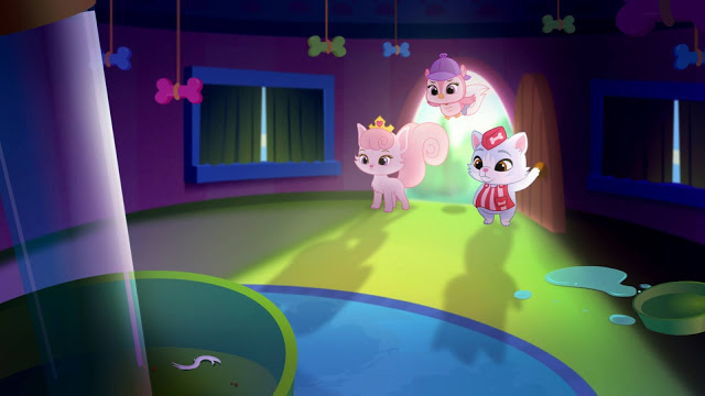
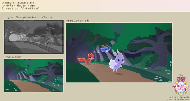
Here are a few production stills from this episode (I think this one is my favorite!), directed by Alan Lau. The color script on this episode was really key in getting the lighting, mood and tone just right, and also making sure transitions worked from the first sequence which was the set up to the indoor Kibble shop and dream sequences. 


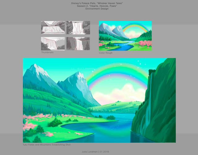
Below is some of the design work I did for the spring episode, "Hearts, Hooves, Eggs!", directed by Roque Ballesteros. The biggest thing I learned in this episode was scaling of details in the distance vs. the scale of details in the foreground. I spent a lot of time looking at mountainscapes studying how to make them work atmospherically.


The color script for the "Masquerade Ball", directed by Roque Ballesteros, was one of my favorites. The episode practically designed itself! A dark room with a party atmosphere was pretty interesting to explore in the color script and in the background design. I was surprised at how dark it could go, actually, and still read as long as the main characters had a good amount of light on them. 


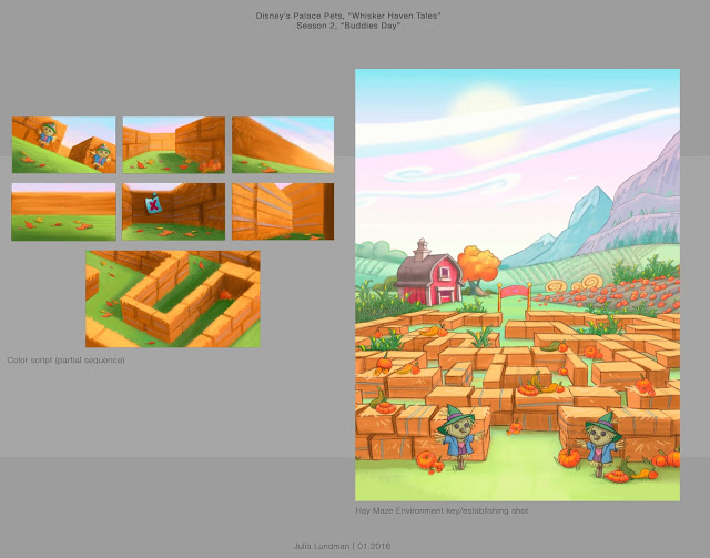
"Buddies Day", directed by Brad Rau, was really fun to design since the fall season was a character in the episode. I thought about things like how the color of the grass and the position of the sun in the sky would be different and distinct from episodes that take place in the summer or spring months. The most difficult part was the lighting in the maze from shot to shot, which required a color script - absolutely. In addition to that, getting a hay texture and shape in flash without it becoming too distracting or vector-y looking against the action of the characters was a real challenge. In the end, I think we found a good balance after a lot of trial and error. 


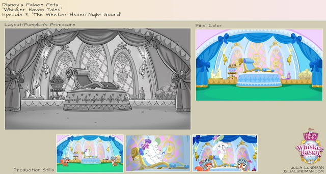
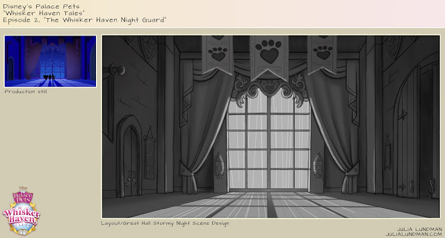
I just wrapped on Season 2, 13 episodes, which will be released throughout the year including a Christmas episode I'm really excited about. I'm really hoping that we get a 3rd season. After 23 3 minute episodes I feel like I've really gotten to know the world pretty well. I enjoy every single part of the storytelling process in animation and film making and especially working with the Bots. I hope to visit the world of Whisker Haven again sometime soon! 

2016

Being a Capricorn, I have always been driven to succeed. It is frustrating to me that even with all my heart and intentions, I have yet to complete some of the many goals I set out to complete way back in my 20's. There are, of course, many complicated life reasons for this. 

This year I've decided that no matter what, I will accomplish a few of my big art goals, no matter what. 

Seven times fall, eight times stand up. 

I did an alternate, darker version of this painting as well. I can't decide which I like better. 

Happy New Year 2016!

Star Wars Comps for Concept

Earlier this year for a class assignment with Armand Baltazar at the Animation Collaborative, we had an assignment to come up with a scene or concept that currently does not exist in a movie. One of my all time favorite movies is, of course, Star Wars, the original trilogy, but most especially "The Empire Strikes Back", where we meet Darth Sidious, "The Emperor", for the first time. 

Up until that point, we feel that Darth Vader is the most powerful guy in the universe, even though we are conscious that he is definitely working for someone. When we meet The Emperor, he seems to be parallel to Master Yoda in power but belongs to the Sith and rules the Empire. However, I had always thought that since Darth Vader has unusual power, the Emperor, being a completely corrupt man, would perhaps have some other way of gaining force power than just by being himself. In addition to that, he must have been extremely peeved when Vader let Luke get away. 

I imagined that in between "The Empire Strikes Back" and "Return of the Jedi", Darth Sidious brings Vader into his private chambers where he keeps a gigantic symbiotic parasite that he uses to not only control Vader, but also torture him and secretly extract force energy from him.

Here are a few concepts. I will bring one of these to full color soon, hopefully in the new year!


Additionally, I sculpted a bust and draped some cloth over him to create a nice working model of the Emperor's face. I've wanted to do a portrait painting of the man, and this will be very helpful for lighting. 


CTN Ad

This year I took up the opportunity to advertise in the CTN Sketchbook, a collectible printed sketchbook you can buy. I created this ad using some of my art. The book is in black and white, and because of that I submitted this piece in black in white. The 2015 sketchbook should be available in a few weeks at the

CTN STORE

I liked the composition a lot, so I also created it in color, too. I also made a bookmark of "The Act". I will have both color bookmarks while at the show. If you see me ask for one - they're free! Ping me at @Paintkatt on Twitter if you're at the show and want a bookmark!


Thanks for reading!

The Unfortunate Toad

This summer I have been working on a short story that I plan to bring to print. It is about a Toad, and is tentatively called, "The Unfortunate Toad". 

There is a cast of characters that you'd expect in a fairy tale, but in this story their roles are a little different, due to some unforeseen circumstances.

I thought I would share some of the work I've created so far. There is a lot more in the works, including many more characters, but I will be keeping those to myself for awhile. In addition to "The Unfortunate Toad" story,  in the next few months I will be posting a few more updates to "The Time Machine" and other art that I have been working on behind the scenes. It's really exciting stuff that I can't wait to share!

***********************************************************************


Please stay tuned for more in the next two months! Thanks for visiting.


Disney's Palace Pets "Whisker Haven Tales"/Environment Designs and Color Keys

I recently had the honor of working with Ghostbot and Disney Publishing on ten 3:30 minute episodes of Disney Junior's "Whisker Haven Tales with the Palace Pets", directed by Alan Lau. Episodes can be seen here: 

www.DisneyPalacePets.com 

My primary role was to develop background "key" environments working from the approved animatics. If you aren't familiar with animation, a color key is an environment design that establishes a location, color palette, and lighting. It is then referred to by other artists on the  the team that need to create various points of view surrounding that piece of the film in the sequence. Elements like water that animate were tricky, especially bubbles. We had to take a close look at how bubbles looked under the water and out of the water. 

Time of day was a major consideration in many episodes. I created guides for blocks of 2-3 hours for each time of day so that the color remained consistent throughout the episodes. 

More episodes will be available soon via the Disney Junior Watch app on iTunes! The show is doing very well. It was a pleasure to work with Ghostbot and Disney on this exciting new show! 

Disney's Palace Pets, "Tales From Whisker Haven"/Color Scripts!

I recently worked on ten 3:30 animated episodes for

Disney's Palace Pets

, a new show on

Disney Junior

. There is also a new Palace Pets Website (!!!) which can be found at

www.DisneyPalacePets.com

The show was developed and produced at

Ghostbot

, directed by the talented

Alan Lau

. It was such a fun project for me personally as I served as Art Director on environments, props and color design. The show was definitely challenging as the Palace Pets have been a successful toy line for Disney for a while now and have a multicolored pastel palette. For this reason, color scripting was necessary on several of the episodes for either a full episode or portions of sequences that were particularly tricky to work out.

Below is my color script for my favorite episode, "The Knight Night Guard". (available to watch on the Disney Junior app now!) Color scripts, if you aren't familiar with them, are a way to get a big picture take on the color design for an entire episode or sequence. It is important to focus on the storytelling as scenes move from shot to shot and sequence to sequence, and make sure the planning for the lighting and effects is consistent logistically from one scene to another. They also are very helpful for animators so they can get a big picture idea of what it is we are shooting for, and also are very helpful for the compositor when piecing together all of the various elements into one shot. Additionally, I enjoy designing color scripts since they give me a chance to think globally about how I want to approach the design of specific environments and how much work I will need to do for specific areas of a sequence, and the work load we are facing in terms of environments and props for a particular episode or sequence.

Below are some stills from Episode 3. They translated pretty closely to the color script - good planning is worth it!

Below is a partial color script for Episode 4, "Throwing a Ball". I didn't have time to do a color script for the entire episode so I focused instead on a tricky sequence that takes place with a time of day change.

Below are a few shots for the final. (Additional characters were added after I did this initial color script.)

I actually did a few more of these but those episodes are not yet released. 

Please check back for updates and be sure to watch Palace Pets "Tales of Whisker Haven" on Disney Junior! Next week I will post about some of the environments and props I designed. Thanks for reading!

Pacific Marine Animal Studies

Some more studies from our recent trip to the Monterey Bay Aquarium. I spent most of my time trying to capture a gesture or general feel for each animal, then tightened up my sketches later using photos I took and in some cases video, the puffins being the most difficult since they were very busy beasts! 

The jellyfish exhibits are like nothing else I've seen at other aquariums. Absolutely stunning.

Moon Jellies (above) are in abundance in the Pacific Ocean, however because they are white they look very similar to white plastic bags. Sea turtles have mistakenly eaten plastic bags and died as a result, one more reason to go from plastic to paper. 

I really loved these gentle sharks. Conservationists are concerned about them becoming overfished due to sport fishing along the Pacific Coast, where they live, mostly along kelp forests and rocky areas. 

Tufted Puffins are in abundance along the Pacific Coast, especially up toward the Aleutian Islands in Alaska. I loved watching them - this guy was very curious about us! 

The light shining through the water in the Kelp Forest exhibit made the anchovy schools look magical. Anchovy schools tend to gravitate toward long columns of kelp in a swirling spiral upward. Sublime! I did these studies from some video footage I shot and then painted various parts of different shots to make it all work together as a portrait of the habitat.

Monterey Bay Aquarium/Color Studies & Sketches

Jamie and I recently went on a trip down the coast to the Monterey Bay Aquarium, one of my very favorite places in the world. We both brought our drawing, sketching, and painting supplies, including my new samsung tablet. Because most of my color sketching was going to be done inside the aquarium, I carried around my tablet in my messenger bag and took it out when I saw something I wanted to study.

As mentioned in my previous post, the primary reason I purchased the tablet was so that I could do a lot more color studies of interior lighting in situations where it would be difficult to take out my usual paints or pastels, places like restaurants, cafes, aquariums, museums, unusual interior lighting situations. Boy am I glad I did. Each time I would sketch from life in the aquarium, I would take a photo before I left. When I would look at the photo later, I noticed a HUGE difference - the camera most of the time did not capture the lighting effects I observed, and if it did, the spirit of that light was completely lost, subdued, or just not there. What an amazing learning experience!

***************************************************

Below are a few of my digital studies. I also did numerous pencil and watercolor studies of the animals in the aquarium, and a few pastels from up the coast. I will post those next week.

 The Kelp Forest. So glad I brought my noise canceling headphones for this one. There were deafening crowds of pre-teens on a field trip with their school. You never know what will confront you when plein air sketching - I highly recommend headphones if you sketch in public places. 

I liked the presentation of this display so much. The blue light spilling from the water and the  yellow-green reflections of the kelp were gorgeous. I felt the design stood well on it's own.

The sketch above is downstairs looking into the Sea Otter display, sea otters mostly spending their time up above water and only occasionally diving below. I noticed this perch watching people as they went by and thought it was funny...

Some sketches went faster than others. This one in the Deep Sea Exhibit was done in about 30 minutes. It was at the end of the day and just seemed to flow. I figured out a composition and story as it evolved in front of me. 

Of all the subjects I studied in the aquarium, this jellyfish display was absolutely the most difficult. I sat across from the display on the floor against a wall in almost total darkness. My eyes had adjusted to the dark, but when I looked down into the bright computer screen of my tablet, my eyes would adjust to that brightness, so that when I looked back up again at the jellies, I had to give my eyes a moment to adjust to the darkness again. VERY tough! I spent a good two hours trying to capture the light of the tank. Wow, what a learning experience this sketch was! 

Composition Breakdowns

In a recent class I took at the Animation Collaborative with the inspiring and seriously talented Armand Baltazar, we had an assignment to break down the compositions of narrative illustrations from visual development artists. We had to

1. write one sentence describing the story of the piece, 

2. describe the point of view (POV) of the piece, and 

3. describe the emotion intended by the piece. 

After that, we drew over the composition breaking down these elements:

 4. the division of the graphic plane (the graphic shapes that make up the composition),

5. Redline the division of depth and mark the foreground, middle ground, and far background,

6. Mark the center of interest,

7. Redline where the eye moves across the piece.

This was an excellent exercise in understanding the architecture of a picture and the thought that goes into guiding the viewers' eye directly to the center of interest. I highly recommend analyzing compositions in this manner for anything from drawings, paintings, and even sculptures to increase your own narrative compositional chops.  

Although the exercise appears simple, I learned a great deal by analyzing each piece. There were some pieces that I haven't posted which failed compositionally; the artist meant the eye to go to one place but unfortunately the eye focused elsewhere. 

Year of the [Electric] Sheep

In 1968, Philip K. Dick wrote a groundbreaking book, “Do Androids Dream of Electric Sheep?”, which was later turned into the film, “Blade Runner”,directed by Ridley Scott. Perhaps the best (at least to me) science fiction film and story of all time. Douglass Trumbull designed all of the practical effects, a profound inspiration on science fiction film and myself all these years. In honor of Year of the Sheep, I did this speed paint.

In 1968, Philip K. Dick wrote a groundbreaking book, "Do Androids Dream of Electric Sheep?", which was later turned into the film, "Blade Runner",directed by Ridley Scott. Perhaps the best (at least to me) science fiction film and story of all time.

Year of the [ Electric ] Sheep. Recorded with Camtasia Studio. Edited in iMovie. Painted in Photoshop CS 6. Initial base layer texture from Cgtextures.com. Custom brushes. Observational study of a sculpture I photographed in the Louvre in 2012, a marble vase originally in Versailles. Music by Vangelis, "Blade Runner". 

Bowie the Greyhound

 On Thursday evenings, I attend a sculpture workshop with some friends. Usually we hire a model for figurative work. This time, however, we thought we'd tackle something different,  the greyhound of one of our favorite models.

Greyhound - model Bowie

 We set Bowie up on a sleeping mat while we sculpted. Occasionally she would get up and walk around the room or go outside for a quick run. 

While I was making the armature, I observed the incredibly graceful movements of our model. I noticed the long flowing s curves repeated throughout her form and her incredibly "springy" stride. I wanted to somehow capture that kinetic grace in the pose.

Greyhound - armature

I didn't make any gesture drawings, but instead decided to just mess with the armature until I found a pose that worked. I put a base layer of clay on the armature, adjusted it several times, and after about two sessions found a pose that had movement. I had trouble with the armature because I used aluminum wire where I should have used steel; the clay is heavy and can bend the aluminum wire. To compensate I decided to make a sturdy base at the bottom and balled up aluminum foil for the rib cage.

Greyhound - first pass gesture

Greyhound - first pass other side gesture

Eventually, our Thursday night sessions ended and our model was no longer available. I decided to take the sculpture home to work on it little by little after work.

The truth is, I am not really a sculptor. I am a two dimensional artist studying the 3rd dimension, sculpture. In the 3 years since I have been learning about sculpting with my friends each Thursday, I have found that the practice aids my understanding of depicting nature in two dimensions greatly. My mind is better able to process how form turns and how light falls on those forms far better than if I hadn't.

Greyhound-3


Greyhound-5


Greyhound - tail anatomy


Greyhound - Scurve2

My underlying interest in visual language is the idea of making something, anything feel alive to the viewer, whether it is realistic or fantasy; I want to be able create an illusion and spirit of life, the sublime. I strive to transcend technique in order to create something beautiful that reflects Nature in a visually poetic manner. It is this idea that keeps me pushing forward, wanting to learn more, improve my abilities and become increasingly skilled at how I might do this. Sculpture has helped me understand in a different way how to think about how to capturing "aliveness" of a creation. While I am certainly a lesser sculptor than others, I feel exploring this medium has helped me solidify ideas about visual illusions.

At this point, I decided to place a black board behind Bowie so that I could see more clearly the lines of her form. I started to soften the muscles and add some areas of compression along with skin folds. I came to the conclusion that although some of the sculpture might not be entirely "correct", it was my choice in serving the design at this point; I enjoyed rounding out forms and accenting areas I found the most beautiful.

Lundman-1

Lundman-2

*********
My "finished" sculpture, at least as finished as I want it to be:

"Bowie", oil based clay on wood base.

Lundman_Bowie_frontview1

Lundman_Bowie_frontview2

Lundman_Bowie_side2

Lundman_Bowie_back1

Lundman_Bowie_back3

Lundman_Bowie_side3

Lundman_Bowie_topview1

Lundman_Bowie_topview2

s curves in motion:


While I worked on this sculpture throughout the summer, I took breaks to attend the Weekend with the Masters painting conference, which you can find in some of my previous posts, but, perhaps more interestingly, during this time I immersed myself in the work of string theorist Brian Greene, author of "The Hidden Reality". *

Aside from ideas about the shape of our questionably infinite universe, one fact about Greene's work stands out as entirely relevant to every day considerations: 

"Nothing in the laws of physics points to free will. Therefore, like time, it is a useful illusion. We are a bag of particles governed by the laws of physics.  And that’s it.”
 (from an interview with screen writer Charlie Kaufman)

 Really? Assuming Nature created these complex particles, it also created the desire for some of us to want to recreate it in art. Why? To understand it? For what purpose? Maybe meditating on Nature's beauty is somehow important in the grander scheme. It certainly is for me at least.

*You can also watch a fantastic PBS dvd series based on his book by the same name, "The Elegant Universe", which explains quantum mechanics in layman terms and is pretty enjoyable regardless (among numerous articles and speeches published all over the web).