CTN Ad

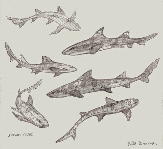
This year I took up the opportunity to advertise in the CTN Sketchbook, a collectible printed sketchbook you can buy. I created this ad using some of my art. The book is in black and white, and because of that I submitted this piece in black in white. The 2015 sketchbook should be available in a few weeks at the

CTN STORE

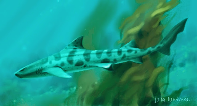
I liked the composition a lot, so I also created it in color, too. I also made a bookmark of "The Act". I will have both color bookmarks while at the show. If you see me ask for one - they're free! Ping me at @Paintkatt on Twitter if you're at the show and want a bookmark!


Thanks for reading!

Pacific Marine Animal Studies

Some more studies from our recent trip to the Monterey Bay Aquarium. I spent most of my time trying to capture a gesture or general feel for each animal, then tightened up my sketches later using photos I took and in some cases video, the puffins being the most difficult since they were very busy beasts! 

The jellyfish exhibits are like nothing else I've seen at other aquariums. Absolutely stunning.

Moon Jellies (above) are in abundance in the Pacific Ocean, however because they are white they look very similar to white plastic bags. Sea turtles have mistakenly eaten plastic bags and died as a result, one more reason to go from plastic to paper. 

I really loved these gentle sharks. Conservationists are concerned about them becoming overfished due to sport fishing along the Pacific Coast, where they live, mostly along kelp forests and rocky areas. 

Tufted Puffins are in abundance along the Pacific Coast, especially up toward the Aleutian Islands in Alaska. I loved watching them - this guy was very curious about us! 

The light shining through the water in the Kelp Forest exhibit made the anchovy schools look magical. Anchovy schools tend to gravitate toward long columns of kelp in a swirling spiral upward. Sublime! I did these studies from some video footage I shot and then painted various parts of different shots to make it all work together as a portrait of the habitat.

A Couple of Plein Air Digital Paintings

For awhile now, I've been trying to come up with an easier take-with-me-everywhere method of plein air sketching. I have full plein air kits for pastels, oil and watercolor, but often I find that even though I keep one of these kits in the trunk of my car, I usually don't feel inclined to bring it all in to a restaurant, coffee shop or on an afternoon trip downtown. I wanted something MUCH more lightweight and accessible - and the iPad has been it.

Here is a sketch from a recent day trip to the ferry building in San Francisco, a busy tourist-heavy area of the city. 

A lovely day plein air painting at the San Francisco Ferry Building. I used the iPad Air, Procreate app, and Wacom Stylus 1. Music by Karrin Allyson, "From Paris to Rio". A note about the stylus: I recently purchase the Wacom Stylus 2 and discovered it does not work with many apps, including Procreate.

My main objective with iPad sketching is to mimic plein air oil paint using the alla prima technique, direct painting, as opposed to more labor intense methods. The idea is to work quickly on site and get it all down in about an hour or so of working. That means everything from gesture, composition, hue, value relationships and light relationships.

About the hardware: I have yet to find a stylus I am completely comfortable with; I am currently using the Wacom Creative Stylus. I am not keen on recommending it, however, because it feels like painting with a giant crayon. I unfortunately purchased the Wacom Creative Stylus 2 and found afterwards that it is not compatible with many painting apps, including Procreate. A few friends have given good reviews of the Jot Adonit Stylus, which is far cheaper and compatible with a lot of apps. 

In the Procreate app, I created a set of swatches in the color picker that are the standard colors of my basic oil painting palette, plus a few white convenience colors so that I don't have to constantly mix the same color over and over. Using these swatches helped me in getting a similar look to traditional paintings, although I think I could still fine tune the set. 

In addition to that, I am still trying to refine my brushes to find a working method that mimics traditional brushes. Procreate provides a set of brushes that you can then customize, but  I have yet to find some that are to my liking.

Continuing my exploration of digital iPad paintings with the Procreate app, I've tried to mimic my oil painting palette in the color picker to see if I can narrow down my palette choices. I am trying to find a good working flow for alla prima digital studies that actually look like oil painting sketches.

Composition Breakdowns

In a recent class I took at the Animation Collaborative with the inspiring and seriously talented Armand Baltazar, we had an assignment to break down the compositions of narrative illustrations from visual development artists. We had to

1. write one sentence describing the story of the piece, 

2. describe the point of view (POV) of the piece, and 

3. describe the emotion intended by the piece. 

After that, we drew over the composition breaking down these elements:

 4. the division of the graphic plane (the graphic shapes that make up the composition),

5. Redline the division of depth and mark the foreground, middle ground, and far background,

6. Mark the center of interest,

7. Redline where the eye moves across the piece.

This was an excellent exercise in understanding the architecture of a picture and the thought that goes into guiding the viewers' eye directly to the center of interest. I highly recommend analyzing compositions in this manner for anything from drawings, paintings, and even sculptures to increase your own narrative compositional chops.  

Although the exercise appears simple, I learned a great deal by analyzing each piece. There were some pieces that I haven't posted which failed compositionally; the artist meant the eye to go to one place but unfortunately the eye focused elsewhere. 

Year of the [Electric] Sheep

In 1968, Philip K. Dick wrote a groundbreaking book, “Do Androids Dream of Electric Sheep?”, which was later turned into the film, “Blade Runner”,directed by Ridley Scott. Perhaps the best (at least to me) science fiction film and story of all time. Douglass Trumbull designed all of the practical effects, a profound inspiration on science fiction film and myself all these years. In honor of Year of the Sheep, I did this speed paint.

In 1968, Philip K. Dick wrote a groundbreaking book, "Do Androids Dream of Electric Sheep?", which was later turned into the film, "Blade Runner",directed by Ridley Scott. Perhaps the best (at least to me) science fiction film and story of all time.

Year of the [ Electric ] Sheep. Recorded with Camtasia Studio. Edited in iMovie. Painted in Photoshop CS 6. Initial base layer texture from Cgtextures.com. Custom brushes. Observational study of a sculpture I photographed in the Louvre in 2012, a marble vase originally in Versailles. Music by Vangelis, "Blade Runner".