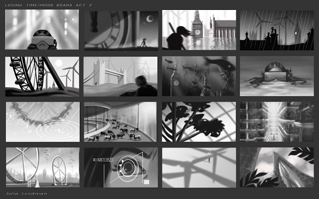
Star Wars Comps for Concept
"LOSING TIME", Poster Roughs
Disney's Palace Pets, "Tales From Whisker Haven"/Color Scripts!
I recently worked on ten 3:30 animated episodes for
, a new show on
. There is also a new Palace Pets Website (!!!) which can be found at
.
The show was developed and produced at
, directed by the talented
Alan Lau
. It was such a fun project for me personally as I served as Art Director on environments, props and color design. The show was definitely challenging as the Palace Pets have been a successful toy line for Disney for a while now and have a multicolored pastel palette. For this reason, color scripting was necessary on several of the episodes for either a full episode or portions of sequences that were particularly tricky to work out.
Below is my color script for my favorite episode, "The Knight Night Guard". (available to watch on the Disney Junior app now!) Color scripts, if you aren't familiar with them, are a way to get a big picture take on the color design for an entire episode or sequence. It is important to focus on the storytelling as scenes move from shot to shot and sequence to sequence, and make sure the planning for the lighting and effects is consistent logistically from one scene to another. They also are very helpful for animators so they can get a big picture idea of what it is we are shooting for, and also are very helpful for the compositor when piecing together all of the various elements into one shot. Additionally, I enjoy designing color scripts since they give me a chance to think globally about how I want to approach the design of specific environments and how much work I will need to do for specific areas of a sequence, and the work load we are facing in terms of environments and props for a particular episode or sequence.

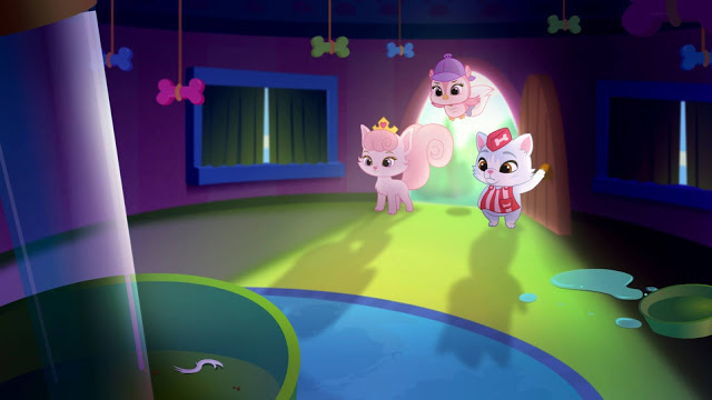
Below are some stills from Episode 3. They translated pretty closely to the color script - good planning is worth it!


Below is a partial color script for Episode 4, "Throwing a Ball". I didn't have time to do a color script for the entire episode so I focused instead on a tricky sequence that takes place with a time of day change.

Below are a few shots for the final. (Additional characters were added after I did this initial color script.)


I actually did a few more of these but those episodes are not yet released.
Please check back for updates and be sure to watch Palace Pets "Tales of Whisker Haven" on Disney Junior! Next week I will post about some of the environments and props I designed. Thanks for reading!
Pacific Marine Animal Studies
Some more studies from our recent trip to the Monterey Bay Aquarium. I spent most of my time trying to capture a gesture or general feel for each animal, then tightened up my sketches later using photos I took and in some cases video, the puffins being the most difficult since they were very busy beasts!

The jellyfish exhibits are like nothing else I've seen at other aquariums. Absolutely stunning.

Moon Jellies (above) are in abundance in the Pacific Ocean, however because they are white they look very similar to white plastic bags. Sea turtles have mistakenly eaten plastic bags and died as a result, one more reason to go from plastic to paper.
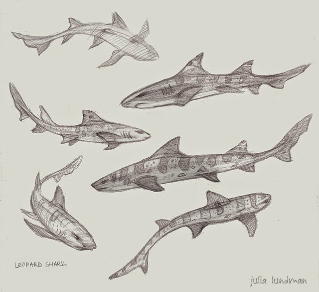
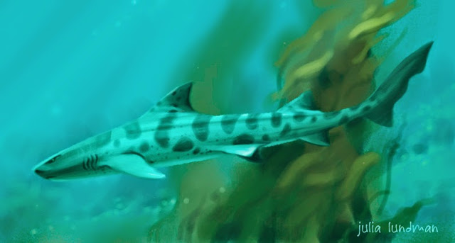
I really loved these gentle sharks. Conservationists are concerned about them becoming overfished due to sport fishing along the Pacific Coast, where they live, mostly along kelp forests and rocky areas.


Tufted Puffins are in abundance along the Pacific Coast, especially up toward the Aleutian Islands in Alaska. I loved watching them - this guy was very curious about us!
The light shining through the water in the Kelp Forest exhibit made the anchovy schools look magical. Anchovy schools tend to gravitate toward long columns of kelp in a swirling spiral upward. Sublime! I did these studies from some video footage I shot and then painted various parts of different shots to make it all work together as a portrait of the habitat.

Monterey Bay Aquarium/Color Studies & Sketches
Jamie and I recently went on a trip down the coast to the Monterey Bay Aquarium, one of my very favorite places in the world. We both brought our drawing, sketching, and painting supplies, including my new samsung tablet. Because most of my color sketching was going to be done inside the aquarium, I carried around my tablet in my messenger bag and took it out when I saw something I wanted to study.
As mentioned in my previous post, the primary reason I purchased the tablet was so that I could do a lot more color studies of interior lighting in situations where it would be difficult to take out my usual paints or pastels, places like restaurants, cafes, aquariums, museums, unusual interior lighting situations. Boy am I glad I did. Each time I would sketch from life in the aquarium, I would take a photo before I left. When I would look at the photo later, I noticed a HUGE difference - the camera most of the time did not capture the lighting effects I observed, and if it did, the spirit of that light was completely lost, subdued, or just not there. What an amazing learning experience!
***************************************************
Below are a few of my digital studies. I also did numerous pencil and watercolor studies of the animals in the aquarium, and a few pastels from up the coast. I will post those next week.
The Kelp Forest. So glad I brought my noise canceling headphones for this one. There were deafening crowds of pre-teens on a field trip with their school. You never know what will confront you when plein air sketching - I highly recommend headphones if you sketch in public places.

I liked the presentation of this display so much. The blue light spilling from the water and the yellow-green reflections of the kelp were gorgeous. I felt the design stood well on it's own.

The sketch above is downstairs looking into the Sea Otter display, sea otters mostly spending their time up above water and only occasionally diving below. I noticed this perch watching people as they went by and thought it was funny...

Some sketches went faster than others. This one in the Deep Sea Exhibit was done in about 30 minutes. It was at the end of the day and just seemed to flow. I figured out a composition and story as it evolved in front of me.

Of all the subjects I studied in the aquarium, this jellyfish display was absolutely the most difficult. I sat across from the display on the floor against a wall in almost total darkness. My eyes had adjusted to the dark, but when I looked down into the bright computer screen of my tablet, my eyes would adjust to that brightness, so that when I looked back up again at the jellies, I had to give my eyes a moment to adjust to the darkness again. VERY tough! I spent a good two hours trying to capture the light of the tank. Wow, what a learning experience this sketch was!
THE TIME MACHINE: Visual Development with Armand Baltazar/Animation Collaborative
I recently took a visual development course at the Animation Collaborative taught by senior visual development artist Armand Baltazar, who has worked for many years in animated film, with credits on Dreamworks, "Shark Tale", "Spirit", and "A Bee Movie", as well as Disney's "Princess and the Frog", and more recently Pixar's "Cars 2", among many others. Of all the classes I've taken in recent years, I found this course to be perhaps the most exciting. I've always been deeply interested in visual storytelling, although I've not always had ideal opportunities to practice that very fine art to the fullest I've wanted. So when Armand's course came up on the roster and time in my schedule allowed, I jumped. Aside from my own interests, I feel a good visual development class is an excellent experience for any artist at any level to go through. So many of us have grand ideas around stories, world building and stylization, but how many of us have really gone deep into our visual storytelling skills? If you've not had the opportunity to take such a class, I encourage you to find one or else pick up a few good "art of" books for film, games, and television.
Regarding this specific class at the Animation Collaborative, I felt it was absolutely worth it. Armand was a fantastic teacher and really put in a lot of extra work and effort in teaching the class, even staying late to give back really valuable individual feedback, paint overs and advice tailored to each student. Each class was chock full of fantastic information about visual development, portfolio development, and tips and techniques for working quickly, as is required on any project in development.
For the class we each picked a classic book to visualize as an animated film. I picked HG Wells', "The Time Machine", a book that I illustrated years ago, but unfortunately didn't do a very good job of it due to the extremely rushed deadline. For years now I've wanted to revisit the story, and have imagined a reboot tailored toward an animated young adult film. I thought I'd share my character design concepts here, and later will share more development. Over the course of the next year I'll be working up ideas around this story and will share more as I solidify ideas.
***********************************************************
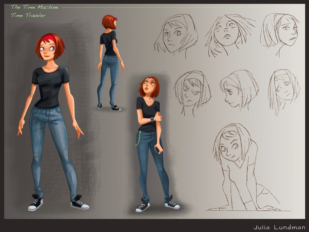
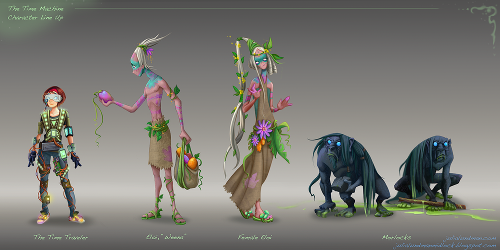
My Time Traveler in my reboot of "The Time Machine" is a young woman in present day. When I draw character sketches, I like to keep a very, very simple line with almost no detail. I like to save any modeling or texturing for painting. I really enjoy the challenge of trying to capture a gesture in as few lines as possible.
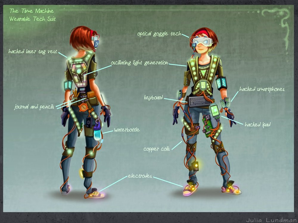
I envision the Time Machine device to be wearable tech made up of everyday things like hacked ipads, iphones and a laser tag vest. Like in the original book, the time machine does not move the individual through space, but only through time.
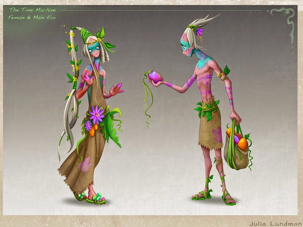
Imagine what happens to those digits after thousands and thousands of years of swiping/touch technology… I enjoyed working on my take on the ELOI quite a lot. I envisioned them growing tall and thin with elaborate hairstyles and lots of adornments.
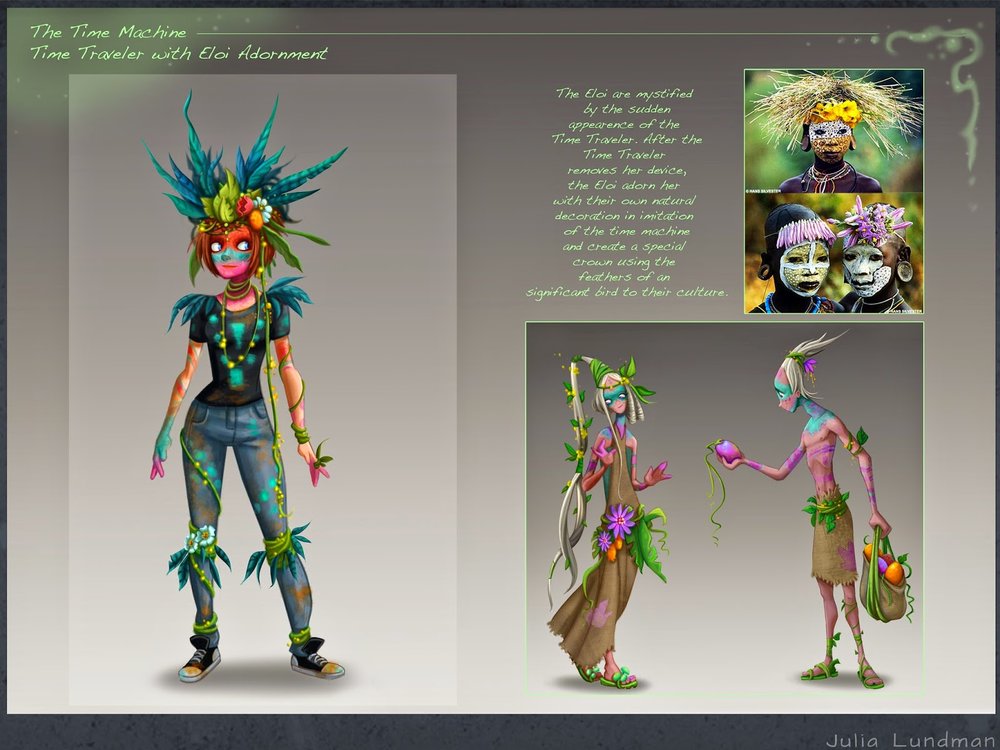
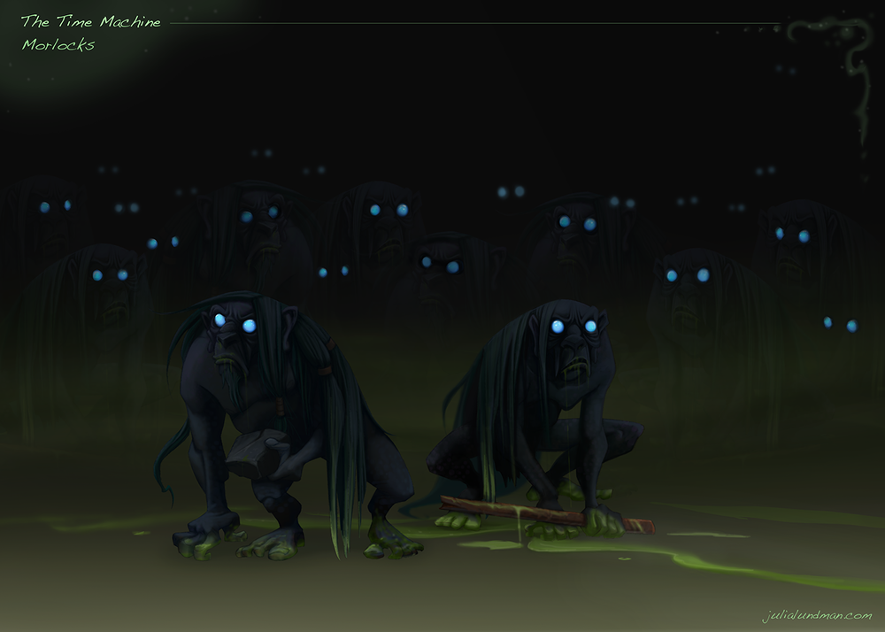
The Morlocks live in underground caves where they have evolved eyes that allow them to see in the complete darkness. They live amongst the ruins, pollution and grim of thousands of years of human corruption.
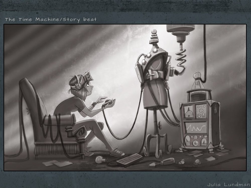
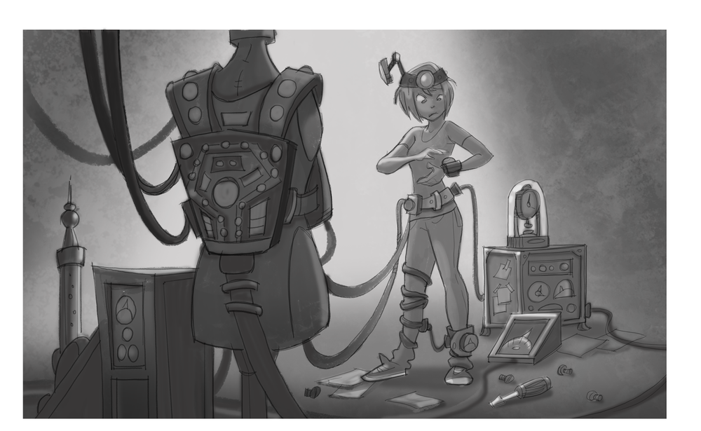
Below are some quick color comps and sketches of what I have been developing around story moment ideas. Most of these are pretty quick, like 2 hours each or even less in the case of sketches. All of these are meant to be exploratory in nature, and will eventually become more finished paintings. I can't wait to work on these!
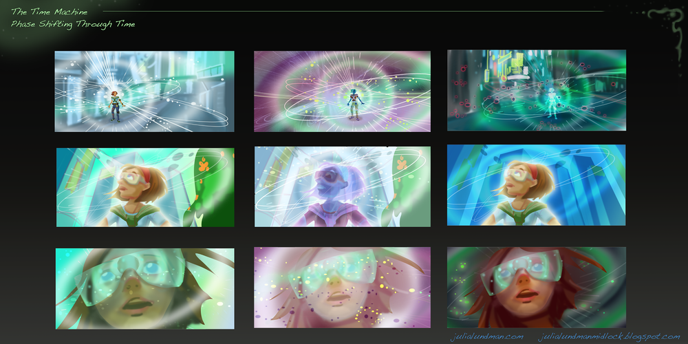
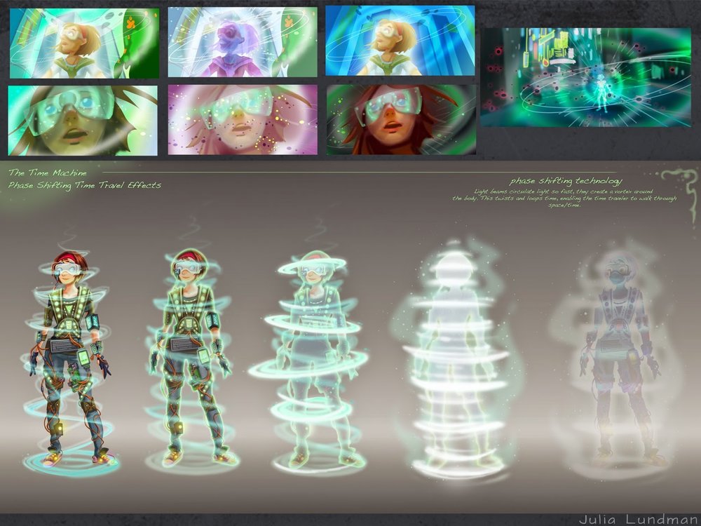
I've long been a fan of Douglass Trumbull, well known in the film industry for his innovative special effects on movies like 2001: A Space Odyssey, Blade Runner, and Star Trek: The Motion Picture. I wanted to emulate his effects in some way, and have envisioned the bottom row of images to be my take on time travel effects.
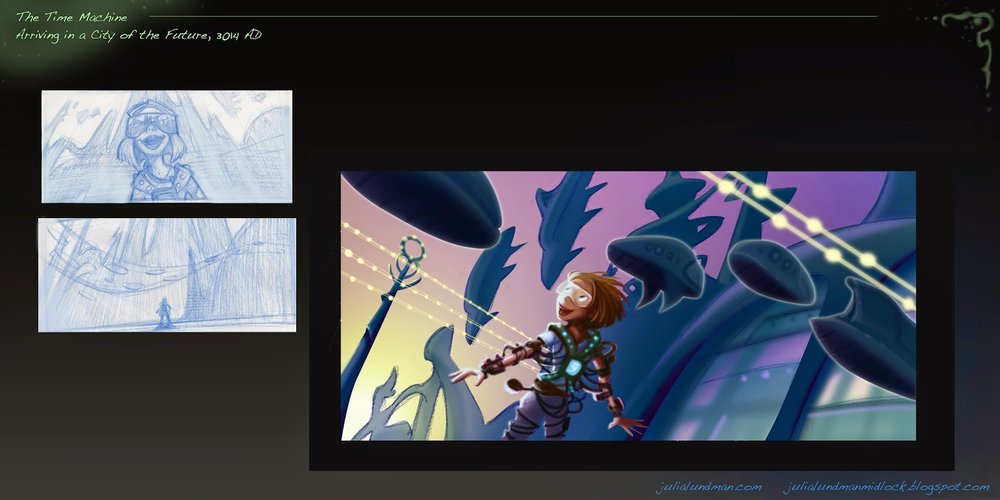
This is my quickie version of a future city, although I have plans to iterate on this a bit more. Given that our class was only 12 weeks and I only had the weekends to work on it, I felt that I didn't have enough time to really dig through this juicy subject. Looking forward to exploring some more concepts!

Hey, who doesn't need a hot Eloi boyfriend in the future? Actually, this is one aspect of the story that I am quite excited about: the friendship between The Time Traveler and Weena, in my version female (time traveler) and male (eloi). I think this can be resonate with the story themes in some unusual ways - I'm so excited to work some more on these ideas.
I actually have a number of additional sketches and comps, but they are still a little too compy to share. Hopefully soon!
As I continue to develop my ideas I will post. I hope to put a little book together by sometime next summer, if all goes well.
Thanks for reading!!!
iPad Sketching
I recently got an iPad air over the holidays. In addition to my tree studies, for some time now I've wanted to study the lighting and staging of various live action shows that I admire. So I thought I'd start with a few shows, freeze frame the shot I like and do an observational study.
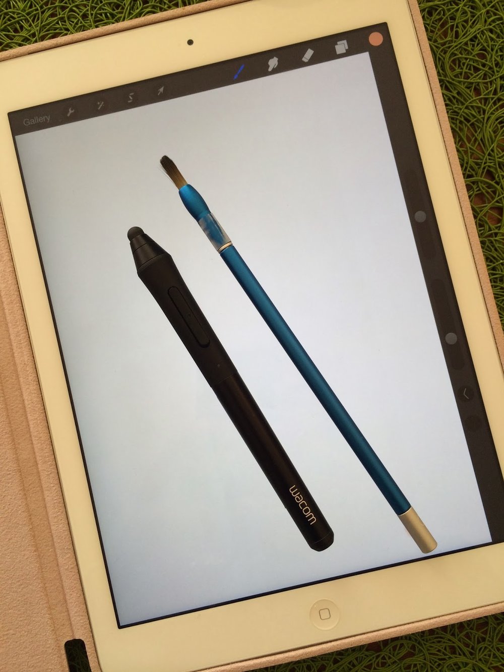
I've also played around with various apps. There are so many out there, and I'm pretty sure I've tested them all at this point. The app I like the most is Procreate. It feels like photoshop, but has the basic stripped down interface that I need for painting, and adjusts that interface to work well on a touch screen. Other apps are clunky for various reasons, but Procreate has gotten it right.
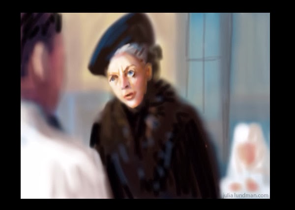
Violet Crawley, The Dowager Countess of Grantham in "Downton Abbey".
My first few attempts were frustrating because it seems that I cannot get the brush size or shape working well enough for me. Also, there is a slight lag between touching the screen and the brush stroke that is a little distracting. Other problems include the color palette; so often the color I thought I chose in the palette is not actually the right value.
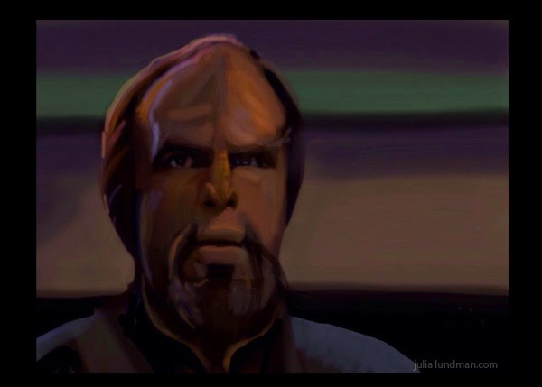
Worf from Star Trek Next Generation.
The above painting of Worf was a little frustrating too because I felt like I was fighting the pen controls the entire time. Also, when I exported it to my photo stream, the painting became darker.
I then tried a bigger scene to see how it works for capturing an entire shot, not just a portrait. I found the brush controls really difficult in that case. The city in the distance for instance is really rough, not all how I was attempting to paint it, but an ok study of the general set up and lighting.
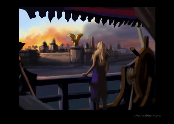
Game of Thrones, Season 3, episode 2. Daenerys Stormborn on her newly acquired ship headed to Astapor.
Game of Thrones Season 3, episode 3. Daenerys Stormborn after she unleashes her dragon Drogon on the leaders of Astapor. (that must have been supremely satisfying!)
I love the lighting in this shot. I struggled with the styluses in this painting, trying to use the brushes to obtain a likeness in the eyes, nose and mouth, but finally decided that I need to think of these studies as just that, color studies.


