Disney's Palace Pets, "Tales From Whisker Haven"/Color Scripts!

I recently worked on ten 3:30 animated episodes for

Disney's Palace Pets

, a new show on

Disney Junior

. There is also a new Palace Pets Website (!!!) which can be found at

www.DisneyPalacePets.com

The show was developed and produced at

Ghostbot

, directed by the talented

Alan Lau

. It was such a fun project for me personally as I served as Art Director on environments, props and color design. The show was definitely challenging as the Palace Pets have been a successful toy line for Disney for a while now and have a multicolored pastel palette. For this reason, color scripting was necessary on several of the episodes for either a full episode or portions of sequences that were particularly tricky to work out.

Below is my color script for my favorite episode, "The Knight Night Guard". (available to watch on the Disney Junior app now!) Color scripts, if you aren't familiar with them, are a way to get a big picture take on the color design for an entire episode or sequence. It is important to focus on the storytelling as scenes move from shot to shot and sequence to sequence, and make sure the planning for the lighting and effects is consistent logistically from one scene to another. They also are very helpful for animators so they can get a big picture idea of what it is we are shooting for, and also are very helpful for the compositor when piecing together all of the various elements into one shot. Additionally, I enjoy designing color scripts since they give me a chance to think globally about how I want to approach the design of specific environments and how much work I will need to do for specific areas of a sequence, and the work load we are facing in terms of environments and props for a particular episode or sequence.

Below are some stills from Episode 3. They translated pretty closely to the color script - good planning is worth it!

Below is a partial color script for Episode 4, "Throwing a Ball". I didn't have time to do a color script for the entire episode so I focused instead on a tricky sequence that takes place with a time of day change.

Below are a few shots for the final. (Additional characters were added after I did this initial color script.)

I actually did a few more of these but those episodes are not yet released. 

Please check back for updates and be sure to watch Palace Pets "Tales of Whisker Haven" on Disney Junior! Next week I will post about some of the environments and props I designed. Thanks for reading!

THE TIME MACHINE: Visual Development with Armand Baltazar/Animation Collaborative

I recently took a visual development course at the Animation Collaborative taught by senior visual development artist Armand Baltazar, who has worked for many years in animated film, with credits on Dreamworks, "Shark Tale", "Spirit", and "A Bee Movie", as well as Disney's "Princess and the Frog", and more recently Pixar's "Cars 2", among many others. Of all the classes I've taken in recent years, I found this course to be perhaps the most exciting. I've always been deeply interested in visual storytelling, although I've not always had ideal opportunities to practice that very fine art to the fullest I've wanted. So when Armand's course came up on the roster and time in my schedule allowed, I jumped. Aside from my own interests,  I feel a good visual development class is an excellent experience for any artist at any level to go through. So many of us have grand ideas around stories, world building and stylization, but how many of us have really gone deep into our visual storytelling skills? If you've not had the opportunity to take such a class, I encourage you to find one or else pick up a few good "art of" books for film, games, and television.

 Regarding this specific class at the Animation Collaborative, I felt it was absolutely worth it. Armand was a fantastic teacher and really put in a lot of extra work and effort in teaching the class, even staying late to give back really valuable individual feedback, paint overs and advice tailored to each student. Each class was chock full of fantastic information about visual development, portfolio development, and tips and techniques for working quickly, as is required on any project in development.

For the class we each picked a classic book to visualize as an animated film. I picked HG Wells', "The Time Machine", a book that I illustrated years ago, but unfortunately didn't do a very good job of it due to the extremely rushed deadline. For years now I've wanted to revisit the story, and have imagined a reboot tailored toward an animated young adult film. I thought I'd share my character design concepts here, and later will share more development. Over the course of the next year I'll be working up ideas around this story and will share more as I solidify ideas.

***********************************************************

My Time Traveler in my reboot of "The Time Machine" is a young woman in present day. When I draw character sketches, I like to keep a very, very simple line with almost no detail. I like to save any modeling or texturing for painting. I really enjoy the challenge of trying to capture a gesture in as few lines as possible.

I envision the Time Machine device to be wearable tech made up of everyday things like hacked ipads, iphones and a laser tag vest. Like in the original book, the time machine does not move the individual through space, but only through time.

Imagine what happens to those digits after thousands and thousands of years of swiping/touch technology… I enjoyed working on my take on the ELOI quite a lot. I envisioned them growing tall and thin with elaborate hairstyles and lots of adornments. 

 The Morlocks live in underground caves where they have evolved eyes that allow them to see in the complete darkness. They live amongst the ruins, pollution and grim of thousands of years of human corruption.

Below are some quick color comps and sketches of what I have been developing around story moment ideas. Most of these are pretty quick, like 2 hours each or even less in the case of sketches. All of these are meant to be exploratory in nature, and will eventually become more finished paintings. I can't wait to work on these!

 I've long been a fan of Douglass Trumbull, well known in the film industry for his innovative special effects on movies like 2001: A Space Odyssey, Blade Runner, and Star Trek: The Motion Picture. I wanted to emulate his effects in some way, and have envisioned the bottom row of images to be my take on time travel effects.

This is my quickie version of a future city, although I have plans to iterate on this a bit more. Given that our class was only 12 weeks and I only had the weekends to work on it, I felt that I didn't have enough time to really dig through this juicy subject. Looking forward to exploring some more concepts!

Hey, who doesn't need a hot Eloi boyfriend in the future? Actually, this is one aspect of the story that I am quite excited about: the friendship between The Time Traveler and Weena, in my version female (time traveler) and male (eloi). I think this can be resonate with the story themes in some unusual ways - I'm so excited to work some more on these ideas.

I actually have a number of additional sketches and comps, but they are still a little too compy to share. Hopefully soon! 

As I continue to develop my ideas I will post. I hope to put a little book together by sometime next summer, if all goes well. 

Thanks for reading!!!

iPad Sketching

I recently got an iPad air over the holidays. In addition to my tree studies, for some time now I've wanted to study the lighting and staging of various live action shows that I admire. So I thought I'd start with a few shows, freeze frame the shot I like and do an observational study. 

I've also played around with various apps. There are so many out there, and I'm pretty sure I've tested them all at this point. The app I like the most is Procreate. It feels like photoshop, but has the basic stripped down interface that I need for painting, and adjusts that interface to work well on a touch screen. Other apps are clunky for various reasons, but Procreate has gotten it right.

Violet Crawley, The Dowager Countess of Grantham in "Downton Abbey". 

My first few attempts were frustrating because it seems that I cannot get the brush size or shape working well enough for me. Also, there is a slight lag between touching the screen and the brush stroke that is a little distracting. Other problems include the color palette; so often the color I thought I chose in the palette is not actually the right value. 

Worf from Star Trek Next Generation.

The above painting of Worf was a little frustrating too because I felt like I was fighting the pen controls the entire time. Also, when I exported it to my photo stream, the painting became darker. 

I then tried a bigger scene to see how it works for capturing an entire shot, not just a portrait. I found the brush controls really difficult in that case. The city in the distance for instance is really rough, not all how I was attempting to paint it, but an ok study of the general set up and lighting. 

Game of Thrones, Season 3, episode 2. Daenerys Stormborn on her newly acquired ship headed to Astapor.

Game of Thrones Season 3, episode 3. Daenerys Stormborn after she unleashes her dragon Drogon on the leaders of Astapor. (that must have been supremely satisfying!)

I love the lighting in this shot. I struggled with the styluses in this painting, trying to use the brushes to obtain a likeness in the eyes, nose and mouth, but finally decided that I need to think of these studies as just that, color studies. 

Learning about Color


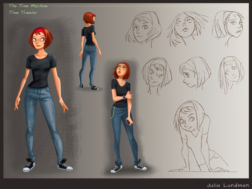
My first experience in learning anything at all about color was in making color charts at the American Academy of Art. I was pretty bummed at the time and wanted to just move ahead to painting, but looking back now, it was a perfect introduction. In mixing up charts we learned about how paint handles, what happens when one color interacts with another, and how value is related to chroma. After this, we went on to painting monotone samples for a while, then with limited palettes, and finally full color, usually assignments ranging from still life painting, illustration, and figure painting. We always used gouache to paint, with the exception of specialized classes like oil painting or watercolor where we always painted from the model.

However, the real break through for me came from constant practice during my years as a background painter of environments and color scripts at Calabash Animation in Chicago combined with observational painting in my home studio and the Palette and Chisel Art League where Richard Schmid painted.

For my background painting job, there were usually 7-12 imaginary landscapes and interior paintings per commercial that I had to plan out and paint. Because of the fine art curriculum I took in art school, we rarely worked from imagination. My only guess then as to how to make convincing paintings with no reference was to apply the principles I learned about in Carlson's Guide to Landscape Painting, which I kept at my desk and referred to constantly. This forced upon me a need to truly understand the concepts of atmospheric perspective, the way color behaves while in a landscape, and other principles of lighting that cause changes on local color of objects. By working backwards, studying light and atmospheric perspective, I could then put those principles into practice on an imaginary stylized landscape.

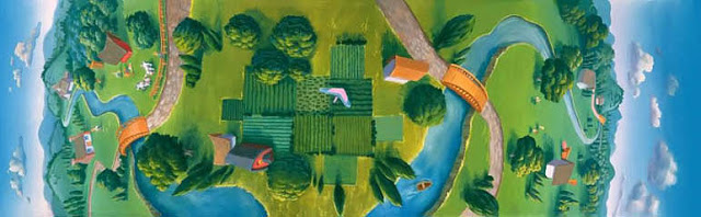
 A Lucky Charms commercial pan background I painted in gouache on illustration board, approximately 3 ft. x 14" wide, around 1994

 However, just working from what I learned in Carlson's Guide to Landscape Painting was not enough. I also pored through books of other artists' work, studying paintings very, very closely. If I had no ideas on color schemes for seemingly mundane things like pavement or boring interior walls, I'd look at how Disney background painters were handling these subjects - usually with interesting lighting, chroma and contrast and learned how lighting and color can be an important compositional element in directing the eye. I combed through book stores and the library to find painters who were working from imagination; I practically memorized every inch of James Gurney's Dinotopia book for examples of great color. 

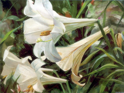
"Lillies", 11x14, gouache on paper, 1992

But working from imagination alone, I believe, is not effective unless an artist works also from life. One tends to inform the other. During my years in Chicago, I regularly painted the still life, figures and portraits from life over at the Palette and Chisel, which helped me to develop a sense of how to mix paint, see color, simplify it, and apply it on canvas. I learned from Richard Schmid the principle of "cool light warm shadows, warm light cool shadows", something entirely new to me at the time. It was there that I learned how critical value relationships are to color, and how important it is to keep your color clean. Interestingly, I also learned from painting the figure and still life how it seems the majority of colors in any given subject seem to be more greyed down that I usually think at first, and how few really true high chroma colors are usually present.

Later on, when I needed to switch to painting in Photoshop at work, the Munsell Color System in the program gave me a way to visualize how connected the relationships are between hue, chroma, and value. 

After having these experiences, I believe that learning about color is not simply the study of one component like a color wheel or color charts. I believe it has to be a combination of methods plus a relentless pursuit in training your mind to see and translate color accurately. I am still learning and sharpening my color and values sense, and hope that by making another concerted push now in my life I might break through a plateau I've been experiencing the past few years. By documenting my experiences and writing down what I know plus reading new research and methods while also painting from life, I hope to make some improvements.

********************************

Learning to Mix Color


Color mixing is one skill in a set of skills that an artist needs to develop for painting in color.

As stated earlier, the first time I ever mixed color was my first year in art school where we mixed color charts. Later, I made much more extensive charts on a recommendation that Richard Schmid made during a lecture at the Palette and Chisel. When he eventually wrote his book, Alla Prima, he included the exact same advice where you can find it to make your own charts. 

The purpose of making color charts is not so that you have "recipes" for mixing color. These charts are not meant to be short cuts, recipes or formulas for color.  At the time I made these I did not know what each oil color did when combined with another in the palette I was using. When I had problems remembering what, for instance, cadmium yellow deep did when combined with terra rosa, looking at these charts helped guide me. When I needed to figure out what color I was looking at in a still life, if I referred to these charts, it helped my eye understand what it was seeing in terms of chroma and value - usually I would mix that color up and go from there by adding a bit of a third. 

Lundman-colorchart-yellowsreds

Lundman-colorchart-redsblues

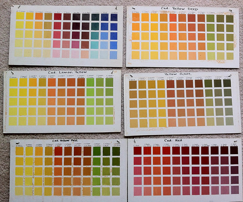
Going through the process of mixing colors for charts like this is important in learning many useful things about how to handle paint, how to physically mix it, apply it, manipulate it into values, observe what happens to it's temperature, and notice how important it is to keep it clean. Making charts like this is also useful when you add a new color to your base palette or for experimenting with a set of colors to find how it reacts with other colors in your palette. 

********************************

Learning to Identify Color


Sometimes while I was first learning to paint, I used a small piece of white paper with holes punched in it. I would look through this piece of paper when I was stuck, aligning it with the color I was trying to identify. Very often I was surprised at what I found - a color that was either more grey, less saturated, and not at all what I thought it was. Often, I would mix up what I was seeing through the hole and put a small swatch up on the white piece of paper. I would keep doing this until I got the correct color.

To help visualize what I mean, I made up an example from a recent photograph I took. Although the water is somewhat greenish blue, it can be very difficult to identify specifically. Here, by calling out swatches, you can see just how green the water is and what it's value is. Our minds might tell us that the mountains in the distance covered with pine trees must be green, also, however by calling out the swatch, we can see that the hills are not green, but greyed blues.  


Screen shot 2012-08-14 at 3.36.17 PM
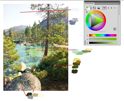
Since I was using Photoshop to make this example, I placed the color wheel there too so you can see where the green of the water is placed within that particular hue.

Isolating colors using a white card punched with a hole puncher can help break down the symbols of what our mind "thinks" it sees into what is actually there. Over time, this simple tool helped me to discover just how saturated or non-saturated a color might be. 

********************************

Tools to Understand Color


After sifting through multiple websites, I finally found two excellent sites that explain color and how an artist uses it. Just about everything an artist needs to know about the physical properties of color and light can be found on these two sites.


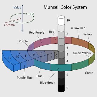
Other tools that help visualize and explain how color works are demonstrated in chart form.  It is widely agreed within the realist painting community that the Munsell Color System is perhaps the most accurate way of understanding color and identifying it in context with other colors. The system identifies three terms: hue, chroma and value.

value: the black and white scale, brightness, how dark or light a subject is

hue:
the local color of the subject 

chroma: the degree of saturation or greyness of that local color


Another useful visualization of the Munsell Color System is the way that the program Adobe Photoshop represents it. Photoshop has an excellent color picker that brings up a color wheel. However, I prefer to use an enhanced extension called Magic Picker, an excellent color wheel for Photoshop used by many professional digital artists. If you have a copy of Photoshop, open up the program and experiment with painting swatches using the color wheel. Playing around with the sliders and adjusters really helped me see how color works using this system. This is the same chart depicted above, but represented differently.

Screen shot 2012-08-14 at 3.26.40 PM

Adobe published a technical guide regarding the Munsell Color System. You can find it HERE.

For further reading on the color wheel, read James Gurney's "The Color Wheel" series, Parts 1-7 on his blog, Gurneyjourney.blogspot.com. Gurney has a different but related approach culminating from his years of research on the color wheel. Excellent information, worth the read, including the comments.

Artist Graydon Parrish teaches a three week workshop in using the Munsell Color System at the Grand Central Art Academy in New York City each summer. The usefulness of learning the Munsell Color System is that it can help any artist identify any color, and use that color to depict anything he or she wishes. It is complex to understand at first, which requires some study and practice. I hope Graydon continues to teach - his classes are on the top of my list to attend!

Here is how Parrish describes the way he determines color in his paintings:

"What distinguishes my system is that I make strings of single chromas combined with single hues. I analyze what I am going to paint, find its notation, then mix up strings to cover the range. Reilly's method used cadmiums, way out of flesh range. A string of cad orange brought down with burnt umber/alizarin crimson shifts not only in value, but in hue and chroma as well, making it hard to predict. Reilly too recommended the addition of neutral greys to kill the chroma, but this causes the hues to shift as well. This is something Reilly never mentioned.

The above is just the beginning. One can analyze, then translate so many effects of nature into paint. I have a photo of a Bouguereau drawing where he had written the various colors of his model: green-grey, yellow-grey, rose-grey etc. With Munsell, the notations can be much closer. No more vague terms. (How much grey, for example, is in green-grey?) Its better to say 7.5 YR 6/3 or 7.5 R 5/4, for the average flesh and the ruddies. Then with mixing and planning, one can create an entire palette of Bouguereau flesh, for every change in value, and predict the rise and fall of chroma.

Likewise, Paris Hilton, could be studied and painted as well in all of her sun-tanned splendor. She is likely a chroma 5. When you then know where the chroma rises and where it falls, why some colors pull yellow in the lights and others don't, and how various transparent objects are more chromatic on the edges, then you have the beginning of an entire repertoire of visual phenomena from which to create." - quoted from the wetcanvas.com forums, HERE.

********************************

How Color Behaves in it's Environment


In addition to studying the Munsell system, learning how to mix and identify color, it is critical to also understand the principles of light and how color is affected by it. Matching color in any given subject is an important skill in developing the eye to see color correctly and helps to determine your palette and pigment choices. However, also understanding the reasons that make color appear a certain way in a particular situation is equally as important.


The very best books I can recommend are:

 Carlson's Guide to Landscape Painting

 Andrew Loomis, Creative Illustration

James Gurney, Color and Light

Richard Schmid, Alla Prima

Here is a summary of some important points I learned from these books about how light and color work together:
  • cool light produces warm shadows; warm light produces cool shadows. (Alla Prima)
  • the most saturated color in a particular area is at the transition between the light side and the dark shadow and also at edges of objects. (Color and Light)
  • Values in a landscape are often as depicted below, the source of the light, the sky, most often (even at night) being the lightest value in the landscape, the ground plane the second, slanting planes third, and upright planes usually the darkest. (Carlson's Guide to Landscape Painting)
  • Value is the most important factor in a painting, with hue and chroma coming next. If values are correct, hue and chroma will still be able to read. (Color and Light)
  • a color will alter it's appearance depending upon the context of that color in the light or if other colors around it change. (Alla Prima, Color and Light)
  • the limitations of pigments prevent us from depicting the wide range of luminosity in the world around us, so we must make adjustments in order to get across an approximation of what we see. (Alla Prima, Color and Light)


page 34, Carlson's Guide to Landscape Painting by John F. Carlson

In "Creative Illustration" by Andrew Loomis, he dedicates a chapter entirely to the great Howard Pyle. Loomis included this chapter in order to pass on directly, in print, information that was taken in note form during classes taught by Pyle regarding his general theory regarding light and color.

"All objects of nature are made visible to the sight by the light and of the sun shining upon them. The result is that by means of this we see the colors and textures of the various objects of nature.
From this it may be seen that color and texture are the property of light and that they do not enter the property of the shadow. For shadow is darkness and in the darkness there is neither form nor color.
Hence form and color belong distinctly to light. Shadow - as the object illuminated by the sun is more or less opaque, so when the light of the sun in obscured by that object, the shadow which results is more or less black and opaque, being illuminated only by the light reflected into it by surrounding objects.
By virtue of shadow all objects of nature assume form or shape, for if there were no shadow all would be a flat glare of light, color and texture...But when the shadow appears, the object takes form and shape.
If the edges of an object are rounded, then the edges of the shadow become softened; if the edges of an object are sharp, then the shadows is correspondingly acure. So, by means of the softness or sharpness of the solid object, is made manifest. 
Hence, it would follow that the province of shadow is to produce form and shape, and that in itself it possesses no power of conveying an impression of color or texture."
-Howard Pyle, as quoted by Andrew Loomis, Creative Illustration, pg. 136