CTN Ad
This year I took up the opportunity to advertise in the CTN Sketchbook, a collectible printed sketchbook you can buy. I created this ad using some of my art. The book is in black and white, and because of that I submitted this piece in black in white. The 2015 sketchbook should be available in a few weeks at the

I liked the composition a lot, so I also created it in color, too. I also made a bookmark of "The Act". I will have both color bookmarks while at the show. If you see me ask for one - they're free! Ping me at @Paintkatt on Twitter if you're at the show and want a bookmark!

Thanks for reading!
A Couple of Plein Air Digital Paintings
For awhile now, I've been trying to come up with an easier take-with-me-everywhere method of plein air sketching. I have full plein air kits for pastels, oil and watercolor, but often I find that even though I keep one of these kits in the trunk of my car, I usually don't feel inclined to bring it all in to a restaurant, coffee shop or on an afternoon trip downtown. I wanted something MUCH more lightweight and accessible - and the iPad has been it.
Here is a sketch from a recent day trip to the ferry building in San Francisco, a busy tourist-heavy area of the city.
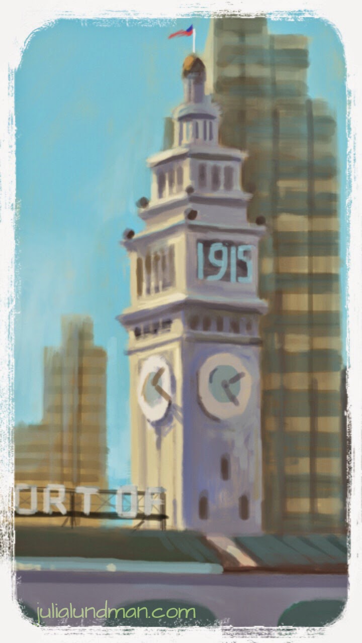
My main objective with iPad sketching is to mimic plein air oil paint using the alla prima technique, direct painting, as opposed to more labor intense methods. The idea is to work quickly on site and get it all down in about an hour or so of working. That means everything from gesture, composition, hue, value relationships and light relationships.
About the hardware: I have yet to find a stylus I am completely comfortable with; I am currently using the Wacom Creative Stylus. I am not keen on recommending it, however, because it feels like painting with a giant crayon. I unfortunately purchased the Wacom Creative Stylus 2 and found afterwards that it is not compatible with many painting apps, including Procreate. A few friends have given good reviews of the Jot Adonit Stylus, which is far cheaper and compatible with a lot of apps.


In the Procreate app, I created a set of swatches in the color picker that are the standard colors of my basic oil painting palette, plus a few white convenience colors so that I don't have to constantly mix the same color over and over. Using these swatches helped me in getting a similar look to traditional paintings, although I think I could still fine tune the set.
In addition to that, I am still trying to refine my brushes to find a working method that mimics traditional brushes. Procreate provides a set of brushes that you can then customize, but I have yet to find some that are to my liking.
iPad sketch videos
My partner, James Baker and I have been sketching lately from the tv, in an effort learn together as he trains to draw with his left hand. He had a stroke last year which left him without the use of his right hand, and while he recovers, we thought he might try adapting the left hand in the mean time so that he can still enjoy drawing.
Its been a difficult challenge full of ups and downs. As artists we are so tied to our motor skills that we tend not to even think about it. It is especially scary if you earn your entire living on your professional art skills which have been perfected in a very personal way over the course of your life. As I watch Jamie improve his leftie drawing skills, I am heartened to see how much of what we must know about drawing comes from the mind. The rest is output, and although it is very difficult to train with a non-native hand, it can definitely be done.
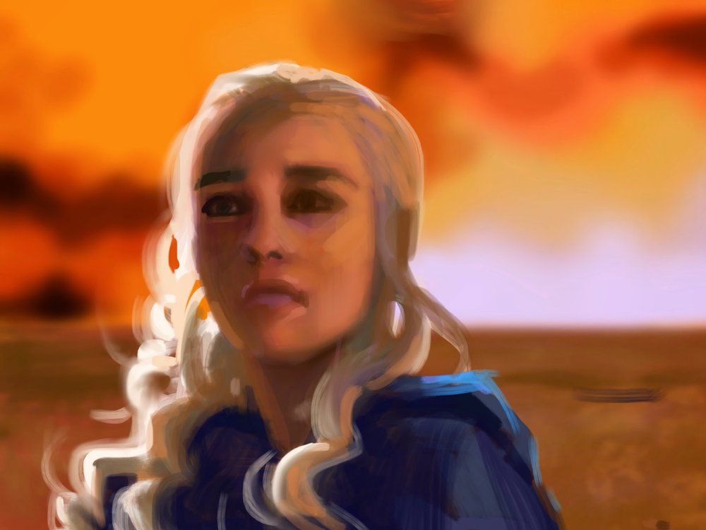
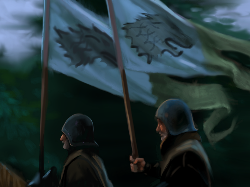
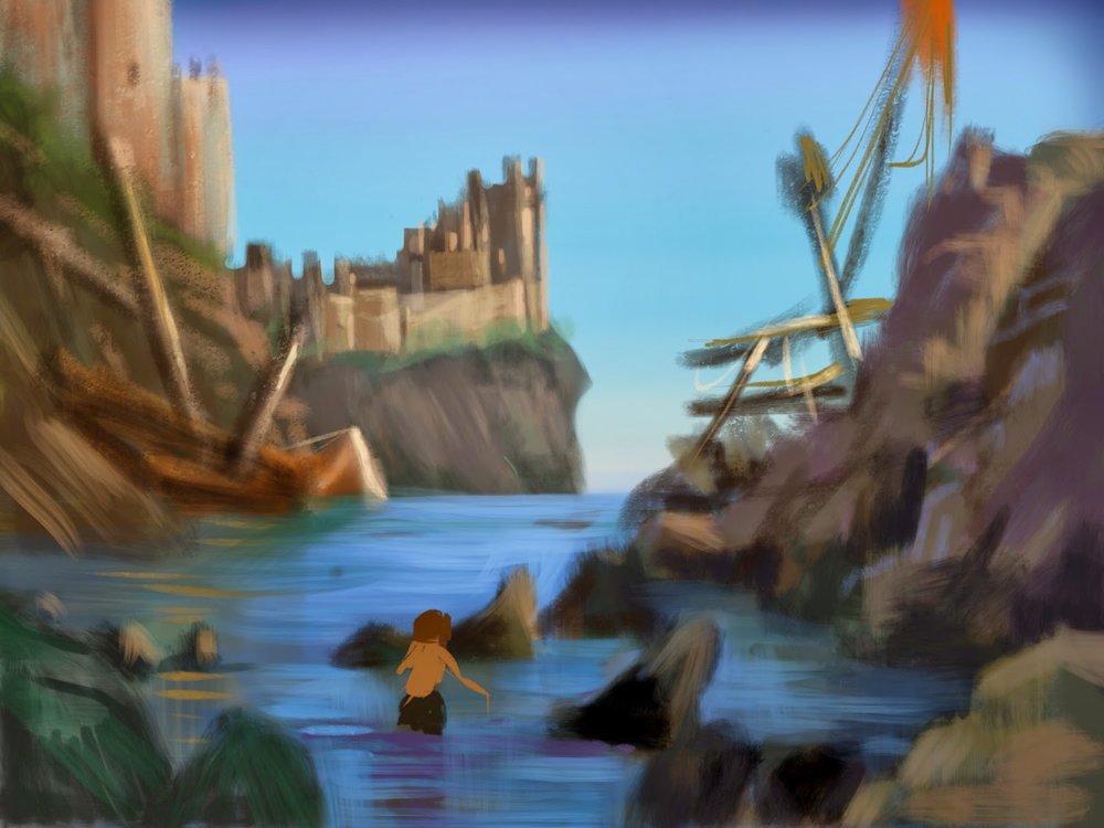
My own recent experiments with iPad sketches from movie compositions are in tandem with Jamie's. We figure out a show that we'd like to study, usually something gritty from the fantasy or sci-fi realm, freeze frame a shot we both agree on, and start drawing. Jamie is doing it old school with pencil, watercolor and paper while I am trying out a new (for me) sketch tool. The important thing is that we are having a blast together while learning. There really is nothing better.
Thanks for stopping by!


